

Executive Overview
When a corporate rebrand or a digital product identity stalls, fails, or misses the mark, post-mortems usually point fingers at the execution phase. Stakeholders complain that the color palettes feel too stark, the typography lacks warmth, or the logo concepts missed the strategic memo. Yet, an investigation into the anatomy of these branding failures reveals a starker reality: the breakdown almost never happens inside design software like Figma or Illustrator. Instead, it originates weeks or months earlier, deep within the strategy phase, where abstract, buzzword-heavy adjectives like “modern,” “trustworthy,” “premium,” “friendly,” and “disruptive” are left entirely undefined.
This fundamental disconnect—the chasm between what a brand’s leadership team thinks these strategic words mean and what a designer is expected to visualize—creates an invisible fault line. Without a translation mechanism, designers are forced to play a guessing game.
Enter the “pre-concept” phase: a rigorous, highly structured preliminary period that sits squarely between the initial project kickoff and the drafting of the first visual direction. This foundational phase is where creative teams research brand context, unearth hidden stakeholder assumptions, navigate perceptual paradoxes, and systematically transform a vague corporate mandate into an actionable visual foundation. By treating the pre-concept phase as a distinct, mandatory discipline rather than a rushed prelude, design studios can replace subjective guesswork with objective, consensus-driven clarity.
Detailed Chronology: Navigating the Pre-Concept Roadmap
To successfully bridge the gap between abstract business strategy and concrete visual assets, the pre-concept phase must follow a deliberate, methodical chronology. It is not enough to simply collect a design brief and dive into moodboarding; teams must guide stakeholders through a structured progression of discovery, mapping, and translation.
Stage 1: Researching Brand Context and Decoding Ambiguity
A standard brand workshop covers the foundational checklist: business models, long-term goals, product specifications, the competitive ecosystem, and target demographics. However, experienced designers know that the real gold lies in uncovering how a brand is perceived.
As Marty Neumeier famously posited in The Brand Gap, “A brand is a person’s gut feeling about a product, service, or company.” Because a brand ultimately lives in the subjective perception of its audience, internal alignment sessions must shift from collecting hard facts to clarifying psychological positioning.

Consider a real-world case study involving a health technology startup. During initial briefings, the leadership team insisted their brand identity needed to look “modern, trustworthy, and disruptive.” On paper, these three adjectives seemed harmonious. However, when probed, the term “disruptive” carried wildly divergent meanings. To the founders, it implied a bold, unconventional rebellion against old-school systems. But when contextualized against their actual target audience—large, deeply conservative government medical institutions—the reality shifted dramatically. A hyper-rebellious, visually loud, or avant-garde identity would instantly forfeit the trust of conservative hospital boards. In practice, their version of “disruptive” had to look exceptionally traditional, leaning heavily into clarity, efficiency, and unassailable institutional confidence.
Without a pre-concept discovery phase to stress-test these assumptions, a designer tasked with creating a “disruptive” health tech brand might have easily produced an edgy, neon-accented visual identity that alienated the company’s core buyers.
Stage 2: Facilitating Active Stakeholder Participation via Mapping
To bypass the limitations of passive corporate presentations, designers must employ active workshops that force stakeholders to externalize their internal models. Two exercises anchor this phase:

- Competitor Perception Mapping: Before the session, curators gather visual artifacts from across the industry—website homepages, product UI screenshots, social campaigns, and marketing collateral. During the workshop, stakeholders plot these entities across a two-axis grid. The axes are custom-tailored to the project’s core tensions (e.g., Understated vs. Bold or Accessible vs. Exclusive). This exercise reveals how the client mentally structures their category, identifying precisely where competitors look generic, overly conservative, or experimental, and exposing a virgin white-space territory for the new brand.
- The Visual Brand Driver Exercise: Moving inward from the category to the brand itself, stakeholders are asked to assign non-literal, metaphorical representations to the company. If the enterprise were a mode of transport, what would it be—a quiet electric sedan, a high-speed freight train, or an agile bicycle? If it were a piece of furniture, a boardroom mahogany table or a soft modular lounge chair? Crucially, participants must defend their choices with four to five core adjectives. This metaphorical scaffolding strips away personal aesthetic biases and forces the team to align on organizational character rather than surface-level styling preferences.
Supporting Context & Metrics: Translating Strategy into Design Principles
Once discovery insights and stakeholder mappings are synthesized, the project transitions into its second major milestone: building the visual foundation. Rather than jumping straight into logo concepts, designers present three interlocking layers that transition abstract concepts into structural boundaries.
[Strategy / Brief]
       │
       ▼
[Look and Feel Boards]  ──> (Explores Category Tension & Perception)
       │
       ▼
[Design Codes]          ──> (Translates Ideas into Visual Principles)
       │
       ▼
[Brand Assets]          ──> (Defines Color, Typography, & Typography Cues)
       │
       ▼
[First Concept Phase]   ──> (Grounded, Context-Aware Execution)
1. Look and Feel (Perception Boards)
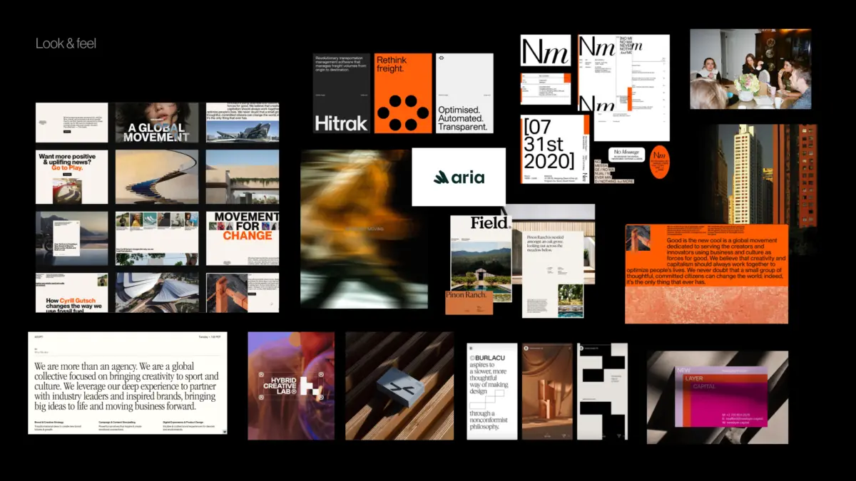
Look and feel boards are explicitly not mood boards compiled of visuals the team simply finds aesthetically pleasing. Instead, they are perception boards built to address category tensions, competitor design codes, and stakeholder character traits. If a brand needs to radiate approachable professionalism, the look-and-feel board evaluates whether that approachability should manifest as editorial refinement or hyper-accessible warmth.
2. Design Code (Translating Ideas into Principles)
Design codes take strategic brand promises and convert them into tangible visual rules. For instance, a fintech enterprise whose core pillar is "frictionless security" might translate that value into a design code featuring razor-sharp geometric grid lines, deep obsidian colorways offset by high-contrast neon caution accents, and unyielding typographic hierarchy. The team tests these metaphors to ensure the visual language supports the strategy before a single layout is rendered.

3. Early Brand Asset Direction
The final layer drills down into foundational identity building blocks: typography systems, color theory parameters, illustration styles, and photographic direction. This tier addresses granular questions: Does the typography lean toward a humanistic sans-serif or an authoritative grotesque? Does the photographic style rely on candid, documentary-style lighting or polished, studio-rendered perfection?
By establishing these parameters early, designers operate within creative guardrails that prevent the final concepts from feeling arbitrary or disjointed.
Official Statements and Industry Insights
Design methodology experts and industry leaders have long championed the democratization of brand strategy through tangible, collaborative frameworks. GV (formerly Google Ventures) partner Jake Knapp, architect of the famed Three-Hour Brand Sprint, underscores the necessity of tangibility in early-stage ideation:

"The point of these exercises is to make the abstract idea of ‘our brand’ into something concrete."
Similarly, brand architecture pioneer Marty Neumeier emphasizes that strategy divorced from perception management is merely an empty corporate exercise. When stakeholders are integrated directly into the pre-concept workflow—placing competitors on perception matrices, debating metaphorical design drivers, and critiquing look-and-feel boards—they transition from passive observers into active co-creators. Consequently, when the eventual identity concepts are revealed, they are never jarring surprises; they are logical, anticipated extensions of a shared vocabulary.
Future Outlook: The Evolution of Brand Strategy in Digital Ecosystems
As digital products become increasingly complex—spanning multi-platform applications, dynamic design systems, AI-driven personalization, and spatial computing environments—the need for a disciplined pre-concept phase is more urgent than ever.

In the future of brand identity design, the luxury of time is shrinking, but stakeholder alignment remains non-negotiable. Organizations that attempt to fast-track their way past the pre-concept phase will continue to suffer from cyclical revisions, bloated design budgets, and fragmented brand expressions. Conversely, agencies and internal product teams that master the art of the pre-concept phase will unlock a sustainable competitive advantage: design work that is strategically bulletproof, emotionally resonant, and culturally credible from day one.
Ultimately, the goal of pre-concept design is not to eliminate creative surprise, but to ensure that when a designer finally opens Figma, every pixel they place has a clear, agreed-upon purpose.
