

Executive Overview
When a high-stakes corporate branding initiative fails, the post-mortem rarely points to a lack of technical talent in Figma, a poorly chosen typeface, or an uninspired color palette. Instead, the root cause of failure almost always lies upstream—specifically in the strategy phase. During this critical kickoff period, abstract adjectives such as "modern," "trustworthy," "premium," "friendly," and "disruptive" are accepted at face value, left completely undefined, and handed off to designers as a mandate.
The resulting friction creates a chasm between what a company genuinely needs to communicate and what a designer is expected to conjure. To bridge this divide, design strategists rely on a vital framework known as the "pre-concept" phase.
The pre-concept phase encompasses the meticulous work that transpires after the initial client kickoff meeting, yet long before the first original visual direction is designed. By systematically researching brand context, unearthing hidden assumptions held by stakeholders, and transforming a shared strategic direction into a concrete visual foundation, organizations can eliminate guesswork. Ultimately, a robust pre-concept phase ensures that the first concept presented to stakeholders is not a blind gamble, but a logical, resonant continuation of a shared vision.
Detailed Chronology: Navigating the Journey from Strategy to Visual Foundation
To understand how visual identity truly takes shape, one must examine the chronological progression of a branding project. Too often, teams rush from a brief and a handful of competitor references straight into moodboarding and concept generation. Without a structured runway, this leap guarantees friction.
Stage 1: Researching Brand Context and Perception
A traditional brand workshop comprehensively covers foundational discovery topics: business models, long-term goals, product specifications, the competitive landscape, and target demographics. However, the true utility of the pre-concept phase lies in asking questions that target perception rather than mere facts.
As Marty Neumeier famously noted in The Brand Gap, "A brand is a person’s gut feeling about a product, service, or company." Because a brand ultimately lives in the minds and perceptions of its audience, internal workshops must explicitly clarify what perception the team is trying to author.

Consider the real-world case of a health-tech company specializing in software for large government medical institutions. During early discovery, leadership stated they wanted the brand to look "modern, trustworthy, and disruptive."
- The Ambiguity: Taken at face value, "disruptive" implies a push toward the bold, unconventional, and rebellious.
- The Reality: After deep stakeholder dialogue, it became clear that disruption within a deeply conservative healthcare ecosystem had to feel utterly credible. A visually loud or experimental brand would destroy institutional trust. Their version of "disruptive" actually looked traditional, relying on supreme clarity, absolute efficiency, and quiet confidence.
Stage 2: Deploying Tactical Alignment Exercises
Words alone are rarely enough to align a diverse group of stakeholders. To bridge the gap between verbal strategy and visual execution, designers must deploy concrete, interactive exercises that force participants to externalize their internal mental models.
Exercise 1: Competitor Perception Mapping
Before entering a workshop, teams should gather visual artifacts from direct and indirect competitors—including website landing pages, app interfaces, marketing collateral, and social touchpoints. During the session, the client team plots these entities onto a two-axis grid.

- The Mechanics: The axes are selected based on the core tension the brand must resolve (e.g., Understated to Bold vs. Accessible to Exclusive, or Traditional to Progressive vs. Corporate to Human).
- The Value: The map’s true worth is not the final chart, but the lively debate it triggers. When one stakeholder views a market leader as "progressive" while another deems them "generic," underlying definitions of innovation and credibility are dragged into the light and reconciled.
Exercise 2: Visual Brand Drivers
To bypass personal aesthetic biases, stakeholders participate in the Visual Brand Driver exercise. Participants choose abstract images across entirely unrelated categories—such as transportation, typography, architecture, animals, furniture, and beverages.
- The Rule: Selections must represent the company, not the individual’s personal taste.
- The Mechanics: For example, if the company were a vehicle, is it a quiet electric car, a high-speed freight train, or a nimble bicycle? Each participant pairs their image selection with four or five descriptive adjectives.
- The Value: This exercise leverages metaphor and association to reveal underlying contradictions in leadership perception—such as one executive viewing the firm as "structured and precise" while another perceives it as "warm and flexible."
Supporting Context & Frameworks: The Three-Tier Visual Foundation
Once stakeholder assumptions are surfaced and charted, the next operational phase translates abstract insights into concrete design boundaries. Rather than jumping straight into logo iterations, studios typically construct a working layer divided into three connected tiers: Look and Feel, Design Code, and Brand Assets.
[ Strategic Inputs & Discovery ]
       │
       ▼
[ Tier 1: Look and Feel (Perception Boards) ]
       │
       ▼
[ Tier 2: Design Code (Visual Metaphors & Principles) ]
       │
       ▼
[ Tier 3: Brand Assets (Typography, Color, Style) ]
       │
       ▼
[ First Concept Execution ]
1. Look and Feel (Perception Boards)
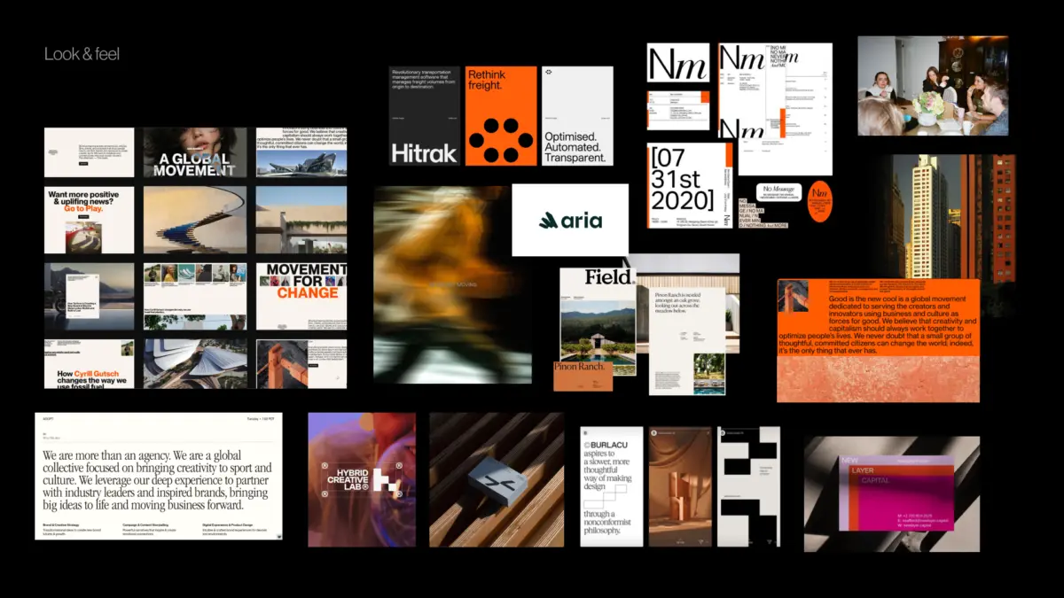
Look-and-feel boards are explicitly not collections of aesthetic styles that a team happens to like. They are diagnostic perception boards. Designers curate third-party visual references that speak directly to desired attributes, category tensions, and stakeholder character traits. If a brand must feel trustworthy yet human, this board helps leadership debate whether that humanity should be expressed via a calm institutional tone or a warm, accessible editorial cadence.

2. Design Code (Translating Ideas into Principles)
Design code elevates the conversation by turning core brand pillars into explicit visual principles and metaphors.
- For a German parenting app, a pillar like "Personalized support for your unique journey" might translate into organic shapes and handwritten lines. Meanwhile, "Research-backed support for real life" introduces doctor photography, clinical data snapshots, and clean infographics to anchor credibility.
- For a PropTech PR agency, a pillar like "Momentum in motion" might manifest visually through directional lines, ripple effects, or subtle motion blur.
3. Brand Assets (The Tactical Building Blocks)
The final pre-concept layer narrows the scope to the foundational building blocks of visual identity: typography scales, color psychology, logo style archetypes, photography treatment, and graphic ornamentation. By reviewing these elements early, the design team establishes firm guardrails without restricting future creative exploration.
Official Statements and Industry Insights
Industry veterans have long championed the necessity of structured upstream alignment. Design thinking pioneers have continuously emphasized that abstract corporate goals must be translated into tangible artifacts before aesthetic production begins.

As Jake Knapp notes in GV’s seminal guide, The Three-Hour Brand Sprint:
"The point of these exercises is to make the abstract idea of ‘our brand’ into something concrete."
When clients are relegated to a passive audience during a strategy presentation, they frequently nod along without realizing the conflicting assumptions they harbor. However, when forced to map competitors, select metaphorical imagery, and defend their design rationales, stakeholders become active participants. Their hidden biases, protective instincts, and operational disagreements surface safely before thousands of dollars and dozens of design hours are invested down the drain.

Future Outlook: The Evolution of Brand Strategy in Digital Products
As digital products become increasingly complex—spanning multi-platform ecosystems, automated design systems, and AI-generated interfaces—the demand for rigorous pre-concept strategy will only accelerate. Brand identity can no longer be treated as a static logo slapped onto a stationery set; it must function as a dynamic, resilient operating system for a company’s entire digital footprint.
Organizations that continue to skip the pre-concept phase will find themselves trapped in endless revision cycles, paralyzed by subjective debates over personal taste ("I like it" versus "I don’t like it"). Conversely, design teams that master the art of pre-concept research, perception mapping, and design coding will elevate their role from tactical service providers to indispensable strategic partners.
Ultimately, the goal of the pre-concept phase is not to make the final visual identity entirely predictable, but to make the surrounding conversation profoundly meaningful. By establishing rigorous boundaries and shared vocabularies upfront, agencies and internal teams alike can ensure that the first visual concept is never a shot in the dark—it is the inevitable, brilliant culmination of a shared journey.