

Executive Overview
Despite boasting a formidable 94% global browser support rate, CSS container queries remain one of the web development industry’s most underutilized and frequently misunderstood layout paradigms. When container queries first landed in stable browser releases, many seasoned developers experienced a collective sense of cognitive friction. The immediate, reflexive question across forums and codebases was deceptively simple: “Why do we need container queries when media queries already exist?”
That initial skepticism, while understandable, has created a massive adoption bottleneck. According to recent developer data from the State of CSS survey, while over 86% of developers are aware of container queries, a mere 41.4% actively utilize them in production. Industry experts have bluntly characterized this adoption rate as shockingly sluggish, especially given that context-aware component sizing sat atop developer wishlists for years.
The root of this disconnect lies in a fundamental optical illusion: container queries look almost identical to traditional media queries at first glance. Because their syntax relies on familiar patterns, many engineers mistakenly assume they serve the same overarching purpose and operate under the same architectural rules.
They do not.
Traditional media queries look outward, asking the global viewport how much screen estate is available. Container queries, by contrast, look inward, querying the exact local boundaries of an individual component’s parent wrapper. This structural shift moves modern web development away from rigid, page-level assumptions and toward a robust, component-driven architecture where content dictates layout rather than the browser window.
Detailed Chronology: The Evolution from Viewport Proxies to Component Intelligence
To understand why container queries represent such a monumental shift in web design, we must examine how responsive web design (RWD) evolved, where its limitations crystallized, and why the industry spent a decade relying on an imperfect proxy.
The Era of the Viewport Proxy
When Ethan Marcotte introduced responsive web design in 2010, the paradigm relied on fluid grids, flexible images, and media queries. At the time, media queries were nothing short of revolutionary. They allowed developers to alter global page layouts based on device characteristics, most notably screen width.
However, media queries established the viewport as a stand-in proxy for component context. When a developer writes a standard rule:
@media (min-width: 1024px)
  .card
    display: flex;
The underlying question being asked of the browser is singular and narrow: “How wide is the physical screen right now?”

For years, this worked adequately because web pages were largely monolithic documents structured around macro-layouts—going cleanly from a multi-column desktop arrangement to a single-column mobile stack. But as the web matured into an ecosystem built on highly modular, reusable design systems, the cracks in the viewport-proxy model began to show.
The Component Breakdown
Consider what happens when that exact .card component is pulled out of a full-width container and placed inside a narrow sidebar grid cell that is only 300 pixels wide on a massive 1920px desktop monitor.
The media query remains blissfully unaware of the sidebar’s constraints. Because the global viewport is still 1920 pixels wide, the min-width: 1024px condition fires, forcing the card into its horizontal layout even though it has a mere 300 pixels of horizontal breathing room. The result is layout collapse: text overflows, flex items cramp, and responsive components break.
As prominent frontend educator Kevin Powell famously noted:
"Media queries are dumb. Not dumb in terms of the concept, but dumb in that they don’t know very much. In fact, most people assume that they know more than they do."
The Shift Toward Inward Intelligence
Container queries bypass this limitation by inverting the perspective. Instead of asking how large the browser window is, a container query asks: “How much space is available for me in this specific spot, right now?”
By registering a parent element as a container using container-type: inline-size, components can monitor their immediate environment and adapt fluidly, whether they reside in a sprawling main content area, a compact modal, or a cramped sidebar.
Supporting Context & Metrics: Macro vs. Micro Layouts
The modern web is characterized by extreme device fragmentation. Recent data mapping modern viewport sizes reveals over 2,300 unique viewport resolutions in active use across consumer devices. Trying to account for every conceivable screen size by chaining abstract media query breakpoints (e.g., 480px, 768px, 1024px, 1200px, 1440px) is an unsustainable game of chasing ghosts.
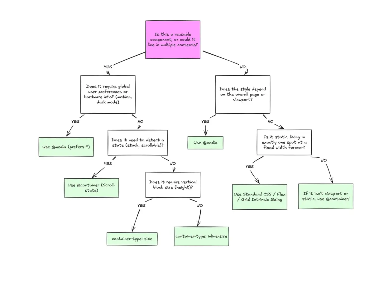
To clarify when to use which tool, modern CSS architecture cleanly divides responsive design into two distinct categories: Macro Layouts and Micro Layouts.

| Feature Attribute | Media Queries (@media) |
Container Queries (@container) |
|---|---|---|
| Reference Point | The global browser viewport window | A designated parent container element |
| Primary Scope | Macro layouts (page structure, grids, system themes) | Micro layouts (components, cards, widgets, nav menus) |
| Context Awareness | Blind to internal layout states and component nesting | Highly aware of local spatial allocations |
| CSS Unit Support | Viewport units (vw, vh, etc.) |
Container units (cqi, cqw, cqb, etc.) |
Macro Layouts (Page Level)
Media queries remain the correct tool for macro-level structural decisions. These are global truths about the document or user environment:
- Adjusting the main site grid from single-column to multi-column.
- Responding to user system preferences via
prefers-color-schemeorprefers-reduced-motion. - Detecting device input capabilities, such as
pointer: coarsefor touchscreens.
Micro Layouts (Component Level)
Container queries take over for micro-layouts—the reusable building blocks that live inside those macro structures. Elements like cards, user profile widgets, complex data tables, and inline navigation bars should not magically transform into "tablet-sized" versions just because the browser window crosses an arbitrary 768px threshold. They should adapt based on their localized spatial availability.
Official Statements & Industry Insights
Adoption metrics collected across major developer ecosystems underscore a profound hesitation to embrace container queries. Speaking at SmashingConf Amsterdam, industry leaders emphasized that while container queries represent the most requested CSS feature of the past decade, their transition into everyday production codebases has lagged significantly behind their native browser implementation timeline.
Part of this hesitation stems from the nuanced technical side effects and behavioral differences that catch developers off guard.
1. The Self-Referential Trap
Unlike media queries, which can be applied directly to any element without structural prerequisites, container queries require a strict parent-child DOM relationship. A container cannot query its own dimensions to alter its own styles. For instance, the following pattern fails because it creates an infinite logical loop:
/* DOES NOT WORK */
.card
  container-name: card;
  container-type: inline-size;


@container card (min-width: 400px)
  .card
    display: flex;
To achieve the desired effect, developers must introduce a dedicated wrapper element, querying the outer container to style its inner descendant.
2. Layout Collapse via Block-Size Queries
When querying a container’s full dimensions using container-type: size (which tracks both inline and block axes), browsers calculate container sizes independently of their children. If an explicit height or aspect-ratio is omitted, the container collapses to 0px, wiping out its contents visually. Best practices dictate defaulting to container-type: inline-size unless block-axis measurement is strictly required.
3. Custom Property Limitations
Currently, container queries cannot evaluate CSS custom properties directly (e.g., @container (min-width: var(--breakpoint-lg))). Because custom properties cascade dynamically down the DOM tree and could potentially be altered by the query itself, evaluating them within query declarations creates cyclical calculation hazards that modern CSS engines prohibit.
Practical Implementation: Fluid Typography and Flexbox Wraps
To truly appreciate the power of container queries, we must examine how they solve advanced layout challenges that previously required heavy JavaScript intervention.

Fluid Component Typography
Historically, fluid typography relied on viewport units (vw) combined with clamp() to scale font sizes relative to the screen:
.card-title
  font-size: clamp(100%, 1rem + 2vw, 24px);
While effective at the page level, moving this component into a sidebar causes the typography to scale incorrectly because it remains bound to the global viewport. Container queries introduce specialized container length units (cqi, cqw, cqb). By pairing these units with clamp(), typography becomes entirely self-contained:
.card-title
  font-size: clamp(1rem, .5rem + 3cqi, 2rem);
Now, the text scales gracefully based strictly on the width of the card’s container, ensuring visual harmony regardless of where the component is placed on the page.
Detecting Flexbox Wrapping Without JavaScript
One of the most exciting capabilities unlocked by container queries is internal state awareness. Standard media queries cannot detect when flex items wrap onto a new line because they are blind to internal layout events. Historically, developers relied on JavaScript ResizeObserver APIs to monitor element wrapping.
By nesting container queries inside flex items, we can achieve pure CSS wrap detection:
/* The flex parent container */
.flex-layout
  display: flex;
  flex-wrap: wrap;


/* Register individual flex items as containers */
.flex-item
  container-type: inline-size;
  flex: 1 1 390px;


/* Default narrow card styles */
.card
  display: flex;
  flex-direction: column;


/* Container query fires once the item expands into a full row */
@container (min-width: 600px)
  .card
    flex-direction: row;
    align-items: center;
Future Outlook: The Component-Driven Web
As the web development community continues to move away from monolithic page building and toward atomic, component-driven design systems (powered by frameworks like React, Vue, Svelte, and Web Components), our styling tools must evolve in tandem.
Container queries are not intended to render media queries obsolete. Macro-layout orchestration, global theming, and device-level environmental adaptations will continue to rely on the viewport. However, for everything living inside those macro structures, container queries provide a cleaner, more resilient, and logically sound foundation.
By dropping the habit of treating container queries as mere syntactic replacements for media queries, developers can build truly modular, portable components that adapt naturally to any environment they inhabit. The era of robust component-driven responsiveness is already here—it is simply time for our codebases to catch up.