

Executive Overview
In the modern enterprise, organizations are drowning in information. Telemetry streams, performance analytics, operational logs, and quarterly metrics are generated at a scale previously unimaginable. Yet, a peculiar paradox defines the weekly standup and the quarterly executive review: someone shares the numbers, the room nods politely in unison, and the meeting adjourns without a single definitive action, directional pivot, or policy change.
When this happens, the blame is almost invariably cast upon the data itself. Teams claim the dataset was incomplete, the granularity was insufficient, or that deeper, more complex investigations are required before any operational risk can be taken.
However, Meriem Benhabiles argues that the raw data is rarely the root of the failure. The fundamental issue is that dashboards are rarely designed to deliver insights. Instead of addressing specific operational questions, they are routinely built out of whatever metrics are easily accessible within internal toolsets. Designers assume their audience rather than studying them, and the critical question—“What specific human decision or behavioral change should happen as a result of seeing this data?”—is rarely, if ever, asked.
Data visualisation and user experience (UX) design are fundamentally trying to solve the exact same underlying problem: moving the right information to the right person in a manner that catalyzes change. While their vocabularies differ, their objective is identical. Treating these disciplines as complementary rather than isolated silos is the precise moment dashboards transition from passive data graveyards into functional, high-leverage decision-making engines.
Detailed Chronology: The Evolution of Data Communication
To understand why modern dashboards so frequently fail, one must trace the evolution of quantitative communication from statistical diagnosis to digital user interfaces.

1973: The Statistical Wake-Up Call
In 1973, statistician Francis Anscombe published a paper that fundamentally challenged how quantitative data is evaluated. Anscombe constructed four distinct datasets that were statistically identical: they shared the exact same mean, variance, correlation coefficient, and regression line. Run traditional numerical queries against any of them, and the output is indistinguishable.
However, when plotted visually, the four datasets revealed completely disparate operational truths. Anscombe’s Quartet demonstrated that visualisation exposes the structural reality that raw numbers routinely conceal.
The Shift to Communicative Design
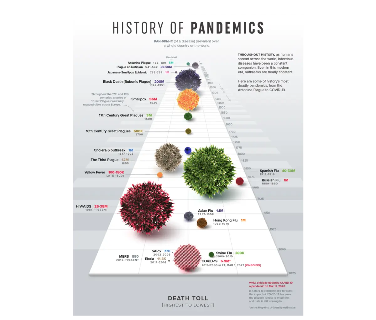
While Anscombe’s contribution was diagnostic, modern applications of data visualisation are fundamentally communicative. Consider Visual Capitalist’s historical mapping of pandemics. Instead of overwhelming the reader with a dense data table of historical casualty counts, the project maps the death tolls of major historical outbreaks using a proportional bubble layout along a single timeline.
Before the human eye processes a single numeric label, the visual system immediately comprehends the terrifying scale of the Black Death relative to every other recorded pandemic. The design does not merely plot data points; it makes the underlying story unavoidable.
The Limits of Tufte’s Data-Ink Ratio
For decades, Edward Tufte’s "data-ink ratio" has served as a foundational principle of quantitative design: every single mark on a chart should exclusively serve the data, stripping away all visual ornamentation. While this approach works brilliantly for a chart viewed in strict isolation, it breaks down in the chaotic, high-pressure environments of the enterprise workplace.

A chart in a corporate presentation is never read in a vacuum. It is analyzed by a human being under operational pressure, competing priorities, and strict time constraints. Stripping a visualization down to its absolute minimalist form often inadvertently removes the vital contextual layers a decision-maker desperately requires. Consequently, the ultimate goal of modern data UX is not blind simplicity; it is appropriate complexity.
The 80% Rule: What Happens Before the Chart
Industry data suggests that roughly 80% of the work that determines whether a dashboard succeeds happens long before a single pixel is drawn or a BI tool is opened. This upstream phase requires answering three core questions: Context, Audience, and Insight.
[Upstream UX Strategy (80%)]
       ├── 1. Context: What operational question are we answering?
       ├── 2. Audience: Who is reading, and what is their data literacy?
       🔑 3. Insight: What exact behavior or decision should change?
              │
              ▼
[Downstream Execution (20%)]
       └── Drawing charts, selecting color systems, and formatting UI.
1. Context: Moving Beyond Available Metrics
Most data initiatives start backward. Teams pull whatever metrics their analytics software naturally tracks and build visualisations around them. This is an artifact of availability bias—we anchor on the data immediately in front of us as the boundary of what is possible.
- The Vague Approach: "Show me how the product is performing." This lacks a metric, a defined population, and an implied action.
- The Context-First Approach: "Identify which features drive retention among users who signed up in Q1." This constraint immediately clarifies what data to include, what comparisons matter, and what noise to discard.
For example, when a UX team attempts to optimize a leaking e-commerce checkout flow, a data-first approach yields a massive, unwieldy dashboard tracking everything from scroll depth to device types. A context-first approach focuses on a singular, urgent question: "At which specific step of the checkout do users drop off?" By filtering out 90% of the noise, the team deploys a simple funnel chart, instantly isolates a bottleneck on the payment screen, and initiates an effective redesign.
2. Audience: Balancing Familiarity and Accountability
Designing for an audience requires evaluating two distinct variables: familiarity (data literacy) and accountability (what is at stake for the viewer).

- Familiarity: Does the user read charts instinctively, or does a complex visualization create cognitive friction? Handing a dense, multi-layered path-exploration graph to an executive is as ineffective as handing a topographic grid coordinate map to someone who navigates purely by physical landmarks.
- Accountability: A chart showing a 12% decline carries vastly different psychological and operational weight for the executive whose performance review depends on it versus the analyst who merely compiles the report.
These factors dictate the appropriate level of information density. An analyst requires a high-density, granular environment to conduct diagnostic discovery. An executive, by contrast, requires a highly synthesized, aggregated translation of that exact same data to make swift capital allocation decisions.
3. Insight: Information vs. Action
Information is what the data displays; insight is the specific decision, shift in understanding, or course correction triggered by that display.
Consider a scenario where a company experiences a sudden 15% drop in booking rates.
- An Information Dashboard simply sounds the alarm with a flat warning metric, triggering panic, executive meetings, and misplaced redesign projects.
- An Insight Dashboard maps the drop against traffic sources and concurrent marketing campaign launches, instantly revealing that core user conversion is perfectly stable while the sitewide rate was diluted by an influx of low-intent traffic from a newly scaled ad buy. The team abandons panic and pauses the underperforming campaign.
Supporting Context & Metrics: A Real-World Case Study
To observe these principles in action, consider a real-world enterprise B2B SaaS project focused on talent management and competency tracking. The platform captured massive telemetry archives, and the initial brief was characteristically vague: "We have an immense archive of user activity; now we need to present it to enterprise teams."
Transforming the Architecture
Rather than building a data graveyard of every available metric, the project team structured the user experience around operational realities:

- Rethinking Metrics: While "time spent on platform" is easy to track and commonly displayed, it is merely a proxy metric that proves presence, not proficiency. The team subordinated time-spent data, utilizing it only as a contextual overlay to support core performance metrics such as competency scores by area, certification completion rates, and historical progression trajectories.
- Audience-Specific Views: Instead of lazily serving identical charts scaled differently for individuals versus managers, the team built entirely distinct narrative frameworks.
- Individual contributors received a self-directed mirror—a granular, private space helping them pace their learning and prioritize weekly goals.
- Managers received a macro pulse check highlighting team-wide vulnerabilities, paired with a newly engineered side-by-side comparison tool that allowed them to evaluate specific team members against standardized competencies.
- Choosing the Right Layout (The Radar Chart): To solve the core design challenge—allowing an individual to evaluate competency across eight distinct areas at a glance—the team rejected standard linear bar charts in favor of a radial radar chart. By mapping multiple variables along axes radiating from a central point, an even polygon signals balanced proficiency, while a skewed shape instantly exposes critical skill gaps.
[Competency Profile Comparison]

      User 1 (Balanced Baseline)          User 2 (Skewed Specialization)
            Skill A                             Skill A
         /     |                            /     |
  Skill H      +      Skill B         Skill H      X      Skill B
     |         |         |               |         |         |
  Skill G      +      Skill C         Skill G      X      Skill C
              |     /                            |     /
            Skill D                             Skill D
   (Even polygon = Proficient)         (Skewed shape = Vulnerabilities)
Quantifiable Impact
Following the deployment of these UX-optimized dashboards:
- Weekly active engagement on the platform’s analytics features rose significantly. Managers shifted from opening the tool once a month for post-mortem reporting to reviewing data every Monday morning for proactive planning.
- Platform churn fell to historic lows. Qualitative feedback confirmed that managers were utilizing the visualisations to spot slipping performance and schedule supportive interventions before minor skill gaps evolved into critical project failures.
Official Statements and Industry Perspectives
Design and data authorities increasingly emphasize the marriage of UX principles with quantitative architecture. Industry consensus highlights that the democratization of BI tools has lowered the barrier to producing charts, but drastically raised the rate of communicative failure.
"Data is a message, and the right amount of signal depends entirely on who’s receiving it. In data visualisation, simplicity is not a fixed virtue — the right level of it is contingent on who is reading, and what they need to do."
— UX Data Design Consensus
Analysts note that organizations investing in "Data UX" routinely outperform competitors in decision velocity. By treating data presentations as interactive software applications rather than static graphic artifacts, enterprises eliminate the friction between analytical discovery and executive execution.
Future Outlook: The Next Frontier of Data UX
As we look toward the future of enterprise intelligence, several defining trends will govern the evolution of data visualisation:

- AI-Driven Contextual Adaptation: Future dashboards will dynamically adjust their information density and layout based on real-time user behavior, role permissions, and contextual urgency, moving away from rigid, one-size-fits-all reporting views.
- Prescriptive Over Descriptive Design: The industry is shifting away from retrospective reporting ("What happened?") toward prescriptive design ("What action should be taken next?"). Visual interfaces will increasingly embed actionable workflows directly inside the analytics module.
- Cross-Disciplinary Fusion: The artificial wall separating data analysts from UX designers will continue to dissolve. Organizations are actively hiring hybrid professionals fluent in both statistical modeling and interaction design.
Conclusion
Data design reaches its zenith when visual presentation is treated as an upstream architectural choice rather than a downstream formatting afterthought. Bringing structured UX thinking to data turns visualisations into active decision-making engines.
The next time you are tasked with constructing a data visualisation—whether an enterprise dashboard, an executive slide deck, or a public-facing infographic—step away from the design canvas and business intelligence tools. Focus your initial effort entirely on the human decisions behind the screen. Only then will your data stop being a passive historical log and begin driving the future.