

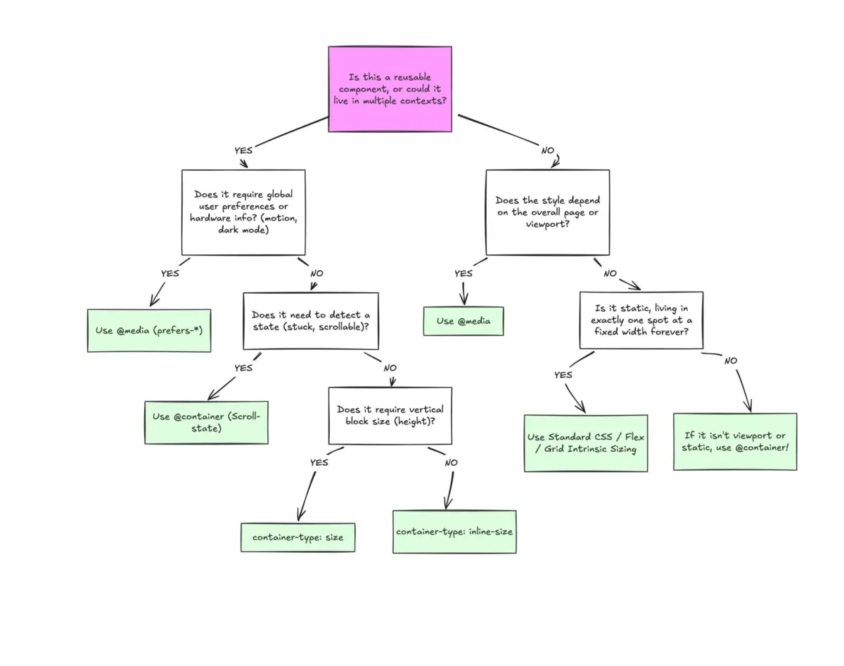
Executive Overview
Despite boasting a remarkable 94% browser support rate globally, CSS container queries remain one of the most underutilized and misunderstood frontiers in front-end development. According to recent data from the State of CSS survey, while an overwhelming 86% of developers are theoretically aware of container queries, a mere 41.4% actively implement them in production environments. This glaring adoption gap has baffled industry thought leaders, especially considering that component-driven responsiveness—the ability for isolated UI modules to adapt naturally to their outer container rather than the browser viewport—has sat atop developer wishlists for well over a decade.
The root cause of this hesitation is not technological apathy, but rather a conceptual illusion. Because container queries share a remarkably similar syntax to traditional media queries (@container versus @media), developers frequently mistake them as a mere drop-in replacement. They approach container queries with a media-query mindset, expecting them to answer the exact same structural questions about environment sizing.
They do not.
Media queries are inherently macroscopic; they look outward to the browser window, asking, "How wide is the screen right now?" Container queries are microscopic; they look inward, asking, "How much space is available for me in this specific spot, right now?"
Understanding this distinction is crucial for modern web architecture. As the web ecosystem continues to fragment across thousands of unique device dimensions, relying solely on the viewport to dictate component design results in fragile, broken layouts. By learning to harness container queries—alongside their native relative units (cqi, cqw, cqb) and advanced layout-detection tricks—developers can finally build truly autonomous, reusable components that thrive anywhere they are placed.
Detailed Chronology: The Evolution of Responsive Design and the Container Query Breakthrough
The Viewport Era and the Birth of Media Queries
To understand why container queries represent such a profound paradigm shift, we must examine the history of responsive web design. When Ethan Marcotte introduced responsive web design in 2010, the industry was fundamentally transitioning from fixed-width desktop sites to multi-device viewing. To solve this, developers were handed media queries via CSS3.
Media queries gave us the illusion that screen width alone is responsible for how applications adapt to their environment. For more than a decade, the viewport acted as the ultimate proxy for design decisions. If a screen was wider than 1024 pixels, the browser applied desktop styles; if it dropped below 768 pixels, it triggered mobile styles.
At the time, this was revolutionary. But it tied layout logic inextricably to the absolute edges of the user’s browser window.
The Component-Driven Revolution and the Architectural Mismatch
As web development evolved, our tooling shifted away from monolithic page templates toward modular, component-driven architectures (powered by frameworks like React, Vue, Svelte, and Web Components). Developers began building self-contained UI units—cards, widgets, navigation menus, and data tables—designed to be dropped anywhere within an application.
This is where the cracks in the media-query model began to widen into chasms. Consider a standard .card component. When engineered with a traditional media query:

@media (min-width: 1024px)
  .card
    display: flex;
The developer is asking the browser: How wide is the screen right now?
If the user views the application on a massive 1920px desktop monitor, the media query fires, applying a horizontal, flexbox-based layout. However, what happens when that exact .card component is placed inside a narrow, 300px-wide grid sidebar?
The media query remains completely blind to its immediate surroundings. Because the viewport is still 1920px wide, the query triggers regardless. The card is forced into a horizontal layout within a claustrophobic 300px column, causing text to cramp, elements to overflow, and UI components to completely deform.
As prominent web educator Kevin Powell famously noted during his address at SmashingConf Amsterdam:
"Media queries are dumb. Not dumb in terms of the concept, but dumb in that they don’t know very much. In fact, most people assume that they know more than they do."
The Arrival and Misapplication of Container Queries
Recognizing these limitations, the W3C and browser vendors introduced CSS Container Queries. Yet, when the feature finally shipped and achieved widespread adoption, developers met it with skepticism or outright indifference. Many shared the initial reaction: "Why do I need this when media queries already exist?"
Because the syntax looks virtually identical, developers attempted to use container queries as direct substitutes for media queries, running into immediate roadblocks—such as trying to make a container query its own parent, or encountering unexpected layout collapses when misusing block-size constraints. This friction led to a cycle of frustration, false starts, and ultimately, under-adoption.
Supporting Context & Metrics: The Fragmented Modern Web
To appreciate why container queries are no longer optional, one must look at the sheer fragmentation of modern hardware. A casual data experiment conducted across modern web traffic reveals that there are now over 2,300 unique viewport sizes actively accessing the web.
Attempting to write media queries that anticipate every permutation of screen width, folding device, tablet orientation, and window resizing behavior is an exercise in futility.
Furthermore, data from the 2025 State of CSS Survey underscores the industry’s disconnect:

- 86% of surveyed developers express full awareness of container queries.
- 94% of global users operate browsers that fully support container queries.
- Only 41.4% actively utilize container queries in their daily codebases.
This enormous gap between capability and execution highlights a critical educational hurdle. Developers are holding onto viewport-centric habits in a component-driven world. When we shift our design mindset from macro-layouts (page structures) to micro-layouts (component structures), we stop asking the viewport how our UI should look, and instead let the content and its container dictate its own destiny.
Official Statements and Industry Insights
Industry experts and standards bodies have been vocal about the architectural shift required to embrace container queries. The prevailing consensus is that container queries are not designed to replace media queries entirely, but rather to establish a clean separation of concerns between page-level layout and component-level responsiveness.
As Kevin Powell emphasized in his technical breakdowns on smart layouts:
"When we think in terms of containers and components, we’re effectively relying on the content to determine layout, not the viewport. Layout logic belongs closer to the container than the viewport in an era of heavy component reuse."
Macro-Layouts vs. Micro-Layouts
A helpful mental framework for modern CSS architecture divides responsibilities into two distinct categories:
- Macro-Layouts (Media Queries): These govern the overarching page architecture. They look outward. Use media queries for major structural page shifts, multi-column grid templates for entire views, operating system preferences (
prefers-color-scheme), and device-specific constraints like touch capabilities. - Micro-Layouts (Container Queries): These govern the internal components living inside the macro layout. They look inward. Use container queries for cards, widgets, forms, sidebars, and modular navigation elements that need to adapt seamlessly regardless of where they are rendered.
Technical Deep Dive: Practical Implementations
To truly understand the power of container queries, we must examine how they solve advanced design challenges that were previously impossible or required heavy JavaScript intervention.
1. Basic Component Adaptation
To use a container query, you must first designate a parent wrapper as a containment context using container-type.
.card-wrapper
  container-name: card;
  container-type: inline-size;


@container card (min-width: 450px)
  .card
    display: flex;
    flex-direction: row;
In this example, the .card component remains entirely decoupled from the browser window. It checks only whether its designated parent wrapper (.card-wrapper) has achieved an inline (horizontal) width of at least 450px.
2. Fluid Typography Within Components
Historically, fluid typography relied on viewport-relative units like vw (viewport width):
.card-title
  font-size: clamp(100%, 1rem + 2vw, 24px);
While effective on full-width banners, this approach fails when the component is placed into a narrow sidebar, causing the font scaling to break down. Container queries introduce specialized relative length units—such as cqi (container query inline-size)—which can be paired with the CSS clamp() function:

.card-title
  font-size: clamp(1rem, .5rem + 3cqi, 2rem);
Now, the typography scales fluidly relative to the component’s container, ensuring proportional harmony whether the card occupies a full-width grid or a cramped widget area.
3. Flexbox Wrap Detection Without JavaScript
One of the most exciting capabilities unlocked by container queries is the ability to detect internal layout states, such as flex item wrapping. Standard CSS lacks a pseudo-class like :wrapped to tell when flex items drop to a new line, historically forcing developers to deploy JavaScript ResizeObserver loops.
By combining flexbox with container queries, we can create pure CSS wrap-detection workflows:
/* The flex parent */
.flex-layout
  display: flex;
  flex-wrap: wrap;


/* Register a flex item as a container */
.flex-item
  container-type: inline-size;
  flex: 1 1 390px; /* Grow to fill space, wrap when below 390px */


/* Default narrow/stacked card styles */
.card
  display: flex;
  flex-direction: column;
  background: #f4f4f4;


/* Fires automatically when the item expands after wrapping into open space */
@container (min-width: 600px)
  .card
    flex-direction: row;
    align-items: center;
    background: #e2f0d9;
Pitfalls, Side Effects, and Caveats
Despite their power, container queries introduce specific architectural gotchas that developers must navigate:
- Self-Querying is Prohibited: A container cannot query its own dimensions to style itself. Doing so would create an infinite calculation loop. You must always establish a wrapper element as the container, and target its children within the
@containerblock. - Layout Collapse with
sizeContainment: If you declarecontainer-type: size(which evaluates both inline and block dimensions), the browser calculates dimensions without inspecting the children. If no explicit height, min-height, or aspect-ratio is provided, the container collapses to0px. Whenever possible, default tocontainer-type: inline-size. - Custom Properties Limitations: Currently, container queries cannot evaluate custom CSS properties directly (e.g.,
@container (min-width: var(--breakpoint-lg))). This restriction prevents circular dependency issues where a query modifying a custom property could trigger infinite evaluation loops.
Future Outlook
The stagnation of container query adoption is rapidly reaching a tipping point. As design systems grow increasingly complex and multi-platform applications become the industry standard, the limitations of viewport-locked media queries are becoming impossible to ignore.
Looking forward, the evolution of CSS containment—including the maturation of container style queries and advanced state-query proposals—promises an even more granular, component-first styling paradigm. Developers who overcome the initial learning curve and stop treating container queries as mere clones of media queries will unlock unprecedented levels of modularity, resilience, and maintainability in their user interfaces.
The tools are fully supported, the documentation is mature, and the architecture is proven. It is time for the front-end community to close the 41% adoption gap and let our components breathe.