

Executive Overview
In the high-stakes, hyper-competitive digital economy of the mid-2020s, the cost of a friction-heavy interface is no longer measured merely in "lost clicks" or fleeting visitor frustrations. Today, poor user experience (UX) drains millions of dollars in wasted engineering spend, erodes customer lifetime value, and severely depresses enterprise valuation. As digital products saturate nearly every market sector, business leaders are undergoing a profound paradigm shift: design is no longer viewed as a cosmetic afterthought or a purely "visual preference." Instead, UX has emerged as the primary engine of corporate survival, revenue retention, and long-term growth.
This realization is anchored not in subjective creative intuition, but in hard, quantifiable data. Modern user experience design is a rigorous discipline rooted in user research, behavioral psychology, and high-volume analytics. To bridge the historical chasm between creative design studios and the corporate boardroom, industry veterans like veteran UX designer Carrie Webster advocate for the power of cold facts. Statistics do not merely advocate for the end user; they prove that exceptional UX is a non-negotiable prerequisite for a healthy bottom line. By examining ten data-backed pillars of user experience, organizations can transition from guesswork to strategic, revenue-generating optimization.
Detailed Chronology: The Evolution of UX from "Pretty Pixels" to Boardroom Strategy
To understand how user experience earned its seat at the executive table, one must trace its evolution from the early days of desktop software to the modern multi-device, AI-integrated landscape.

- The Early Web and Desktop Era (Late 1990s – Early 2000s): During the formative years of commercial internet adoption, digital interfaces were primarily treated as digital brochures. "Webmasters" and early graphic designers focused heavily on visual novelty, layouts, and typography. Usability was largely an afterthought, constrained by slow dial-up speeds and limited browser capabilities.
- The Mobile-First Disruption (2010s): The proliferation of smartphones fundamentally compressed digital interactions. Screen real estate shrank dramatically, and context became paramount. Users demanded instant utility on the go. During this era, design systems began to professionalize, and early metrics surrounding mobile bounce rates, page load speeds, and touch-target friction began catching the attention of agile product teams.
- The Data-Driven Maturation (Late 2010s – 2020s): As digital transformation accelerated across banking, healthcare, retail, and enterprise software, companies accumulated massive datasets regarding user behavior. Usability research matured into hard financial metrics. Industry benchmarks from institutions like the IBM Systems Institute, McKinsey, and the Nielsen Norman Group began mapping direct correlations between micro-interactions (such as a 0.1-second speed increase) and multi-million-dollar revenue swings.
- The Modern AI and Hyper-Personalization Era (Present): Today, user experience is no longer a static layout of screens; it is a dynamic, living guide powered by artificial intelligence and real-time behavioral analytics. Yet, despite technological leaps, the fundamental tenets of human psychology—such as split-second visual judgments and cognitive load limits—remain steadfastly unchanged.
Supporting Context & Metrics: Ten Pillars of UX ROI
To effectively communicate the value of UX to stakeholders, design leaders rely on ten empirical, data-backed truths that govern digital consumer behavior.
1. Fixing Issues in the Design Phase is 100 Times Cheaper
One of the most compelling financial arguments for upstream design is the classic 1:100 rule. Extensive studies from the IBM Systems Institute and Segue Technologies demonstrate that fixing a software defect or usability flaw after a product has been coded and launched can be up to 100 times more expensive than addressing it during the initial wireframing and prototyping phase.
Think of early-stage UX work as "engineering insurance." By the time developers begin writing code, core user flows should be thoroughly validated. Discovering a fundamental navigation flaw post-launch incurs massive technical debt, wasted developer hours, and severe opportunity costs as users abandon a broken product.

2. Performance Directly Dictates Conversion Rates
In modern digital architecture, performance is the bedrock of user experience. A visually stunning interface is utterly worthless if the user bounces before the browser finishes rendering. Statistics show that 47% of users expect a web page to load in two seconds or less.
Missing this threshold is financially catastrophic: a single-second delay can depress conversion rates by 20% and user satisfaction by 16%. Conversely, micro-optimizations yield massive rewards. Shaving just 0.1 seconds off a mobile retail site can lift conversion rates by 8.4%, while improving Largest Contentful Paint (LCP) benchmarks drives direct, measurable sales growth.
3. The 50-Millisecond Visual Verdict
First impressions happen in the blink of an eye—literally. Academic research indicates that users form a definitive opinion about a website or application’s visual appeal in approximately 50 milliseconds (0.05 seconds). This split-second gut reaction is an evolutionary survival mechanism that dictates whether a user stays to evaluate a value proposition or bounces immediately. Studies reveal that 94% of these first impressions are strictly design-related. If an interface feels dated or unprofessional, users subconsciously project that lack of quality onto the underlying brand and service.

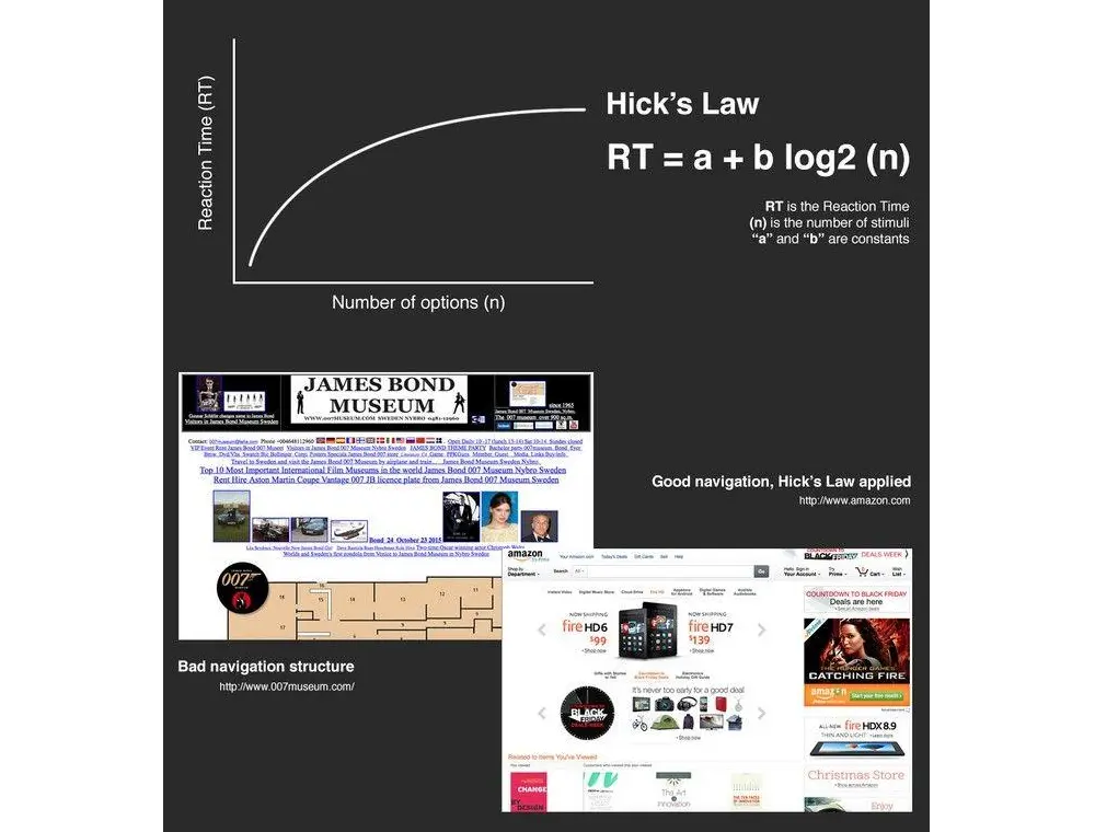
4. Hick’s Law: The Financial Cost of Cognitive Overwhelm
Corporate stakeholders frequently operate under the flawed assumption that offering "more options" equals "more value." Human psychology proves precisely the opposite. Hick’s Law dictates that the time and cognitive effort required to make a decision increase logarithmically with the number of choices available. Every unnecessary menu item, redundant form field, or cluttered sidebar acts as a tax on the user’s brain. Simplifying choices through progressive disclosure and ruthless minimalism is a proven path to higher conversion rates.
5. White Space as a Cognitive Relief Valve
Often mischaracterized by non-designers as "wasted white space," strategic negative space is a powerful tool for directing user focus. Research from usability labs indicates that proper deployment of white space can increase a user’s content comprehension by up to 20%. In an era where human attention spans hover around 8 seconds, giving the eye a place to rest reduces cognitive load and naturally guides users toward primary conversion actions, such as "Buy Now" or "Start Free Trial."
6. The Goal Gradient Effect and "Fake" Progress
One of the most fascinating psychological hacks in product design is the Goal Gradient Effect, which proves that users become increasingly motivated to complete a task the closer they believe they are to the finish line. In classic consumer studies, loyalty cards pre-stuffed with two "bonus" stamps achieved completion rates vastly superior to blank cards requiring the exact same total purchases. In digital onboarding, initializing a progress bar at 15% rather than 0% capitalizes on this phenomenon, driving completion spikes of over 40%.

7. Typography, Legibility, and Readability
Cramming dense walls of text "above the fold" is a frequent mistake driven by marketing anxiety. Data proves that proper typography—specifically optimized line height (leading), proportional paragraph width, and font weights—can boost reading speed and content comprehension by up to 20%. When typography is cramped or difficult to decipher, the user’s perceived effort spikes, directly driving up bounce rates. Legibility is, at its core, a conversion tool.
8. The 20% Rule: Designing for Scanners, Not Readers
Eye-tracking studies conducted by the Nielsen Norman Group confirm a hard truth about digital consumption: users do not read web pages word-for-word; they scan them. On a typical page, users actively absorb only 20% to 28% of the text. Because modern users scan in distinct F-patterns or spotted layouts, designing for linear reading is a tactical failure. High-converting pages utilize bold subheadings, bullet points, and scannable visual hierarchy.
9. Why Five Users is the Magic Number in Testing
Many organizations waste six-figure budgets on massive, lumbering user studies involving dozens of participants, only to drown in redundant qualitative data. Usability science demonstrates that usability testing with just 5 distinct users typically uncovers up to 85% of critical interface problems. Beyond the fifth user, teams hit a sharp point of diminishing returns. Small, agile, and frequent testing cycles yield far superior products at a fraction of the cost.

10. The 9,900% ROI of Strategic UX Investment
Perhaps the most staggering statistic in modern business metrics is the documented financial return of user experience design. Industry benchmarks indicate that, on average, every $1 invested in UX returns $100—representing an astounding 9,900% ROI. This windfall is driven by compounded efficiencies: dramatically higher conversion rates (up to 400% in optimized environments), minimized customer support overhead, and drastically reduced engineering rework.
Official Statements and Industry Insights
Industry leaders and global research institutions have consistently validated the commercial weight of user-centric design philosophies:
- The McKinsey Design Index: Comprehensive research published by McKinsey & Company tracking design practices across multiple industries revealed that top-tier design-driven companies achieve 32% higher revenue growth and 56% higher total returns to shareholders (TRS) compared to their industry peers.
- The Experience Disparity Gap: According to insights from Bain & Company, a staggering 80% of companies believe they deliver a "superior customer experience," yet only 8% of customers actually agree. This massive disconnect represents an immense vulnerability—and a golden market opportunity—for organizations willing to align their digital products with empirical user data.
- Carrie Webster, Veteran UX Designer: Summarizing the paradigm shift in corporate values, Webster notes: "UX design is no longer a team you hire to ‘make things look nice.’ It is the research-driven, data-backed discipline that ensures your digital product isn’t just a cost centre, but a revenue-generating machine."
Future Outlook: The Role of AI in the Next Generation of UX
As the digital landscape advances into the late 2020s, artificial intelligence has fundamentally altered how products are built, tested, and personalized. AI-driven analytics, automated accessibility checkers, and predictive user-flow modeling have accelerated the resolution of common friction points.

However, emerging technology has not rendered human psychology obsolete. While AI can dynamically tailor interfaces and predict intent at scale, the foundational constraints of human biology remain absolute: our brains still make visceral aesthetic judgments in 50 milliseconds, our attention spans still crave the cognitive relief of white space, and our decision-making faculties remain governed by Hick’s Law.
Looking forward, the organizations that dominate their respective markets will be those that successfully marry cutting-edge AI automation with timeless, data-backed user experience principles. The era of subjective guesswork in design is officially over. The data is clear, the psychological frameworks are proven, and the financial returns are undeniable. The only remaining question for modern enterprises is whether they will let empirical insights guide their digital evolution, or watch their competitors do it first.