

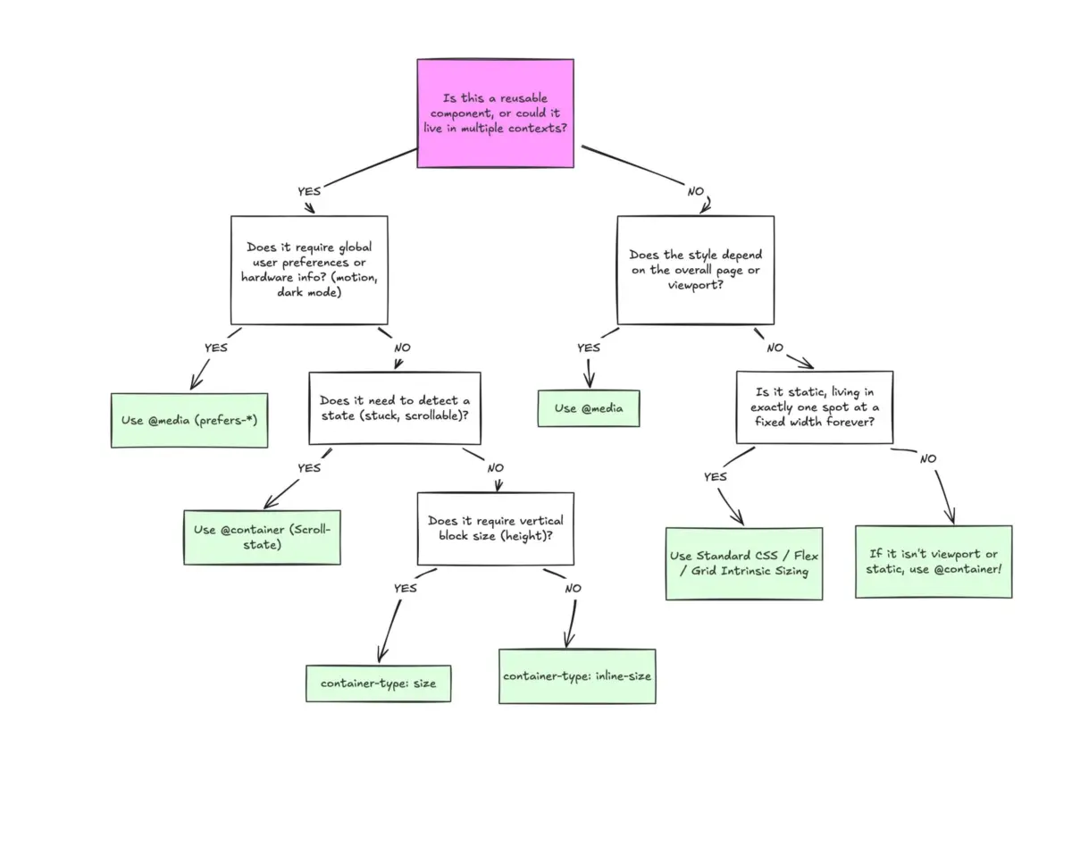
Despite achieving robust, cross-browser support sitting comfortably at roughly 94%, CSS container queries remain a perplexing anomaly in modern web development. While industry-wide awareness is extraordinarily high—with developer surveys indicating that upwards of 86% of frontend practitioners recognize the feature—actual production adoption hovers at a meager 41%.
To understand this disconnect is to confront a deeper habit within the engineering community: the tendency to map new, paradigm-shifting APIs onto old, familiar mental models. When container queries first landed, many developers asked a fundamental, reductive question: "Why do we need this when media queries already exist?"
The short answer is that they do not serve the same purpose. Media queries look outward at the macro-level viewport, treating the browser window as the ultimate source of truth. Container queries look inward, empowering components to adapt dynamically to the micro-level environments in which they are placed. Bridging this conceptual gap is essential for building resilient, highly reusable design systems for the modern web.
Executive Overview: The Paradigm Shift from Viewport to Container
For over two decades, responsive web design has been inextricably bound to the viewport. Media queries gave developers the ability to sculpt layouts based on screen width, fostering an era where entire page structures fluidly transitioned from multi-column desktop views to stacked mobile layouts.
However, the modern web has evolved past monolithic page designs. We live in an era of component-driven architecture, where discrete UI elements—cards, widgets, navigation bars, and form controls—are tossed into wildly unpredictable contexts. A .card component might sit happily inside a sprawling 12-column grid on a 1920px desktop display, or it might be squeezed into a cramped 300px sidebar.
When governed by a traditional media query, that card has no idea how much physical space it occupies. It only knows how wide the browser window is. If a media query dictates that the card should shift to a horizontal layout at min-width: 1024px, that transformation will fire on a massive desktop monitor even if the card itself is choked for room inside a narrow sidebar. The result? Broken layouts, text overflows, and forced compromises.
Container queries dismantle this limitation. By allowing components to query their immediate parent container rather than the global viewport, they shift layout logic from the macro page level down to the micro component level. It is no longer about asking, "How wide is the screen right now?" Instead, it is about asking, "How much space is available for me in this specific spot, right now?"

Detailed Chronology: From Feature Request to Underutilized API
The journey toward container queries highlights a fascinating timeline of developer frustration, community advocacy, and eventual specification standardization.
1. The Era of the CSS Wishlist (2018–2019)
Long before browsers ever shipped container queries, the concept sat at the absolute pinnacle of community wishlist items, prominently featured on community roundups like CSS-Tricks. Developers building modular design systems in frameworks like React, Vue, and Angular frequently hit a brick wall: CSS lacked a way to style a component based on its container’s dimensions. Workarounds relied heavily on JavaScript-based ResizeObserver instances or convoluted CSS hacks that tracked class changes.
2. Standardisation and Release (2021–2023)
As the W3C CSS Containment Module Level 3 specification matured, browser vendors began implementing container size and style queries. To the surprise of many architects, the feature rolled out with sweeping stability across Chrome, Safari, and Firefox. Yet, because the syntax heavily mimics @media, developers instinctively treated @container as a drop-in replacement for @media, leading to early implementation errors, layout collapses, and lingering skepticism.
3. The Adoption Crisis (2025–2026)
Speaking at SmashingConf Amsterdam, educator and developer advocate Kevin Powell bluntly characterized container query adoption as "terrible." Despite broad industry awareness, the inertia of legacy habits kept teams reaching for media queries out of sheer muscle memory. Surveys from the State of CSS underscored a persistent gap: while developers knew the tool existed, fewer than half integrated it into their daily workflows.
Supporting Context & Metrics: Navigating Fragmented Realities
To appreciate why media queries are increasingly inadequate for modern component engineering, one must look at the sheer fragmentation of user hardware.
According to data compiled by viewport analytics projects, the modern web features over 2,300 unique viewport sizes. Designing brittle, hardcoded breakpoints (e.g., 768px for tablets, 1024px for laptops) is a losing battle against an infinite array of screen dimensions, foldable devices, split-screen browser windows, and resizable desktop panels.
Consider how this friction manifests in code. A typical media query looks outward:

@media (min-width: 1024px)
  .card
    display: flex;
This code is agnostic to the component’s reality. Contrast this with a true container query implementation:
/* Step 1: Establish the container context */
.card-wrapper
  container-name: card;
  container-type: inline-size;


/* Step 2: Query the container's inline size */
@container card (min-width: 450px)
  .card
    display: flex;
    flex-direction: row;
In this setup, the .card component is entirely self-sufficient. It cares not for the device viewport; it cares only whether its parent wrapper provides at least 450px of horizontal space.
Official Statements and Industry Insights: The "Macro" vs. "Micro" Divide
Industry experts emphasize that container queries are not meant to entirely eradicate media queries. Rather, developers must understand the clear division of labor between the two tools.
"Media queries are dumb. Not dumb in terms of the concept, but dumb in that they don’t know very much. In fact, most people assume that they know more than they do."
— Kevin Powell, Frontend Educator and Speaker
To successfully integrate both tools, architects often categorize layouts into two distinct domains:
- Macro Layouts (Media Queries): These dictate the overall page structure, global headers, footers, major grid templates, system-level preferences (
prefers-color-scheme), and device capabilities (such as touch interactions). They look outward at the viewport. - Micro Layouts (Container Queries): These govern everything living inside the macro layout—cards, widgets, forms, and navigation menus. They look inward at available component space.
This separation of concerns ensures that components remain truly modular, portable, and responsive to any environment without requiring bespoke viewport overrides.
Practical Applications Beyond Basic Dimensions
Container queries extend far beyond simple structural wrapping. Two advanced use cases illustrate their true power in modern engineering:

1. Fluid Typography Inside Components
Traditionally, fluid typography relied on viewport-based units (vw, vh) paired with clamp():
.card-title
  font-size: clamp(100%, 1rem + 2vw, 24px);
When a component containing this title is moved into a cramped sidebar, the viewport-based unit can cause the text to scale improperly. By leveraging container query length units (cqi, cqw, cqb) alongside clamp(), typography scales relative to the component’s container:
.card-title
  font-size: clamp(1rem, .5rem + 3cqi, 2rem);
2. Flexbox Wrap Detection Without JavaScript
Detecting when a flex item wraps onto a new line has historically required JavaScript ResizeObserver logic. However, by nesting container queries inside flex items, developers can trigger style adjustments natively when wrapping occurs:
.flex-layout
  display: flex;
  flex-wrap: wrap;


.flex-item
  container-type: inline-size;
  flex: 1 1 390px;


@container (min-width: 600px)
  .card
    flex-direction: row;
    align-items: center;
Navigating Side Effects and Limitations
Like any powerful CSS feature, container queries come with specific constraints that developers must navigate:
- Self-Referencing Prohibitions: A container cannot query itself. Attempting to declare a container and apply a container query to that exact same element creates an infinite calculation loop. A distinct parent wrapper is always required.
- Layout Collapses with Size Queries: Querying a container’s full
size(both inline and block dimensions) without an explicit height can cause the container to collapse to0px. Best practice dictates defaulting toinline-sizeunless block-axis querying is strictly necessary. - Custom Property Restrictions: At present, container queries cannot directly evaluate CSS custom properties (e.g.,
min-width: var(--breakpoint-lg)), due to circular dependency risks within the DOM cascading tree.
Future Outlook: Embracing Component-Driven Design
The slow adoption of CSS container queries is ultimately a symptom of a transitional phase in web development. Developers spent over a decade perfecting viewport-centric mental models, and unlearning those habits takes deliberate effort.
Yet, as design systems grow increasingly complex and component reusability becomes the gold standard of frontend engineering, container queries offer an indispensable upgrade to our styling toolkit. By letting content dictate layout rather than forcing elements to bend to the arbitrary geometry of the browser window, container queries pave the way for a more resilient, adaptable, and genuinely responsive web.