

Executive Overview
In the realm of digital product development, nomenclature is rarely viewed as a foundational engineering or design pillar. Yet, "naming things" remains universally acknowledged as one of the most notoriously difficult challenges in software and interface architecture. The language we choose does more than merely label an artifact; it fundamentally shapes how cross-functional teams conceptualize problems, structure codebases, and converse with users. When vocabulary fractures—resulting in designers, developers, product managers, and users speaking entirely different lexical dialects—the downstream consequences include ballooning technical debt, poor feature discoverability, and systemic user confusion.
This comprehensive guide investigates the mechanics of effective digital nomenclature. By surveying industry-leading methodologies, open-source repositories, and design system case studies from organizations like Intuit and Vodafone, we explore practical frameworks for naming everything from basic HTML classes and color palettes to complex design token taxonomies and user-facing product features. Ultimately, establishing a unified vocabulary bridges the gap between conceptual design and executable code, streamlining collaboration across the entire product lifecycle.

Detailed Chronology: The Evolution of Naming Systems in Modern UI/UX
To understand how modern design systems approach the taxonomy of user interfaces, it is helpful to trace the evolution of digital nomenclature from the early days of unstructured web development to today’s token-driven ecosystems.
Phase 1: The Wild West of Unstructured Styling (Late 1990s – Late 2000s)
In the formative years of the web, naming conventions were largely ad-hoc. Developers relied heavily on visual descriptions (e.g., .blue-box, .large-header) or arbitrary shorthands. This approach frequently caused critical maintenance bottlenecks. As applications scaled, a style update often required renaming classes across thousands of HTML and CSS files because names were too tightly coupled to transient visual properties rather than semantic intent.

Phase 2: Methodologies and Semantic Structure (2010s)
Recognizing the unsustainable nature of ad-hoc naming, the industry developed structured methodologies such as BEM (Block, Element, Modifier), SMACSS, and OOCSS. These frameworks introduced strict rules for HTML and CSS classes, emphasizing modularity and encapsulation. Concurrently, UI design tools like Sketch and Figma began introducing artboards and layers. However, designers often carried over messy organizational habits—leaving layers labeled as "Rectangle 40Copy" or "Group 12"—which created steep learning curves for developers attempting to translate visual files into production-ready components.
Phase 3: The Rise of Design Systems and Tokens (Late 2010s – Present)
As multi-platform applications and multi-brand organizations expanded, the scale of digital products outgrew traditional CSS methodologies. The industry shifted toward design tokens—abstracted entities representing core design decisions such as colors, typography scales, and spacing values. Managing these tokens required robust taxonomies capable of supporting multiple themes, brands, and viewports simultaneously. Today, sophisticated naming architectures like those pioneered by Intuit, Vodafone, and enterprise design systems have transformed nomenclature from a casual afterthought into a precise, scalable science.

Supporting Context & Metrics: Navigating the Lexical Divide
The friction caused by poor nomenclature is not merely an aesthetic annoyance; it is a quantifiable drag on velocity and user adoption.
The Cost of Lexical Misalignment
In many organizations, product development stalls because stakeholders operate in isolated semantic silos:

- The Designer’s Dialect: Focuses on layout hierarchy, spatial relationships, and visual states (e.g., "Primary Button Hover").
- The Developer’s Dialect: Focuses on component encapsulation, state management, and DOM structure (e.g.,
<Button variant="primary" state="interactive" />). - The Product Manager’s Dialect: Focuses on user outcomes, business value, and feature metrics (e.g., "Checkout Conversion Prompt").
- The User’s Dialect: Focuses on everyday mental models and immediate tasks (e.g., "Pay Now").
When these four dialects fail to intersect, teams waste countless hours arguing over what to call a simple component or feature. Furthermore, research into feature adoption indicates that low usage rates are frequently driven not by a lack of utility, but by poor discoverability stemming from obscure, internal jargon. If users cannot immediately understand what a feature does based on its title, engagement metrics drop precipitously.
Curated Resources for Naming HTML Classes and Code
When struggling to name functions, classes, or properties, looking beyond standard technical vocabulary can spark creative solutions.

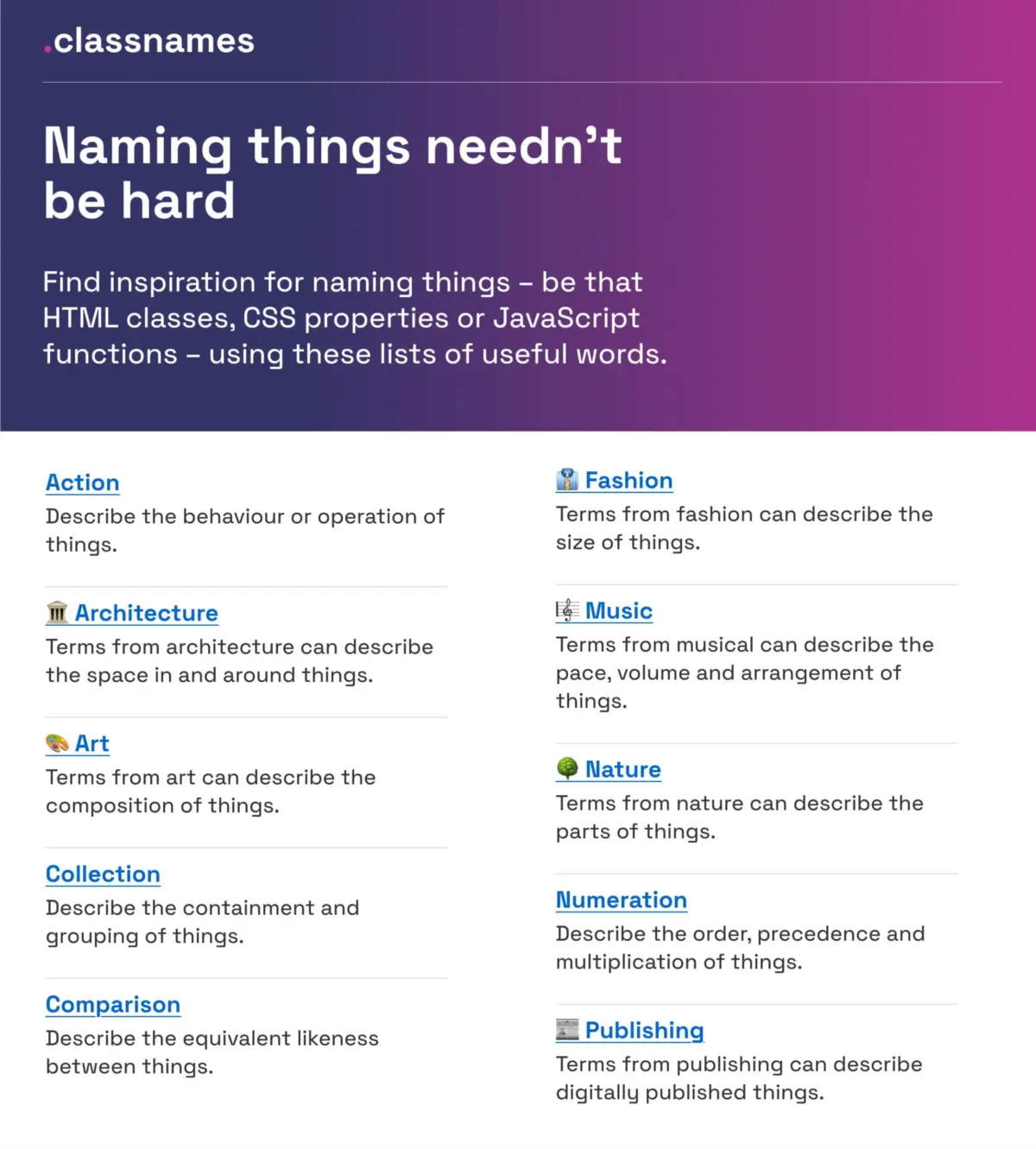
- Classnames (
classnames.paulrobertlloyd.com): A curated resource providing thematically grouped lists of words. It extends far beyond traditional code terminology, offering evocative terms drawn from nature, art, theater, music, architecture, fashion, and publishing to help developers think outside the box. - Color Names Repositories: Maintaining consistent color taxonomies is notoriously difficult. David Aerne’s comprehensive GitHub repository (
meodai/color-names) compiles over 30,000 unique color names sourced from community contributions and varied references. Paired with intuitive interfaces like Color Parrot (parrot.color.pizza), teams can easily assign memorable, human-readable names to hex codes rather than relying on arbitrary numbers.
Official Guidelines & Best Practices for UI Architecture
Industry leaders have established rigorous guidelines to standardize naming across layers, components, design tokens, and user-facing features. Below is a synthesis of best practices derived from prominent design system audits.
1. Layers, Groups, and Components
According to design system expert Javier Cuello, an effective layer or component name must possess a logical structure: it should be short, deeply meaningful, universally understood across the team, and entirely detached from transient visual properties.
- Do: Name components based on their functional role (e.g.,
Navigation Bar,Accordion Group). - Don’t: Name components after their exact styling or position (e.g.,
Blue Box Top Right).
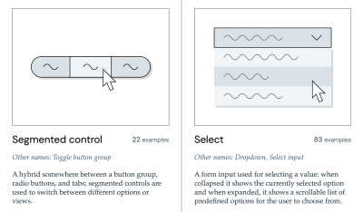
For a comprehensive view of real-world component naming conventions, Iain Bean’s Component Gallery (component.gallery/components/) inventories over 50 UI components from production design systems, detailing the various aliases each interface pattern goes by. For a quick visual reference, Name That UI (namethatui.com) serves as an indispensable visual dictionary.
2. Design Token Taxonomies
Scaling design tokens across complex, multi-brand organizations requires a structured taxonomy that maps out relationships from raw primitives to page-level implementations.

- Intuit’s Token System: Facing the challenge of unifying disparate brands like Mailchimp, QuickBooks, TurboTax, and Mint, Intuit engineered a flexible token taxonomy that transcends individual brand themes, establishing a resilient foundational layer for all products.
- Vodafone UK’s Variables Taxonomy Map: Available via the Figma Community, Vodafone’s mapping framework illustrates a four-tier collection structure—moving seamlessly from brand primitives and semantics to component and page-level variables. Built upon Nathan Curtis’s foundational work on token naming, this structure ensures that any engineer or designer can discern a token’s origin, purpose, and application simply by reading its identifier.
- Design Token Naming Guide (
namedesigntokens.guide): Created by Romina Kavcic, this interactive tool and its accompanying inventory spreadsheet provide a step-by-step framework for configuring token structures across components, categories, states, and roles without losing track of complex overrides.
3. Naming New Features for Discoverability
Erin Gannon’s practical guide on feature naming highlights that feature adoption is a multi-step journey: a capability must first be discovered, then understood, tried, learned, and finally integrated into existing workflows.
- Tap Into User Language: Good feature names are driven by user problems and needs. Rather than inventing clever internal codenames, product teams should ask users to describe a task or outcome in their own words and incorporate that exact vocabulary into the interface.
- Signal the Job-to-Be-Done: The name should explicitly communicate the value or outcome a user can expect to achieve, eliminating cognitive friction during discovery.
4. Naming Products and Services
When establishing a brand-new product or service identity, open-source repositories like Onym (guide.onym.co) offer structured methodologies, brainstorming prompts, vetting exercises, and etymological guides to help teams navigate the complex landscape of naming external offerings.

Future Outlook: The Horizon of Automated and Semantic Nomenclature
As artificial intelligence and automated design-to-code pipelines mature, the future of nomenclature is poised for a paradigm shift. Several emerging trends will likely define the next decade of UI architecture:
- AI-Assisted Semantic Validation: Future design system tooling will integrate intelligent linters that analyze component usage and automatically flag semantic drift—alerting teams when a newly introduced class name or token violates established organizational taxonomies.
- Dynamic Multi-Dialect Mapping: Advanced design tokens will increasingly support automated translation layers, allowing designers, developers, and localized user interfaces to seamlessly map internal variables to culturally adapted terminology without breaking programmatic integrity.
- Living Glossaries as Core Infrastructure: Organizations will treat their design system glossaries not as static documentation pages, but as dynamic, executable code dependencies that automatically sync variable names across Figma libraries, React components, and backend schemas.
By treating nomenclature as a critical engineering discipline rather than an afterthought, digital product teams can eliminate costly ambiguities, accelerate feature adoption, and build resilient, scalable systems that stand the test of time.