

Executive Overview
In the realm of digital product development, an old adage persists: "There are only two hard things in Computer Science: cache invalidation and naming things." While originally coined by Phil Karlton in the context of software engineering, this sentiment resonates just as profoundly in user interface (UI) design, UX writing, architecture, and design systems management.
Language is not merely a tool for labeling; it is the cognitive framework through which multidisciplinary teams conceptualize, build, and scale digital products. When designers speak one dialect (relying on spatial or visual metaphors), developers speak another (rooted in structural logic and component states), and product managers speak a third (driven by business metrics and user stories), friction is inevitable. Teams frequently find themselves trapped in circular debates, wasting valuable sprint cycles arguing over whether a component should be called a "flyout," a "dropdown," a "popover," or a "menu."
The stakes of nomenclature go far beyond internal developer ergonomics. Poor naming conventions directly impact product metrics. When a newly launched feature suffers from abysmal user adoption, root-cause analyses often reveal a surprising culprit: discoverability issues stemming from an ambiguous, internal-facing feature name that fails to align with the user’s mental model.

This comprehensive guide explores the multifaceted challenges of naming across the digital product lifecycle. Drawing on industry-leading methodologies, open-source resources, and enterprise case studies from organizations like Intuit and Vodafone UK, we examine actionable strategies for naming everything from raw color values and UI components to scalable design tokens and consumer-facing features.
Detailed Chronology of the Naming Crisis in Digital Design
To understand how modern design and engineering organizations arrived at today’s complex nomenclature landscape, it is helpful to trace the evolution of digital crafting over the past two decades.
Era 1: The Wild West of Web Design (Late 1990s – Late 2000s)
In the early days of the web, naming was strictly an ad-hoc affair. CSS classes were coined on the fly based on immediate visual appearance rather than semantic meaning (.red-text, .big-box, .float-left). This approach worked for static brochure websites, but as web applications grew in complexity, it resulted in brittle codebases where changing a design requirement necessitated rewriting entire stylesheets.

Era 2: Methodologies and Modular Systems (2010s)
As front-end engineering matured, the industry recognized the need for strict naming methodologies. Frameworks and naming conventions emerged to bring order to chaos:
- BEM (Block, Element, Modifier): Introduced a structured syntax (
block__element--modifier) that reduced specificity wars and improved CSS scalability. - Atomic Design: Promoted by Brad Frost, this methodology categorized UI parts into atoms, molecules, organisms, templates, and pages, mirroring the chemical composition of the physical world.
Despite these breakthroughs, a persistent disconnect remained between design tools (like Photoshop and early Sketch) and codebases. Designers named layers Rectangle 41 and Group Copy 2, while developers translated those arbitrary vectors into semantic components like <PrimaryButton />. The handoff was rife with translation errors and lost intent.
Era 3: The Design Systems Era and Tokenization (Present)
Today, modern product development is anchored by comprehensive design systems—centralized repositories of reusable UI components, patterns, and design tokens. As multi-brand, multi-themed, and multi-platform applications become the norm, the complexity of naming has scaled exponentially. Organizations are no longer naming isolated web pages; they are architecting unified, cross-functional taxonomies that bridge design files, code repositories, and business analytics.

Supporting Context & Metrics: The Anatomy of an Effective Name
What separates a disastrous naming convention from a scalable, intuitive taxonomy? According to design system experts like Javier Cuello, an effective name adheres to several non-negotiable criteria: it must possess a logical structure, remain concise, carry rich semantic meaning, be universally understood across teams, and—crucially—remain entirely independent of transient visual properties.
The Dangers of Generic vs. Specific Naming
When establishing a vocabulary for code classes, variables, or design tokens, practitioners routinely fall into two distinct traps:
- Too Generic: Names like
.item,.box, or--spacing-smlack descriptive context. When a system scales to hundreds of components, generic names invite naming collisions and cognitive overload, forcing developers to constantly inspect code to understand a variable’s purpose. - Too Specific: Conversely, names tied to immediate visual traits—such as
--bright-neon-blue-button-border—shatter the moment a brand refresh occurs. If the primary action color shifts from blue to emerald green, a visually-anchored name becomes instantly obsolete, requiring exhaustive refactoring.
Sourcing Inspiration: Thinking Outside the Box
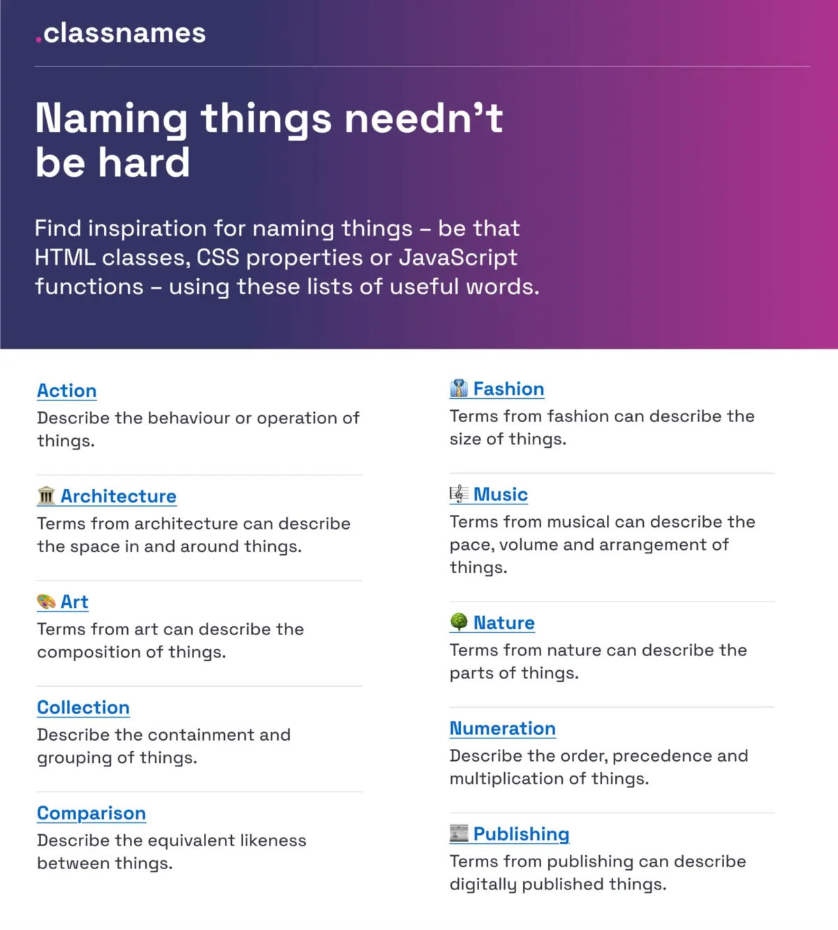
When struggling to establish a baseline vocabulary for classes, CSS properties, or functional states, teams can leverage innovative open-source resources like Paul Robert Lloyd’s Classnames. This repository breaks out of standard developer jargon by providing thematically grouped lists of words categorized by behavior, likeness, order, grouping, and association. It introduces evocative terms drawn from nature, architecture, fashion, theater, and publishing, helping engineering teams formulate semantic, memorable class names that avoid generic numerical suffixes.

Official Case Studies & Methodologies
Real-world implementations from leading technology enterprises offer a blueprint for solving enterprise-grade naming challenges.
1. Scaling Design Token Taxonomies: The Intuit Model
Managing a multi-product ecosystem that includes household names like Mailchimp, QuickBooks, TurboTax, and Mint presents an extraordinary design challenge. The parent company, Intuit, faced a critical bottleneck: their legacy design token system was too brand-centric and rigid to support cross-platform product expansion.
Nate Baldwin documented Intuit’s architectural overhaul in a comprehensive case study. The team evaluated the core pain points of their legacy taxonomy, defining rigorous criteria for a scalable system. Their new framework successfully decoupled core brand themes from underlying functional tokens, establishing a flexible taxonomy that serves as a foundational engine across diverse financial and marketing software ecosystems.

2. Multi-Brand Orchestration: Vodafone UK’s Variables Taxonomy Map
Taking token architecture a step further, the Vodafone UK Design System team released their Variables Taxonomy Map via the Figma Community. Built upon Nathan Curtis’s foundational research on design token architecture, Vodafone’s map illustrates how to orchestrate a complex, multi-brand and multi-themed design system.
The framework systematically connects four essential layers:
- Brand & Primitive Tokens: Raw values (colors, spacing scales, typography scales).
- Semantic Tokens: Context-driven variables that define purpose (e.g.,
--color-background-interactive-hover). - Component Tokens: Specific attributes tied directly to UI building blocks.
- Page & Contextual Tokens: Layout-specific adaptations.
This interconnected approach ensures that any team member can instantly trace a variable back to its origin and understand precisely where and why it is deployed, simply by reading its name.
3. Decoding UI Components: The Component Gallery
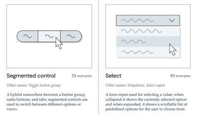
When designing or coding standard interface patterns, reinventing the wheel—or worse, inventing a novel name for a standard component—creates unnecessary friction. Iain Bean addressed this by curating the Component Gallery, an exhaustive index capturing real-world design systems.
The gallery catalogs over 50 UI components—ranging from basic accordions to complex data tables—and explicitly highlights the various synonyms and aliases each component goes by across different corporate design systems. Complementary tools like Name That UI serve as visual dictionaries, bridging the gap between colloquial descriptions and official design system nomenclature.
4. Human-Centric Feature Naming
Beyond internal code architecture and component libraries, external product naming dictates user adoption. As UX researcher Erin Gannon outlines in her practical guide “What Do We Call This Thing?”, low feature adoption is frequently a symptom of poor discoverability caused by internal corporate jargon.

Gannon emphasizes that feature names must be driven by user needs and problems, rather than internal engineering structures. Effective feature names signal the "job-to-be-done"—the tangible value or outcome delivered to the user. The golden rule of feature naming is deceptively simple: tap into the user’s own language. By conducting user research sessions where customers explain workflows in their own words, product teams can harvest authentic vocabulary that naturally resonates during onboarding and discovery.
Future Outlook: The Horizon of Semantic Design
As the boundary between design tools and code continues to blur through token automation, artificial intelligence, and unified design graph technologies, the discipline of naming is undergoing a renaissance.
- AI-Assisted Nomenclature: Generative design tools are increasingly capable of analyzing semantic context in codebases and Figma files, automatically flagging naming conflicts, suggesting compliant design tokens, and enforcing system-wide consistency.
- Universal Taxonomies: The ongoing standardization of design tokens via W3C Community Groups signals a future where token structures are interoperable across disparate design tools (Figma, Penpot) and development frameworks (React, Vue, Swift, Kotlin).
- Cross-Disciplinary Glossaries: Progressive organizations are investing in living internal glossaries—shared dictionaries maintained jointly by UX writers, product managers, designers, and engineers—ensuring that enterprise vocabulary evolves collaboratively rather than in silos.
Wrapping Up
Ultimately, the right name is simply the one that is universally understood, agreed upon, and actively utilized by both the product team and the end user. Countless operational hours are squandered every year simply because cross-functional partners speak about the exact same system mechanics in disconnected dialects.

When user adoption lags or sprint velocity slows down, look closely at your nomenclature. Unresolved naming conflicts and semantic ambiguity are silent productivity killers. By investing time in establishing rigorous, human-centric naming conventions—supported by robust community resources like Classnames, Color Parrot, The Component Gallery, and structured token guides—organizations can dramatically reduce friction, eliminate confusion, and foster a culture of seamless, collaborative creation.
Editor’s Note: The tools, guides, and repositories referenced in this article represent the tireless work of independent creators and open-source contributors dedicated to improving the web. At Smashing Magazine, we celebrate this spirit of open knowledge-sharing. For those interested in exploring web architecture, accessibility, and design systems further, browse our upcoming online workshops and educational resources.