

Executive Overview
For over a decade, web developers have relied on a singular yardstick to measure the responsiveness of digital interfaces: the viewport. Media queries trained us to look outward, asking the browser a single, rigid question: "How wide is the screen right now?"
While this approach served the early era of multi-device design, the modern web demands a more modular, component-driven philosophy. Enter CSS Container Queries—a feature boasting robust, near-ubiquitous browser support sitting at approximately 94%. Yet, despite widespread technical readiness, adoption remains surprisingly sluggish. Recent data from the State of CSS survey reveals that while 86% of developers are aware of container queries, a mere 41.4% actively use them in production.
The core issue is not a lack of interest, but a persistent design illusion: because container queries look and feel nearly identical to traditional media queries at first glance, developers often treat them the same way. This fundamental misunderstanding leads to misapplied logic, rigid layouts, and missed opportunities for truly fluid, context-aware components. This article examines the critical differences between viewport-based and container-based responsiveness, explores advanced architectural patterns, outlines common pitfalls, and establishes a definitive framework for when to deploy macro versus micro layout strategies.
Detailed Chronology: The Evolution of Responsive Design and the Container Query Bottleneck
To understand why container queries are still widely underutilized, we must trace how the web industry arrived at its current workflow.
The Viewport Era and the Illusion of Screen-Width Domination
In the early days of responsive web design (RWD), Ethan Marcotte’s seminal principles introduced fluid grids, flexible images, and media queries. The @media rule gave developers unprecedented control over how documents adapted to varying device dimensions—from massive desktop monitors down to mobile screens.
However, media queries act as a proxy. They establish a direct contractual relationship between the document and the browser window. If a screen width crosses a certain threshold (e.g., 1024px), a global rule fires across the entire DOM tree.
As the web shifted from monolithic page layouts to modular, component-driven architectures—propelled by frameworks like React, Vue, and Svelte—the limitations of this macro-level approach became apparent. A card component designed to look pristine in a full-width grid cell would suddenly deform, cramp, or overflow when dropped into a narrow desktop sidebar, simply because the global viewport was still wide enough to trigger the desktop media query.
The Longing for Component-Aware Layouts
For years, the ability for an isolated component to adapt intelligently to the size of its parent container topped CSS community wishlists. Developers were forced to resort to complex JavaScript solutions—such as ResizeObserver instances or bespoke CSS classes managed by application state—just to replicate what should have been a native styling capability.
When container queries finally shipped across major browsers, developers rejoiced, only to quickly stumble over conceptual inertia. Because the syntax mirrored media queries (@container (min-width: ...)), many developers treated them as drop-in replacements for viewport checks, writing code that either failed to compile due to circular reference errors or produced unexpected layout collapses. This friction stunted early adoption, creating a gap between technical availability and practical mastery.
Supporting Context & Metrics: The Adoption Paradox
The disconnect between browser capability and developer adoption is one of the most intriguing phenomena in modern front-end engineering.
The Numbers Behind the Gap
- 94% Browser Support: Modern engines (Chromium, Firefox, Safari) have fully supported container size queries for years.
- 86% Awareness vs. 41.4% Usage: According to the State of CSS survey, developers know the tool exists, but fewer than half have integrated it into their daily workflows.
- 2,300+ Unique Viewport Sizes: Modern web traffic originates from an astronomical array of distinct device dimensions, rendering rigid viewport breakpoints obsolete as a sole metric for component responsiveness.
During industry gatherings like SmashingConf, leading developer advocates have highlighted this exact paradox, noting that container query adoption has lagged severely behind its anticipated trajectory. The root cause traces directly back to how we are trained to think about layout logic. When developers view responsiveness as an external property of the screen rather than an internal property of the component, they naturally default to what is comfortable and familiar: the media query.
Official Statements and Architectural Insights
Industry leaders have been vocal about the paradigm shift required to transition from media queries to container queries. As noted by web design educator Kevin Powell, traditional media queries suffer from a structural limitation: they simply do not know enough about their environment.
"Media queries are dumb. Not dumb in terms of the concept, but dumb in that they don’t know very much. In fact, most people assume that they know more than they do."
When we rely exclusively on viewport measurements, our components remain completely blind to their immediate surroundings. Container queries flip this script entirely. Instead of asking, "How wide is the device?" container queries enable the component to look inward and ask, "How much horizontal space is available to me in this specific container, right now?"

This introduces a vital distinction in modern CSS architecture:
- Macro Layouts (Media Queries): Focus on the outer context and page-level structure. They manage global grid columns, major layout shifts, system preferences (
prefers-color-scheme), and hardware capabilities (touch versus mouse). - Micro Layouts (Container Queries): Focus on the inner context and component-level behavior. They govern how cards, widgets, forms, and navigation modules adapt when constrained by sidebars, modals, or multi-column grids.
Technical Deep-Dive: Putting Container Queries into Practice
To harness container queries effectively, developers must understand both their syntax and their distinct mechanical behavior.
1. Declaring and Querying a Container
Unlike media queries, which require no preliminary DOM setup, container queries require you to explicitly declare a container context on a parent element before its children can query it.
/* Step 1: Establish the container context */
.card-wrapper
  container-name: card;
  container-type: inline-size;


/* Step 2: Query that container's size */
@container card (min-width: 450px)
  .card
    display: flex;
    flex-direction: row;
In this example, the .card component is entirely decoupled from the browser viewport. It evaluates only whether its parent wrapper (.card-wrapper) has achieved an inline (horizontal) width of at least 450px. If true, the layout shifts to a horizontal flex row; otherwise, it gracefully defaults to its block layout.
2. Fluid Typography Inside Components
A common anti-pattern in responsive design is utilizing viewport-relative units (vw) for component-level typography. When a card containing a fluid title is moved from a wide container into a narrow sidebar, the font scale breaks because it remains tethered to the global screen width.
Container queries introduce dedicated relative units (cqi, cqw, cqb), which measure dimensions relative to the container rather than the viewport. By pairing these units with CSS clamp(), developers can build truly self-contained fluid typography:
.card-title
  font-size: clamp(1rem, 0.5rem + 3cqi, 2rem);
Now, the typography scales dynamically based on the available space inside the component’s direct container, ensuring proportional harmony regardless of where the component is rendered on the page.

3. Solving Flexbox Wrap Detection Without JavaScript
One of the most powerful downstream benefits of container queries is their ability to react to internal layout states—such as flex items wrapping onto a new line—without resorting to heavy JavaScript ResizeObserver scripts.
Consider a horizontal navigation menu or a row of cards built with Flexbox (flex-wrap: wrap). Standard CSS cannot natively detect when items drop to a secondary row. However, by nesting container queries within individual flex items, we can create intelligent responsive triggers:
/* The flex parent container */
.flex-layout
  display: flex;
  flex-wrap: wrap;


/* Register each flex item as an inline-size container */
.flex-item
  container-type: inline-size;
  flex: 1 1 390px; /* Grow to fill space, wrap automatically at 390px */


/* Default card styles when stacked or constrained */
.card
  display: flex;
  flex-direction: column;
  background: #f4f4f4;


/* Once the individual item's container expands past 600px */
@container (min-width: 600px)
  .card
    flex-direction: row;
    align-items: center;
    background: #e2f0d9;
As the parent viewport shrinks and forces the flex items to wrap into tighter arrangements, the individual item’s width shifts, triggering the container query and adapting the internal card design accordingly.
Known Pitfalls and Side Effects
While container queries are exceptionally powerful, they introduce specific architectural constraints that developers must navigate:
- Self-Querying is Impossible: An element cannot serve as its own container and query itself simultaneously. Doing so would create an infinite calculation loop. To style child elements based on a container’s size, you must establish the
container-typeon an explicit parent wrapper. - Layout Collapse via Block-Size Queries: If you declare
container-type: size(which evaluates both inline and block dimensions) without providing an explicit height, min-height, or aspect ratio, the container’s height will collapse to0px. For most layout scenarios, stick tocontainer-type: inline-sizeunless block-dimension querying is strictly required. - Custom Property Limitations: You cannot currently pass CSS custom properties (CSS variables) directly into container query conditions (e.g.,
@container (min-width: var(--breakpoint-lg))). This limitation prevents dynamic breakpoint management via custom properties due to potential cascade loops.
Future Outlook: A Balanced Hybrid Approach
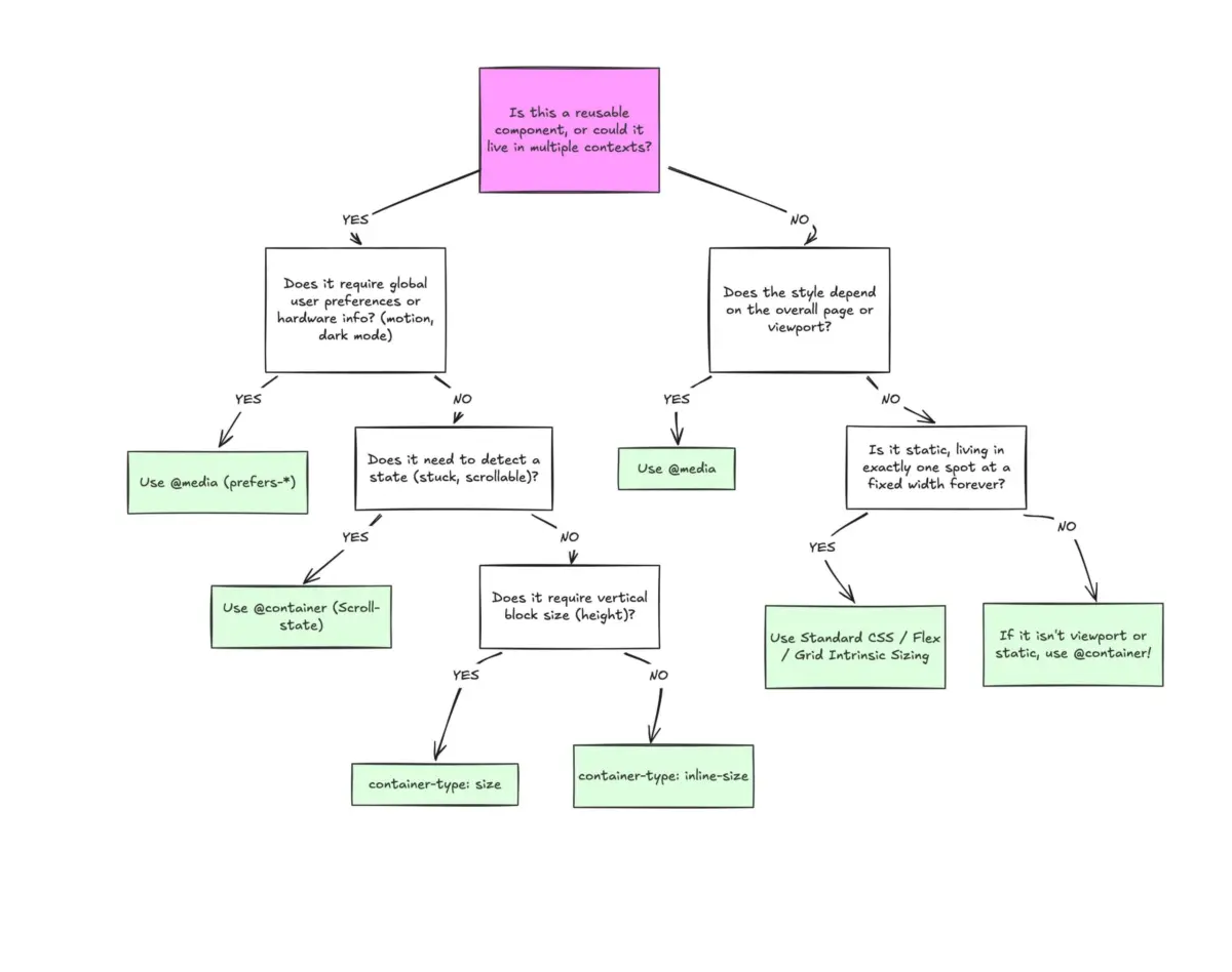
Container queries do not render media queries obsolete. Rather, they establish a mature division of labor within modern design systems.
When deciding which query type to implement for a given feature, engineers should evaluate the component’s scope:
- Use Media Queries when: The component or layout rule is strictly tied to the overall page structure, macro-level grid architecture, global navigation headers, or device-level environmental preferences (
prefers-color-scheme, pointer capabilities). - Use Container Queries when: The component is designed for reuse across multiple layout contexts (e.g., appearing inside both a full-width hero section and a constricted sidebar widget).
[Is the component layout tied to the global page frame?]
  ├── YES ──> Use Media Queries (@media) [Macro Layout]
  └── NO  ──> Is the component reused across multiple contexts?
                ├── YES ──> Use Container Queries (@container) [Micro Layout]
                └── NO  ──> Consider standard fluid CSS / Flexbox / Grid
By shifting our mindset from external viewport dependence to internal component awareness, we align our CSS architecture with the core tenets of modern component-driven development. Container queries are no longer an experimental luxury—they are an essential tool for building resilient, future-proof user interfaces on an increasingly fragmented web.
