

Executive Overview
In the realm of digital product design and software engineering, few challenges are as universally acknowledged yet chronically underestimated as the art of naming. "Naming is hard"—a cliché so frequently repeated that it risks losing its profound gravity. Yet, the language we choose does far more than merely tag a variable or label a Figma frame; it actively shapes our cognitive models, dictates the parameters of cross-functional dialogue, and lays the structural foundation for how scalable systems are built.
When nomenclature fails, friction immediately follows. Confusion arises over colors, icons, user interface (UI) components, and core product features. Design tokens become muddled, HTML classes turn into unmaintainable anomalies, and JavaScript variables lose their descriptive integrity. Often, creators swing too far in either direction: names are either too generic—obscuring intent and rendering the element indistinguishable from its peers—or too specific, stripping the asset of the flexibility and modularity required for modern, responsive development.
This comprehensive guide serves as an authoritative exploration into the mechanics of effective nomenclature. By drawing upon industry-standard resources, established design systems, and expert methodologies, we examine how top-tier organizations navigate the complexities of naming everything from foundational design tokens and CSS selectors to high-level product features and multi-brand taxonomies.

Detailed Chronology & Evolution: From Ad-Hoc Labelling to Systemic Taxonomies
To understand how the tech industry arrived at our current obsession with robust design token taxonomies and standardized component galleries, one must trace the evolution of digital crafting over the past two decades.
Phase One: The Wild West of Web and Design (Late 1990s–2010s)
In the early days of web development and digital design, naming was treated as an afterthought. Developers relied on idiosyncratic abbreviations (nav_bar_2, txt_box_red), while designers organized their Photoshop layers with default identifiers like Layer 1 copy 3 or Rectangle 42. There was little standardization, and teams operated in silos. A designer’s nomenclature rarely matched a front-end engineer’s CSS class structure, leading to endless translation errors during handoffs.
Phase Two: The Rise of Methodologies (2010s–2020)
As digital products scaled in complexity, the industry recognized that ad-hoc naming was unsustainable. This realization catalyzed the development of structured CSS methodologies. Systems like BEM (Block, Element, Modifier), OOCSS (Object-Oriented CSS), and SMACSS attempted to bring order to the chaos by enforcing strict rules on how classes should be structured. Simultaneously, the advent of dedicated digital design tools like Sketch and Figma forced designers to establish systemic naming conventions for layers and symbols, paving the way for the modern design system era.

Phase Three: The Era of Design Tokens and Multi-Brand Ecosystems (2020–Present)
Today, the challenge has evolved from simply styling a single web page to orchestrating multi-brand, multi-platform, and multi-themed design systems. Modern enterprises—such as Intuit and Vodafone—manage massive portfolios where a single color or typography token must cascade seamlessly across dozens of distinct products. Naming is no longer just a coding best practice; it is a vital architectural discipline that bridges design tokens, code variables, and human cognitive patterns.
Supporting Context & Methodologies: Tools and Frameworks for Better Naming
Mastering nomenclature requires moving past personal intuition and tapping into established frameworks, repositories, and mental models. Below is a breakdown of the essential resources and strategies deployed by leading design and engineering teams.
1. Thinking Outside the Box: General Code Naming
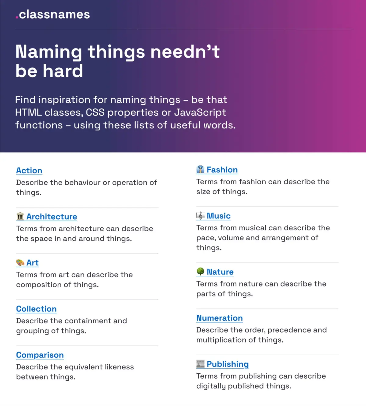
When struggling to name HTML classes, CSS properties, or JavaScript functions, creators often trap themselves within a narrow vocabulary. Resources like Classnames (curated by Paul Robert Lloyd) offer a refreshing antidote to this constraint.

- The Approach: The platform provides thematically grouped lists of words categorized by behavior, likeness, order, grouping, and association.
- Beyond the Obvious: It introduces themed collections drawn from nature, art, theater, music, architecture, fashion, and publishing—vocabulary sets that rarely cross a developer’s mind during a standard coding sprint, yet provide rich, evocative, and highly descriptive alternatives for complex UI patterns.
2. Navigating the Color Spectrum
Colors are notoriously difficult to name objectively. Hex codes and RGB values are precise for machines but meaningless to humans, while generic terms like blue-light or dark-slate quickly break down as palettes expand.
- The Solution: David Aerne’s Color Names repository serves as a massive open-source taxonomy containing over 30,000 unique color names sourced from diverse references and thousands of community contributions. Coupled with tools like Color Parrot, designers and developers can instantly retrieve evocative, human-readable names for any given hex value, complete with robust color pickers and search utilities.
3. Structuring Layers, Groups, and Components in Design Tools
In collaborative environments like Figma, messy layer panels kill productivity. Javier Cuello’s comprehensive guide on naming best practices for layers, groups, and components outlines the pillars of scalable design file management:
- Core Principles: An effective name must possess a logical structure, remain concise, carry clear semantic meaning, be universally understood across the team, and—crucially—avoid reference to visual properties (e.g., avoid naming a component
BlueButton, as its color token may change in a dark mode or alternate brand theme).
4. Decoding Design System UI Components
When designing or building standard interface patterns, reinventing the wheel—or worse, inventing a novel name for an established pattern—creates unnecessary cognitive load for users.

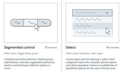
- The Component Gallery: Created by Iain Bean, this resource aggregates over 50 real-world UI components (ranging from accordions to visually hidden elements) sourced from production-grade design systems. It documents not only what a component looks like and how it functions, but also the alternative names it goes by across different organizations.
- Name That UI: A complementary visual dictionary that provides instant clarity on common interface components, ensuring cross-functional teams speak the exact same dialect.
Official Statements & Industry Case Studies: Scaling Nomenclature in Enterprise Environments
To understand how these principles operate at scale, we can look to two major engineering case studies that transformed design token architecture.
Intuit: Building a Flexible Token Taxonomy
As the parent company behind massive global financial and productivity tools like Mailchimp, QuickBooks, TurboTax, and Mint, Intuit faced a monumental challenge: how to build a unified design token taxonomy that could scale across disparate brands without losing contextual relevance.
In an exhaustive case study, Nate Baldwin detailed the creation of Intuit’s modern token system. The old taxonomy suffered from deep-seated pain points, including over-reliance on brand-specific nomenclature that made cross-brand migration nearly impossible. By establishing rigorous criteria centered on semantic abstraction and clear categorization, Intuit engineered a foundational token system that serves as a single source of truth for diverse software ecosystems, proving that a well-architected taxonomy is the backbone of enterprise scalability.

Vodafone UK: The Variables Taxonomy Map
Addressing an even more complex multi-brand, multi-theme environment, the Vodafone UK Design System team released their Variables Taxonomy Map on the Figma Community platform. Built upon the foundational work of design system expert Nathan Curtis, Vodafone’s map deconstructs the anatomy of a design token into an orchestrated system of interconnected collections.
The taxonomy maps tokens across four distinct layers:
- Brand: Core values tied to identity.
- Primitives: Raw values (e.g., absolute hex codes, base spacing scales).
- Semantics: Contextual application tokens (e.g.,
color-background-primary). - Pages/Components: Highly specific implementations.
Through this structured cascade, any team member can inspect a token’s name and immediately deduce its origin, intended context, and hierarchical relationship within the broader system.
(For practitioners looking to build similar structures, Romina Kavcic’s Design Token Naming Guide + Builder and the accompanying Design Token Names Inventory spreadsheet offer interactive tools and four-level spreadsheets to filter, manage, and scale token inventories effortlessly.)
Future Outlook: The Intersection of Feature Discovery and Semantic Harmony
Looking ahead, the evolution of naming extends far beyond codebases and design files into product strategy and feature adoption.
The Psychology of Feature Naming
As product teams ship rapid iterations, new features frequently suffer from abysmal adoption rates. According to UX strategist Erin Gannon in her guide "What Do We Call This Thing?", low feature adoption is rarely a failure of engineering; rather, it is a failure of discoverability rooted in poor nomenclature.

- The Journey: Feature adoption follows a strict sequence: discovery $rightarrow$ comprehension $rightarrow$ trial $rightarrow$ learning $rightarrow$ integration into an existing workflow.
- The Fix: Effective feature names must be driven by user needs and problems, signalling the tangible outcome or "job-to-be-done." Crucially, teams must tap into the user’s native language—observing how customers describe their pain points in their own words and mirroring that exact vocabulary in the product UI.
Eliminating Cross-Departmental Dialects
Ultimately, the future of efficient product development hinges on linguistic alignment. Too much organizational time is wasted because cross-functional partners speak entirely different dialects:
- The Designer’s Dialect (focused on visual hierarchy and layout)
- The Developer’s Dialect (focused on modularity, state, and DOM structure)
- The Product Manager’s Dialect (focused on KPIs, user stories, and feature delivery)
- The User’s Dialect (focused on practical outcomes and intuitive workflows)
When these dialects clash, frustration mounts, technical debt accumulates, and user experience degrades. By establishing a shared, authoritative lexicon—supported by robust design tokens, component galleries, and systematic naming taxonomies—organisations can eliminate ambiguity, reduce cognitive overhead, and build digital products that are as harmonious under the hood as they are intuitive on the surface.