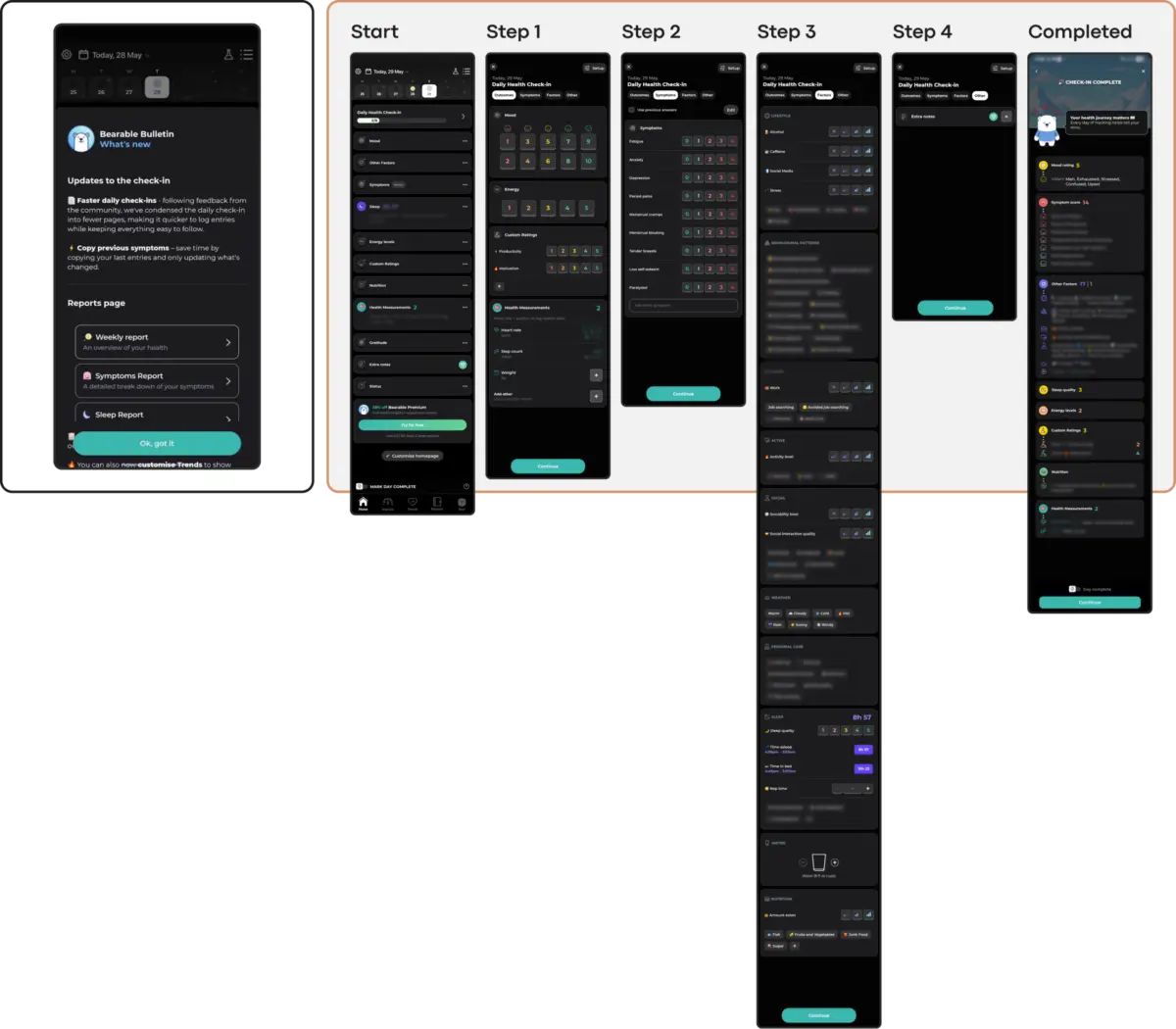
Mental health applications face a staggering, well-documented retention crisis. Industry metrics reveal a harsh reality: approximately 95% of users who open a mental health or wellness application on day one abandon it entirely by day thirty, with median 30-day retention hovering at a meager 3.3%. Even the industry’s most recognized platforms lose up to 50% of their user base within the first ten days.
While multiple operational and clinical factors contribute to this mass exodus, emerging UX research points to a primary culprit: many mental health apps prioritize external visual appeal and novel design trends over the actual, cognitive needs of their users.
In an application ecosystem defined by human vulnerability, cognitive strain, and emotional distress, blindly chasing visual fashion introduces deadly friction. When users open a mental health app, they are rarely driven by curiosity. Instead, they arrive out of acute need—often stressed, anxious, overwhelmed, or exhausted. In these vulnerable states, an unconventional icon, a confusing gesture, or a flashy, high-energy animation ceases to be a delightful surprise. Instead, it becomes an overwhelming cognitive burden and a direct catalyst for abandonment.
Introduced by UX strategist Kat Homan, a vital new evaluation framework urges designers to evaluate visual and interaction patterns against a singular, uncompromising metric: Does a trend lower the cost of using the application when the user can least afford it? This article explores why trend-driven user interfaces actively undermine clinical efficacy, how they clash with the psychological state of distressed users, and what an empathetic, human-centric design paradigm looks like in practice.
Detailed Chronology of the mHealth Engagement Crisis
To understand why modern mobile health (mHealth) interfaces fail, one must trace the evolution of digital product design over the past decade. The consumer application landscape has long been dominated by metrics tied to hyper-engagement, aggressive retention hacks, and viral visual trends.
Phase 1: The Import of Entertainment UI Paradigms (2015–2018)
As digital health apps flooded the market, early developers relied heavily on established playbooks from consumer tech, gaming, and productivity sectors. Features like daily streaks, push notifications, and gamified reward systems were imported directly into mental health spaces. The underlying assumption was simple: if gamification works for language-learning and fitness apps, it should work for emotional wellness.
Phase 2: The Visual Fashion Boom and Neo-Brutalist Interventions (2019–2023)
As competition intensified, product teams increasingly turned to bold visual trends to capture attention and signal market innovation. Neo-brutalist layouts featuring stark contrasts, hidden navigation drawers relying on non-standard gestures, and abstract, unlabeled icons flooded the market. While these design choices won accolades on portfolio platforms like Dribbble, they systematically alienated users experiencing cognitive fatigue or high anxiety.
Phase 3: The Recognition of Cognitive Overload and the Shift to "Quiet Design" (2024–Present)
Recent clinical studies published in digital health journals have sounded the alarm on the mismatch between flashy aesthetics and therapeutic utility. Researchers began mapping the direct correlation between dense, trend-driven interfaces and rapid user abandonment. This realization has sparked a counter-movement: a shift toward low-friction, state-aware interfaces that prioritize emotional alignment, predictable information architecture, and non-coercive interactions.
Supporting Context & Metrics: The High Cost of Trend-Driven Design
The friction introduced by trendy UI patterns is not merely an aesthetic annoyance; it is a clinical hurdle. Research highlights five core areas where trend-driven design actively works against therapeutic usability:
Cognitive Friction: When an interface demands complex visual parsing or non-standard gestures (e.g., hidden menus, abstract controls), it taxes the user’s executive function. For a person experiencing brain fog, depression, or an acute panic attack, this extra effort becomes an insurmountable barrier.
Emotional Mismatch: Studies investigating color and aesthetics in mHealth apps reveal that distressed users strongly prefer subtle, grounded palettes (darker backgrounds, muted taupes, and soft greens). Cheerful, hyper-saturated colors or relentlessly upbeat branding can feel deeply dismissive, creating a jarring conflict with the user’s authentic emotional state.
The Inconsistency Penalty: Mental health relies heavily on routine and predictability. Novelty-driven navigation forces users to relearn interactions on every visit, generating cumulative mental fatigue.
Silent Accessibility Exclusion: Minimalist trends often feature low-contrast text and tiny interactive targets that fail Web Content Accessibility Guidelines (WCAG 2.2), quietly locking out users with visual, motor, or cognitive impairments.
The Coercion Paradox: Aggressive gamification, such as unforgiving daily streaks and urgency-driven notifications, transforms a support tool into an obligation. For individuals managing depressive states, a broken streak turns into a visible record of personal failure, inducing shame rather than motivation.
The scale of the mental health crisis requires a radical transformation in how digital products are conceived. According to estimates by the World Health Organization (WHO), over one billion people globally currently live with a mental health condition, with depression alone affecting nearly 5% of adults. Furthermore, global cases of anxiety and depression have surged by 25% over the last decade.
Experts emphasize that digital tools serving this massive population must operate under a completely different ethical and operational mandate than standard consumer software.
"In mental health technology, sustainable retention is earned not by capturing attention, but by becoming a consistently respectful and helpful presence in a user’s life."
— Kat Homan, UX Strategist and Designer
Clinical literature echoes this sentiment, stressing that therapeutic software must function as a digital refuge. When designers borrow patterns from the attention economy—such as infinite scrolls, surprise paywalls inside crisis paths, or anxiety-inducing notification loops—they violate the core Hippocratic oath of digital product development: First, do no harm.
Future Outlook: A Practical Evaluation Framework for Designers
As the mHealth sector matures, the era of uncritical trend adoption is drawing to a close. To build applications that survive past day three, product teams must adopt rigorous evaluation frameworks. Before introducing any visual or interaction pattern into a mental health product, designers should subject it to a five-point diagnostic test:
Does it reduce or increase cognitive load? (Ensuring clear, linear paths that require minimal decision-making during acute stress).
Does its emotional tone match the user’s state? (Offering solace through subtlety rather than forced, high-energy cheerfulness).
Does it respect routine and predictability? (Avoiding unnecessary navigational novelty that forces users to relearn the interface).
Does it meet stringent accessibility standards? (Ensuring high contrast, adequate touch targets, and multimodal inputs like voice control).
Does it support rather than coerce? (Removing punitive mechanics like rigid streaks and replacing them with forgiving, shame-free return triggers).
By shifting the focus away from portfolio-driven aesthetics and toward compassionate, state-aware functionality, designers can build tools that users do not just look at, but truly trust. In the realm of mental health technology, the ultimate metric of success is not how long an interface holds the user’s gaze, but how safely and effectively the support is felt when it matters most.