

Executive Overview
For decades, responsive web design has been governed by a single, monolithic authority: the viewport. Since the advent of CSS media queries in the late 2000s, developers have relied almost exclusively on screen widths, device orientations, and pixel densities to dictate how layouts adapt to changing environments. Whether a user accesses a site on a sprawling 4K monitor, a standard laptop, a ruggedized tablet, or a compact smartphone, the standard design pattern has remained identical—ask the browser window how wide it is, and shift the layout globally.
Yet, the contemporary web landscape has evolved past the macro-level limitations of the browser frame. Modern web architecture is component-driven, modular, and built on the promise of infinite reuse. A UI card component designed to look pristine in a wide multi-column grid is frequently dropped into a narrow sidebar or embedded within a tight accordion interface. When traditional media queries are tasked with managing these nested realities, they fail. A media query evaluating a 1920px desktop viewport sees plenty of room and triggers a wide layout, entirely ignorant of the fact that the card itself has been squeezed into a 300px sidebar cell, causing text to cramp, images to distort, and interfaces to break.
Enter CSS Container Queries. Despite boasting an impressive roughly 94% global browser support rating, container queries remain shockingly underutilized. Recent industry insights, including data from the State of CSS surveys and observations from expert educators like Kevin Powell at SmashingConf Amsterdam, reveal a massive discrepancy between developer awareness and actual implementation. While the vast majority of developers know container queries exist, fewer than half actively use them in production.
This deep dive investigates why container queries suffer from an adoption paradox, how developers continually misapply them by treating them as direct replacements for media queries, and why understanding the philosophical shift from "macro-layout" to "micro-layout" architecture is essential for the next generation of scalable web design.
Detailed Chronology: The Evolution from Viewport Proxies to Component Awareness
To understand the friction surrounding container queries, it is helpful to retrace how the web engineering community arrived at our current dependency on the viewport.
The Era of the Viewport Proxy
When mobile browsing began to surge in the early 2010s, media queries were nothing short of revolutionary. They rescued developers from fixed-width desktop designs by introducing conditional styling based on device metrics. @media (min-width: 768px) became the universal shorthand for transitioning from a single-column mobile view to a multi-column desktop layout.
However, the viewport has always been a proxy—a stand-in metric for what we actually cared about: space. Because the browser window was the only container dimension easily accessible to CSS, developers grew accustomed to treating the entire screen as the ultimate arbiter of component design.
As single-page applications (SPAs) and component-based frameworks like React, Vue, and Svelte took over the industry, our design methodologies fractured. We stopped thinking exclusively about "pages" and started thinking about "components." We built isolated, highly reusable UI elements meant to thrive anywhere in the DOM. But our CSS tools lagged behind. Components remained chained to the viewport, forced to query the outer browser window to decide how they should behave internally.
The Long Road to Standardization
The realization that components needed interior awareness was not sudden. For years, "component-based responsive design" sat atop CSS feature wishlists. Developers resorted to complex JavaScript solutions—such as ResizeObserver instances tracking element bounds or brittle class-name toggles managed by reactive state—just to make a single card shift from a vertical stack to a horizontal row when its parent container crossed a certain threshold.

When CSS Container Queries were finally standardized and implemented across major browser engines, they solved this architectural pain point natively. Yet, because their syntax (@container) visually mirrors media queries (@media), a dangerous cognitive shortcut occurred across the web development community: developers assumed container queries were simply media queries rebranded for smaller boxes.
This superficial resemblance bred widespread misunderstanding. Developers attempted to apply container queries with viewport-oriented mindsets, ran into unexpected layout containment rules, encountered infinite style loops, and quickly abandoned the feature in favor of familiar, predictable media queries.
Supporting Context & Metrics: The Adoption Paradox
The disconnect between the technical power of container queries and their actual deployment in production environments is one of the most fascinating case studies in recent front-end development history.
The Numbers Behind the Gap
According to the State of CSS surveys, general awareness of container queries sits at an impressive 86%. Most developers working professionally today know the feature exists and understand its theoretical purpose. However, active adoption hovers around 41.4%.
[Developer Awareness vs. Adoption]
Awareness:  [████████████████████] 86%
Adoption:   [█████████           ] 41.4%
While survey data inherently carries minor sample biases, the trend is clear: adoption has lagged far behind browser compatibility. Over 94% of users globally browse on engines that fully support container queries. The barrier to entry is no longer technical or infrastructural—it is psychological and pedagogical.
Fragmented Viewports in a Component-First World
The necessity for container-based responsiveness becomes starkly apparent when examining the physical realities of modern hardware. Data tracking modern device ecosystems reveals over 2,300 unique viewport sizes in active use across the global web.
It is mathematically and practically impossible to write robust media queries that account for every possible combination of screen dimensions, split-screen browser window sizes, OS-level window managers, and responsive sidebars. When layout logic is coupled to the viewport, your components are effectively flying blind. By shifting layout logic inward—allowing the component to inspect its immediate container—we decouple component integrity from device fragmentation.
Official Insights & Expert Perspectives
Industry leaders have been vocal about the community’s sluggish transition to container-driven development. Speaking at SmashingConf Amsterdam, renowned CSS educator Kevin Powell pulled no punches, bluntly stating that container query adoption has been "terrible."
Powell’s critique goes to the heart of how developers conceptualize CSS architecture:

"Media queries are dumb. Not dumb in terms of the concept, but dumb in that they don’t know very much. In fact, most people assume that they know more than they do."
When developers write a media query, they are asking the browser a single, isolated question: How wide is the screen right now? The browser answers accurately, but that answer is entirely useless when evaluating the micro-environment of a nested UI element.
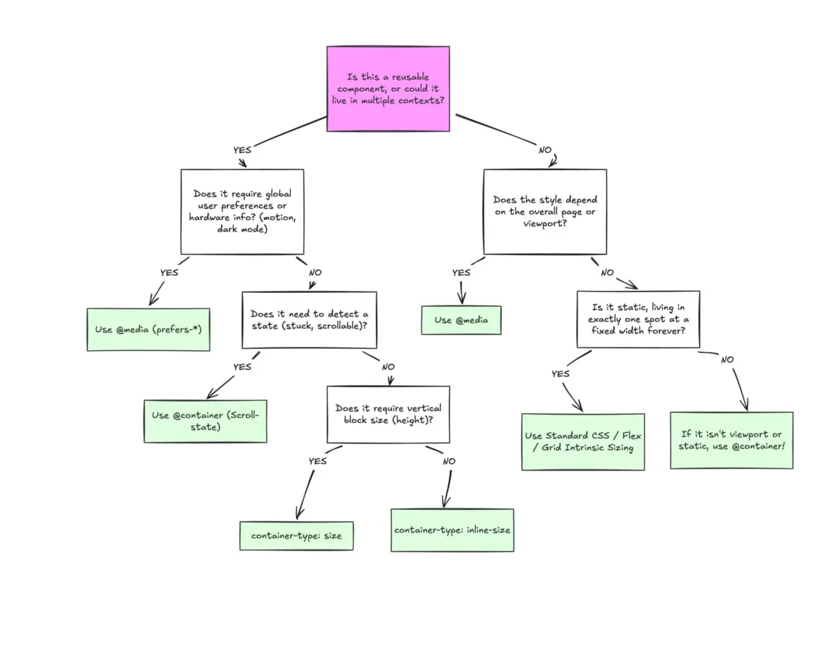
Macro Layouts vs. Micro Layouts
To resolve this cognitive dissonance, front-end architects are increasingly adopting a clear mental model dividing responsive design into two distinct domains:
- Macro Layouts (Page Level): Managed by Media Queries (
@media). These govern the overarching architecture of the document—global grid structures, site headers, footers, major sidebars, system-level user preferences (prefers-color-scheme), and hardware capabilities (touch vs. mouse input). - Micro Layouts (Component Level): Managed by Container Queries (
@container). These govern reusable UI components—cards, widgets, form controls, navigation menus, and buttons. They answer the question: How much space is available for me in this specific spot, right now?
By maintaining this strict separation of concerns, developers stop treating components like passive victims of the viewport and start treating them like autonomous, context-aware design systems.
Practical Engineering: Mastering Container Queries
To move past the initial learning curve, engineers must master the structural differences, syntax rules, and inherent side effects of container queries.
1. Registering a Container
Unlike media queries, which automatically target the global viewport, container queries require you to explicitly declare an element as a query container. This establishes a containment context in the DOM.
.card-wrapper
  container-name: card;
  container-type: inline-size;
By setting container-type: inline-size, you instruct the browser to monitor the horizontal (inline) dimensions of the .card-wrapper element. Once registered, any descendant element can query this container using the @container rule:
@container card (min-width: 450px)
  .card
    display: flex;
    flex-direction: row;
2. Fluid Typography Without Viewport Units
Historically, fluid typography relied heavily on viewport-relative units like vw or vh paired with CSS clamp() functions. While effective at the page level, viewport-based fluid typography breaks down when a component is moved into a constrained wrapper.
Container queries introduce dedicated relative units—such as cqi (container query inline-size) and cqb (container query block-size). By pairing these units with clamp(), typography scales fluidly relative to the component’s immediate container rather than the screen:

.card-title
  font-size: clamp(1rem, 0.5rem + 3cqi, 2rem);
Whether this card resides inside a sprawling 1200px main content area or a cramped 280px sidebar, the typography adapts gracefully to its local environment.
3. Solving Flexbox Wrap Detection
One of the most powerful advanced patterns enabled by container queries is tracking internal layout states, such as flexbox wrapping.
Ordinarily, CSS cannot detect when flex items wrap onto a new line. If you have a horizontal menu or a row of cards that wraps due to space constraints, styling the wrapped state traditionally requires JavaScript (ResizeObserver). However, by combining container queries with flexbox growth properties, CSS achieves this natively:
/* The flex parent */
.flex-layout
  display: flex;
  flex-wrap: wrap;


/* Register individual flex items as containers */
.flex-item
  container-type: inline-size;
  flex: 1 1 390px; /* Grow to fill space, wrap when below 390px */


/* Default state for narrow/stacked cards */
.card
  display: flex;
  flex-direction: column;


/* Once the container expands past 600px, shift layout */
@container (min-width: 600px)
  .card
    flex-direction: row;
    align-items: center;
Navigating Container Query Caveats and Side Effects
While powerful, container queries introduce specific architectural traps that developers must navigate:
- Self-Containment Restrictions: A container cannot query itself. If you apply
container-type: inline-sizeto.card, you cannot write a container query targeting.cardwithin that same element. You must establish a parent wrapper in the DOM hierarchy. - Size Containment Layout Collapses: Querying a container’s full block size (
container-type: size) causes the browser to calculate dimensions without examining child elements. If an explicit height, min-height, or aspect ratio is omitted, the container collapses to0px. Best practice dictates defaulting toinline-sizeunless block-size tracking is strictly mandatory. - Custom Property Restrictions: At present, container queries cannot directly evaluate CSS custom properties (variables) within their conditions (e.g.,
@container (min-width: var(--breakpoint-lg))is invalid). This restriction prevents cyclical logic loops where a query condition modifies the very variable it evaluates.
Future Outlook: The Component-Driven Horizon
The maturation of CSS Container Queries marks a fundamental philosophical turning point in front-end web development. We are moving away from the era of brute-force global overrides and entering an era of intelligent, localized component design.
As browser support solidifies past the 95% threshold and developers build deeper familiarity with container-based paradigms, the reliance on brittle JavaScript layout observers will continue to diminish. Furthermore, upcoming experimental specifications—such as container style queries—promise to expand component awareness beyond physical dimensions into computed style states.
Container queries are not meant to eradicate media queries entirely; macro layouts still demand viewport-level oversight. Rather, container queries complete the responsive design toolkit. By bridging the gap between component architecture and layout responsiveness, they ensure that the web components of tomorrow remain resilient, adaptable, and truly modular, regardless of where they land in the DOM.