

Executive Overview
In the realm of digital product design, few user interface components are as ubiquitous—or as frequently mishandled—as the accordion menu. Used primarily to organize dense hierarchies, hide secondary content, and streamline mobile screen real estate, the collapsible accordion seems deceptively simple. Yet, recent comprehensive UX research reveals a troubling disconnect between how designers intend these components to function and how users actually interpret them.
At the heart of this usability friction are visual signifiers: the tiny icons, carets, chevrons, arrows, and plus-minus symbols that accompany menu labels. Far from being mere decorative flourishes, these graphical cues carry immense cognitive weight. They dictate user expectations regarding tap targets, page navigation, and state changes. When implemented poorly, they lead to user frustration, misclicks, and broken workflows.
Recent findings from the Nielsen Norman Group (NN/g) shed critical light on these interface patterns. The research provides definitive guidance on several long-standing design debates: Why do custom icons consistently fail? Why are split menus inherently harmful to user experience? And, most importantly, why is the humble caret universally recognized as the safest, most reliable choice for expansion and collapse?
This report delves into the mechanics of accordion iconography, examining the psychological impact of overloaded symbols, analyzing real-world implementations by global brands, and outlining a definitive framework for creating cleaner, more intuitive digital navigation systems.
Detailed Chronology: The Evolution of Accordion Usability
To understand how we arrived at the current consensus surrounding accordion icons, we must trace the evolution of web and mobile navigation patterns over the past two decades.
The Early Web and the Birth of the Accordion
In the nascent days of responsive web design and mobile-first development, designers faced an unprecedented spatial crisis. Desktop menus—sprawling, multi-column megamenus filled with text links—simply could not fit on smartphone screens. Borrowing a metaphor from physical accordion instruments, interface designers introduced the collapsible menu item: a single-line header that expanded vertically upon interaction to reveal sub-categories.
Initially, these components lacked standardized iconography. Early developers relied on text links, arbitrary folder icons, or primitive JavaScript toggles. Users were forced to guess whether tapping a menu heading would navigate them to a dedicated landing page or simply push adjacent content downward to reveal a nested list.
The Icon Overload Era
As UI design matured into a formal discipline, design systems began introducing a flood of visual signifiers. Icons proliferated across web applications and e-commerce platforms. Designers experimented with a dizzying array of symbols:
- Right-facing and down-facing directional arrows ($rightarrow$, $downarrow$)
- Chevrons and carets in various weights and orientations
- Mathematical operators (
+and–) - Completely custom, brand-specific iconography designed to align with corporate aesthetic guidelines
Unfortunately, this visual explosion created an unintended consequence: symbol overloading. Because these icons were deployed inconsistently across different platforms, users could no longer rely on a universal mental model. A plus sign on Site A meant "add to cart," while on Site B it meant "expand accordion." An arrow pointing right could signify page navigation, horizontal scrolling, or a nested submenu.
The Rise of the Split Menu
In an effort to maximize functionality, interface architects introduced the "split menu" or dual-action accordion. In this pattern, the text label of a menu item linked directly to a category overview page, while the adjacent icon (usually an arrow or plus sign) controlled the expansion of the accordion dropdown.

While theoretically efficient—allowing users to either
view the parent category or drill down into sub-categories—usability testing consistently exposed this pattern as a major design flaw. Users struggled to distinguish between the micro-hit targets of the text label and the icon. Misclicks became rampant, leading users to unintended landing pages when they merely wanted to browse sub-menus, or vice versa.
The Shift Toward Empirical UX Research
Recognizing the widespread ambiguity in accordion design, researchers—most notably at the Nielsen Norman Group—began conducting empirical studies to observe actual user behavior. By tracking gaze patterns, click distributions, and task success rates, these studies moved the conversation away from subjective aesthetic preferences and toward hard, data-backed usability metrics. The resulting data provided clear answers regarding what users actually expect when encountering different types of accordion signifiers.
Supporting Context & Metrics: What the Research Tells Us
The empirical data gathered on accordion icons shatters several long-held assumptions in the design community. By evaluating how users interact with different icon families, researchers have mapped out precise behavioral patterns.
The Problem with "No Icon"
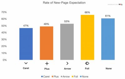
When an accordion header appears with no accompanying icon whatsoever, user expectations tilt heavily in one direction: they expect to be navigated to a new page.
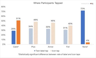
Without a visual signifier indicating state change or expansion, the human brain processes the text label as a standard hyperlink. When a user taps a text-only header and the page suddenly stretches downward to reveal an accordion instead of loading a new view, it creates a subtle cognitive dissonance. While users can adapt to this behavior, it removes the crucial affordance that prepares them for a localized interaction rather than a navigation event.
The Custom Icon Trap
Brand identity often drives organizations to commission custom icons for their design systems. However, NN/g research highlights that users consistently struggle with non-standard, custom accordion icons. Because these graphics lack universal cultural precedent, they fail to instantly signal expandable behavior.
Furthermore, behavioral tracking reveals an interesting psychological quirk regarding hit areas: users tend to tap fairly equally on the icon and on the text label for most standard icons. This means that an icon is not just a visual signal; it forms a core part of the interactive hit area. If an ambiguous custom icon is used, the entire bounding box of the menu item becomes a zone of uncertainty.
The Verdict on Plus/Minus and Arrows
Mathematical operators (+/–) and directional arrows ($leftarrow$/$rightarrow$ or $uparrow$/$downarrow$) are widely understood, but they suffer from severe contextual pollution.
- The Plus/Minus Dilemma: While a plus sign intuitively suggests addition or expansion, it is heavily overloaded in digital interfaces. Users encounter plus signs in e-commerce (adding items to a cart), cloud storage (uploading files), photo editing (zooming in), and playlist management (saving for later). When applied to multi-level navigation where multiple accordions can be open simultaneously, the plus/minus paradigm breaks down. A minus sign
-sitting above an expanded menu can easily be misinterpreted as a deletion or minimization action rather than a collapse toggle. - The Arrow Confusion: Directional arrows carry physical baggage. Horizontal arrows (
→) strongly imply forward momentum and page navigation. When rotated downward (↓), they lose their navigational clarity and often fail to communicate that an accordion is about to expand vertically. Additionally, users frequently associate arrows with scrolling, sliding, or pagination controls.
The Caret: The Undisputed Gold Standard
Against this backdrop of overloaded symbols, the caret (or downward-pointing triangle, ⌄) emerges as the absolute safest and most reliable icon choice.

Research demonstrates that when a caret is present, users overwhelmingly understand its purpose: the item is expandable. Interestingly, studies show that users are even more likely to deliberately target the caret icon directly (rather than the text label) compared to other symbol types. This makes the caret an exceptionally clear visual anchor.
The recommended behavioral pattern for the caret is straightforward:
- Collapsed State: Display a caret pointing downward ($downarrow$ or $vee$).
- Expanded State: Transition the icon to point upward ($uparrow$ or $wedge$) or sideways ($rightarrow$), depending on the layout paradigm.
If an alternative is strictly required by brand guidelines, the classic plus/minus system remains functional, provided it is implemented consistently without multi-level ambiguity.
Official Guidelines & Industry Best Practices
Translating empirical research into actionable design principles requires discipline. Based on current UX findings, digital product teams should adhere to the following core directives when designing navigation and accordion systems.
1. Eliminate Split Menus Entirely
Split menus—where the text label navigates to a URL and the icon opens the dropdown—must be avoided. They introduce unnecessary interaction complexity and fail standard usability testing.
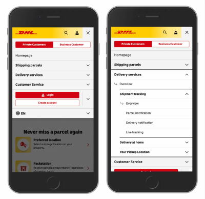
Instead, adopt a unified interaction model:
- The Main Category Tap: Tapping anywhere on the parent category header (text or icon) expands the menu to expose sub-options.
- The Overview Link: To provide access to the parent category’s landing page, include a dedicated "Overview" or "All [Category Name]" link as the very first item inside the expanded dropdown.
Major global enterprises have successfully transitioned to this model. For example, logistics giant DHL utilizes a clean, unified accordion navigation on its digital platforms. By eliminating superfluous external arrows and abandoning split menus, DHL ensures that every section features an explicit "Overview" link within the dropdown, dramatically reducing user misclicks and cognitive load.
2. Rely on Underlining for Direct Links
If a navigation element is purely a link designed to take the user to a new page, do not clutter it with arrows, carets, or custom badges.
The most effective, universally recognized signifier for a hyperlink remains underlining. While some modern minimalist design trends attempt to strip underlines away in favor of color differentiation alone, underlining is unmatched in accessibility and clarity. It may not feel cutting-edge or visually trendy, but it communicates navigability flawlessly across every demographic and device type.
3. Keep States Simple and Predictable
Overcomplicating accordion states—such as animating complex multi-directional morphing icons that point diagonally or rotate through 360 degrees—often distracts the user.
Keep state changes binary and clean:
- Closed: Caret pointing down.
- Open: Caret pointing up (or right).
Consistency breeds familiarity. When users encounter predictable UI patterns across your application, their cognitive load decreases, allowing them to focus entirely on content consumption rather than interface navigation.
Future Outlook: The Next Frontier of Interface Navigation
As digital interfaces continue to evolve beyond traditional glass screens into spatial computing, voice-activated UI, and adaptive AI-driven layouts, the fundamental principles of information architecture remain remarkably resilient. Even as we look toward augmented reality (AR) environments and conversational agents, the need to organize hierarchical information efficiently is paramount.
The Rise of Adaptive Design Systems
Looking ahead, modern design systems are moving toward automated, data-informed component libraries. Rather than relying on static guesses about what an icon should do, enterprise design teams are increasingly embedding telemetry into their components. By tracking micro-interactions in real time, organizations can identify where users hesitate or misclick on navigation items, allowing for continuous, data-driven refinement of hit targets and icon choices.
Accessibility and Inclusive Design
A critical driver for future navigation standards is strict adherence to digital accessibility regulations (such as WCAG guidelines). Screen readers and assistive technologies rely heavily on proper semantic markup (aria-expanded, aria-controls) rather than visual icons alone.

As the industry matures, the separation of visual signifiers from underlying functional semantics will become even more pronounced. The caret will remain the visual standard for sighted users, but robust ARIA attributes will ensure that screen reader users receive an identical, unambiguous understanding of component states.
Conclusion: Embracing Radical Simplicity
The overarching lesson from recent accordion usability research can be summarized in three words: Simplicity wins.
In our rush to pack digital products with clever micro-interactions, custom icons, and split-action buttons, we frequently introduce friction where none should exist. By respecting user mental models—using an underlined text label for page navigation, a clean caret for accordion expansion, and avoiding split menus entirely—designers can build digital experiences that are intuitive, accessible, and effortlessly frictionless. After all, the best interface design is the one the user never has to think about.
