

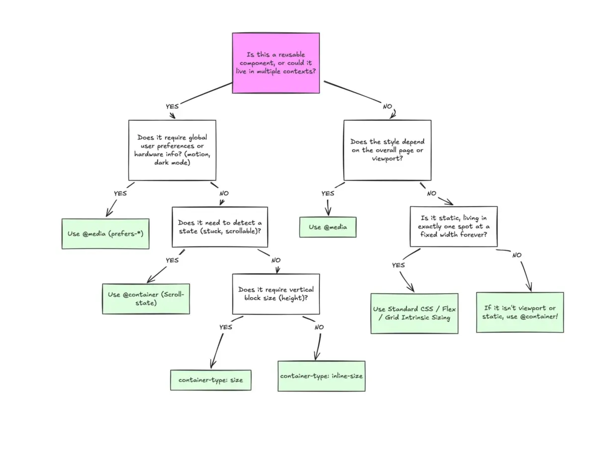
Executive Overview
Despite achieving robust, cross-browser support sitting comfortably at roughly 94% globally, CSS container queries remain surprisingly underused, frequently misunderstood, and widely misapplied. For years, frontend developers have clamored for a native mechanism to allow UI components to respond intelligently to the exact dimensions of their immediate parents rather than the arbitrary width of a device viewport. Yet, industry data—including findings from the State of CSS surveys and insights shared at major developer conferences like SmashingConf—reveals an unexpected reality: adoption has lagged far behind developer awareness.
The root of this disconnect lies in a fundamental optical illusion. At first glance, container queries look almost identical to traditional media queries. Because the syntax is remarkably familiar, many developers naturally assume they serve the same purposes and operate under the same logic.
They do not.
Media queries look outward, querying the macro-environment of the browser window or device characteristics. Container queries look inward, querying the micro-environment of a component’s assigned parent wrapper. This article examines the core architectural differences between media queries and container queries, explores why treating them interchangeably leads to broken layouts, analyzes real-world implementations such as fluid typography and flexbox wrap detection, and outlines a definitive framework for deciding when to reach for each tool in modern web architecture.
Detailed Chronology: The Evolution from Viewport Proxies to Component-Driven Design
The Media Query Era: The Viewport as a Proxy
To understand why container queries represent such a monumental paradigm shift, we must first trace the evolution of responsive web design (RWD). When Ethan Marcotte coined the term in 2010, the web was predominantly document-driven. Websites were collections of text and images reflowing inside a single browser window. To make these pages adapt to varying devices, developers relied on @media rules.
The viewport has always been a proxy—an imperfect stand-in for the physical space a layout actually occupies. When a developer writes:
@media (min-width: 1024px)
  .card
    display: flex;
They are asking the browser a single, isolated question: “How wide is the screen right now?”
For macro-layouts—such as shifting an entire website from a multi-column desktop grid to a single-column mobile view—this approach worked wonderfully. However, as the web transitioned from static documents to complex, component-driven applications (powered by frameworks like React, Vue, and Svelte), the limitations of the viewport proxy became painfully apparent.
The Component Crisis and the Quest for Smart Layouts
Modern applications rely heavily on reusable components. A .card component might be designed to display an image alongside descriptive text in a horizontal layout. On a large desktop monitor with a 1920px viewport, that card should theoretically have plenty of room.
However, what happens when that exact .card component is placed inside a narrow sidebar grid cell measuring only 300px wide?
The media query remains oblivious to this local constraint. Because the overall viewport is still 1920px, the min-width: 1024px rule fires, forcing the card into its horizontal flex layout despite having only 300px of actual horizontal breathing room. The result is a broken interface: text overflows, images distort, and layouts cramp.
As Kevin Powell famously noted in discussions on smart layouts: "Media queries are dumb. Not dumb in terms of the concept, but dumb in that they don’t know very much."
For years, developers attempted to solve this with JavaScript-based ResizeObserver APIs or complex CSS hacks, while "Component-Driven Layouts" sat atop CSS wishlists worldwide. When CSS Container Queries finally landed in browsers, they were supposed to solve this exact problem. Yet, transition friction and legacy mental models have caused developers to graft container query syntax onto old media query habits, missing the structural philosophy entirely.
Supporting Context & Metrics: Adoption Realities and Fragmentation
The Adoption Paradox
The sluggish adoption of container queries stands in stark contrast to their broad browser availability. According to the caniuse telemetry database, container queries enjoy roughly 94% global support across all major modern evergreen browsers.
Yet, empirical developer metrics paint a different picture:
- Awareness vs. Usage: Data from the State of CSS survey indicates that while 86% of developers are aware of container queries, only 41.4% actively use them in production environments.
- Industry Consensus: At SmashingConf Amsterdam, frontend educator and advocate Kevin Powell bluntly characterized container query adoption as "terrible," highlighting a persistent disconnect between available tooling and daily engineering practices.
The 2,300-Size Fragmentation Crisis
Why does this matter? Because the modern web is vastly more fragmented than it was a decade ago. Recent audits of viewport sizes across major web properties cataloged over 2,300 unique viewport sizes derived from more than 120,000 distinct data points.
Trying to design components that adapt gracefully to thousands of potential screen widths using static media query breakpoints (768px, 1024px, 1440px) is a losing battle. Components can no longer rely on guesses about the global screen size; they must be self-aware agents that adapt directly to the space they are explicitly given.
Official Statements and Expert Analysis: Macro vs. Micro Layouts
To effectively leverage both media queries and container queries, developers must draw a firm line between macro layouts and micro layouts.
+-----------------------------------------------------------------+
|                       MACRO LAYOUT (Page)                       |
|  - Managed via @media queries                                   |
|  - Evaluates global viewport, system preferences, device specs  |
|  - Controls global grid, headers, footers, page-level structure |
+-----------------------------------------------------------------+
                                |
                                v
+-----------------------------------------------------------------+
|                      MICRO LAYOUT (Component)                   |
|  - Managed via @container queries                               |
|  - Evaluates local parent wrapper width (inline-size)           |
|  - Controls cards, widgets, forms, modular UI elements          |
+-----------------------------------------------------------------+
Macro Layouts (The Viewport Domain)
Media queries remain the correct tool for macro layouts. They look outward and evaluate global environmental truths that apply to the entire document. This includes:
- System Preferences: Queries like
prefers-color-scheme(dark/light mode) orprefers-reduced-motion. - Hardware Capabilities: Pointers, touch screens, and hover states.
- Page-Level Structure: Major page-level shifts, viewport-spanning hero banners, and root grid templates.
Micro Layouts (The Container Domain)
Container queries are purpose-built for micro layouts—the autonomous building blocks that live inside macro layouts. Cards, widgets, accordions, form controls, and navigation modules should not care if they are viewed on a folding phone or an ultra-wide desktop monitor. They should care exclusively about whether their immediate container has enough inline space to render their preferred layout variant.

Technical Implementation Guide
To transition from media-query thinking to container-query thinking, let us examine concrete technical implementations and common architectural pitfalls.
1. Basic Component Scoping
To use a container query, you must first designate a parent element as a containment context using the container-type and optional container-name properties:
/* Step 1: Establish the container context */
.card-wrapper
  container-name: card;
  container-type: inline-size;


/* Step 2: Query the container's available space */
@container card (min-width: 450px)
  .card
    display: flex;
    flex-direction: row;
In this architecture, the .card component is entirely decoupled from the browser viewport. If the .card-wrapper expands beyond 450px—whether inside a full-width main content area or a generous desktop sidebar—the horizontal layout triggers automatically.
2. Fluid Typography Inside Components
Historically, responsive typography relied heavily on viewport units (vw, vh) paired with clamp():
/* Antipattern: Tied to the global viewport */
.card-title
  font-size: clamp(100%, 1rem + 2vw, 24px);
When this card is placed into a narrow sidebar, the 2vw calculation scales incorrectly based on the massive screen width rather than the confined sidebar width, breaking visual hierarchy. Container queries introduce specialized relative length units (cqi, cqw, cqb), allowing fluid typography to scale relative to the container:
/* Modern Approach: Tied to the local container */
.card-title
  font-size: clamp(1rem, .5rem + 3cqi, 2rem);
3. Flexbox Wrap Detection Without JavaScript
One of the most powerful latent capabilities of container queries is detecting internal layout changes—specifically, tracking when flex items wrap onto new lines. Because media queries cannot see inside a container, detecting flex wrapping historically required heavy JavaScript ResizeObserver scripts.
By nesting container queries inside flex items, we can achieve native wrap detection purely in CSS:
/* The flex parent container */
.flex-layout
  display: flex;
  flex-wrap: wrap;


/* Register each flex item as an independent container */
.flex-item
  container-type: inline-size;
  flex: 1 1 390px; /* Expands to fill available space; wraps at 390px */


/* Default state for narrow/stacked views */
.card
  display: flex;
  flex-direction: column;
  background: #f4f4f4;


/* Container query fires when the individual item expands into a full row */
@container (min-width: 600px)
  .card
    flex-direction: row;
    align-items: center;
    background: #e2f0d9;
Known Pitfalls, Side Effects, and Limitations
While container queries are exceptionally powerful, they introduce specific architectural constraints that developers must navigate carefully.
Pitfall A: A Container Cannot Query Itself
Unlike media queries, which can be applied directly to any element relative to the screen, container queries require a strict parent-child relationship. An element cannot serve as its own container and query itself:
/* DOES NOT WORK: Infinite loop risk */
.card
  container-name: card;
  container-type: inline-size;


@container card (min-width: 400px)
  .card
    display: flex;
The Fix: Introduce an explicit wrapper element (.cards) to act as the containment context, allowing styling rules to target its descendent (.card).

Pitfall B: Size Containment Layout Collapses
When developers utilize container-type: size (which evaluates both inline and block dimensions), elements can unexpectedly collapse to 0px in height:
/* Dangerous: Can collapse layout if height isn't explicitly defined */
.hero-banner
  container-type: size;
Because the browser calculates containment dimensions without examining internal children, failing to provide an explicit height, minimum height, or aspect ratio will cause the container to collapse. For the vast majority of component designs, developers should explicitly use container-type: inline-size to avoid block-axis collapses.
Pitfall C: Incompatibility with CSS Custom Properties in Queries
At present, container queries cannot evaluate CSS custom properties directly:
:root
  --breakpoint-lg: 1600px;


/* DOES NOT WORK */
@container (min-width: var(--breakpoint-lg))
  /* ... */
This restriction exists to prevent circular dependency logic where a container query modifies a custom property that, in turn, alters the query evaluation threshold, triggering infinite cascading loops.
Future Outlook: The Component-First Web
The ongoing hesitation to adopt container queries stems primarily from entrenched habits formed during the early days of responsive design, when the viewport was our only reference point. However, as design systems, micro-frontends, and highly modular component libraries dictate modern frontend architecture, our tooling must evolve to match.
Media queries are not obsolete; they remain vital gatekeepers for global page architecture, system preferences, and macro-level breakpoints. But treating container queries as mere drop-in replacements for media queries ignores their true architectural potential.
When we shift our mindset from asking “How big is the screen?” to asking “How much space does this component have right now?”, we unlock a genuinely resilient, portable, and future-proof approach to building web interfaces. The tools are fully supported across all modern browsers—it is time for engineering practices to catch up.