ts Rule, Split Menus Fail, and Simplicity Wins in Accordion Design
Executive Overview
In the intricate landscape of user experience (UX) and interface design, few components appear as deceptively simple as the accordion. Designed to efficiently organize heavy volumes of content by toggling visibility—expanding to reveal hidden details or collapsing to conserve precious screen real estate—the accordion is a staple of modern web and mobile architecture. Yet, beneath its unassuming exterior lies a minefield of potential usability pitfalls.
Recent empirical studies, most notably comprehensive research conducted by the Nielsen Norman Group (NN/g), have cast a harsh light on how minor design decisions—such as the choice of an icon, the implementation of split menus, or the conflicting behaviors assigned to text labels versus graphic signifiers—can profoundly impact user behavior and cognitive load.
For years, designers have leaned on intuition, aesthetic trends, or platform-specific defaults when styling accordions, introducing a chaotic assortment of chevrons, arrows, plus signs, and triangles. However, data-driven insights reveal that users harbor very specific, ingrained mental models regarding these visual cues. When interfaces violate these expectations, the friction manifests as misdirected clicks, frustration, and increased abandonment rates.
This comprehensive analysis explores the psychological underpinnings of accordion interaction. We examine why the humble caret remains the gold standard for expansion states, why split menus actively harm usability, how "overloaded" symbols like plus-minus signs create ambiguity, and why the time-tested practice of underlining text links remains undefeated. Ultimately, this report serves as a definitive guide for product designers, developers, and UX researchers striving to craft frictionless, intuitive digital ecosystems.
Detailed Chronology: The Evolution of Accordion Usability Research
To understand the current best practices in accordion design, one must retrace how the industry arrived at these insights. The journey of standardizing disclosure widgets—commonly known as accordions or collapsible menus—has been marked by a transition from arbitrary graphic design choices to rigorous, user-centered behavioral studies.
The Early Web and the Wild West of Icons
In the infancy of modern web design, desktop-driven applications and early content management systems frequently utilized disclosure triangles, derived from desktop operating system folder trees (such as early iterations of Microsoft Windows Explorer and Apple’s macOS Finder). These initial implementations were strictly functional, prioritizing utility over visual polish.
As the web transitioned into the responsive, mobile-first era, user interfaces underwent a rapid evolution. Designers sought to declutter complex navigation menus, particularly on resource-constrained mobile viewports. This gave rise to the widespread adoption of the accordion menu. However, without universal guidelines, designers began experimenting with a disparate array of visual indicators:
Right-pointing arrows ($rightarrow$)
Down-pointing chevrons ($downarrow$)
Plus and minus symbols ($+/-$)
Custom proprietary graphic assets designed to match brand aesthetics
During this period, little empirical testing was applied to determine whether users actually understood what these icons meant in a web navigation context. The prevailing assumption was that any small geometric shape placed next to a menu item would intuitively signal interactivity.
The Shift Toward Empirical UX Research
Recognizing the widespread confusion in navigation patterns, research powerhouses like the Nielsen Norman Group (NN/g) initiated deep-dive usability studies focusing specifically on accordion icons and interaction areas. By tracking user gaze, click behavior, and task completion rates across various layouts, researchers began isolating the exact psychological triggers that dictate how humans interact with expandable elements.
The findings were revealing. Researchers discovered that users do not view UI elements in isolation; instead, their interactions are governed by immediate, unconscious expectations formed by decades of web conventions. When an icon failed to match its historical precedent—such as using a non-standard custom icon or employing a split menu—user error rates spiked dramatically.
Today, the industry stands at a crossroads. Armed with hard data from comprehensive eye-tracking and interaction studies, modern UI design is shedding the decorative excess of the past decade. The focus has decisively shifted back to what works reliably, prioritizing cognitive ease over novelty.
Supporting Context & Metrics: Decoding User Behavior and Iconography
The core of effective accordion design lies in understanding hit areas, visual signifiers, and semantic baggage. Let us break down the key data points and psychological phenomena that govern how users navigate these elements.
The Power of the Caret: Why It Remains the Safest Choice
When testing various symbols—including carets, chevrons, arrows, triangles, and plus/minus signs—research consistently points to the caret (or downward-pointing triangle) as the single most reliable icon for indicating expand-and-collapse functionality.
Why does the caret succeed where other icons falter?
Immediate State Signification: A downward caret ($nabla$) clearly denotes that content is hidden below and can be brought into view. Conversely, an upward caret ($Delta$) or a sideways caret ($rightarrow$) effectively communicates an active or collapsed-to-expanded state transition.
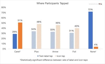
Distinct Interaction Area: Interestingly, NN/g studies revealed a unique behavioral quirk regarding user tapping patterns. While participants tended to click or tap relatively equally on text labels versus icons across most styles, users demonstrated a noticeably higher tendency to tap directly on the caret icon itself. This implies that the caret serves not merely as a passive visual label, but as a primary, magnetic hit target.
The Perils of "No Icon"
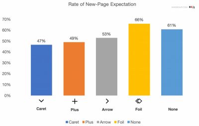
What happens when an accordion header features no icon at all? The data is unambiguous: without an icon, users universally expect tapping the menu item to navigate them directly to a brand-new page.
When designers strip away visual indicators in the name of minimalist aesthetics, they inadvertently break the user’s mental model if the element actually triggers an accordion drop-down. Users are left stranded, experiencing unexpected behavior that disrupts their journey through a site or application.
The Overloaded Nature of Plus/Minus and Arrows
While plus ($+$) and minus ($-$) signs, as well as directional arrows ($leftarrow/rightarrow$), are generally understood by digital natives, they suffer from a severe UX affliction: semantic overloading.
The Problem with Plus/Minus: The plus symbol has been co-opted by dozens of distinct digital paradigms. Depending on the context, a plus sign can mean:
Add an item to a shopping cart.
Save an item for later.
Zoom into an image or map.
Expand an accordion.
In multi-level navigation structures where multiple tiers are expanded simultaneously, a sea of plus and minus signs creates visual noise and cognitive fatigue, forcing users to stop and decode symbols rather than consuming content.
The Problem with Arrows: Horizontal and vertical arrows carry baggage related to scrolling, sliding, pagination, or jumping to specific anchors within a long document. Using them interchangeably for accordions muddies their functional definition.
The Deadly Sin of Split Menus
Perhaps the most damaging design pattern uncovered in recent studies is the split menu. This is an architectural layout where the text label of a menu item links directly to a parent category page, while the adjacent icon (such as an arrow or plus sign) controls the accordion drop-down.
Split menus consistently fail usability testing for several reasons:
Target Precision Failure: On mobile devices, fat-finger syndrome makes hitting a tiny 20×20 pixel icon next to a text label exceptionally difficult. Users frequently trigger the wrong action—landing on a category page when they merely wanted to browse sub-categories, or vice versa.
Unpredictable Mental Models: Users do not naturally expect a single menu row to possess a bifurcated functionality. They perceive the entire row as a cohesive interactive unit.
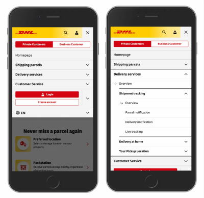
Instead of deploying split menus, best practices dictate a unified approach: tapping the main category row opens the accordion menu, and a dedicated "Overview" or "All Categories" link is cleanly housed inside the expanded drawer. This pattern has been successfully deployed by major global enterprises, such as logistics giant DHL, streamlining navigation without sacrificing access to top-level pages.
Official Statements and Industry Expert Perspectives
Leading voices in UX research and design architecture have continuously advocated for stripping away unnecessary ornamentation in favor of absolute clarity.
In published analyses regarding accordion mechanics, usability experts emphasize the golden rule of interface design: predictability trumps novelty.
"If it’s a link, the easiest and most effective way is to simply underline it — without any arrow, caret, or other icon. Perhaps it’s not particularly exciting, but it works flawlessly every single time," notes consensus UX commentary derived from foundational Nielsen Norman Group explorations into navigational iconography.
Furthermore, digital design leaders stress that overloading menus with redundant arrows—such as placing a right-facing arrow next to every single link just to indicate that it is clickable—is a relic of outdated design thinking. Users already understand that standard text links are interactive, especially when properly styled with color changes or underlines. Adding gratuitous directional indicators creates visual clutter that distracts from the core content.
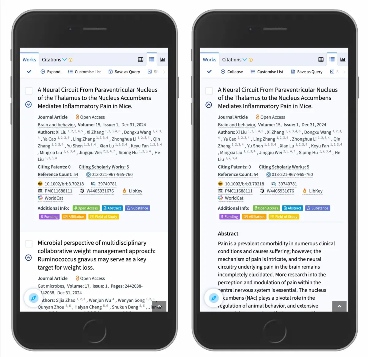
Industry case studies, such as the scholarly search platform Lens.org, demonstrate how proper execution of the caret icon on mobile interfaces dramatically improves data discovery. By utilizing a clean caret-down for collapsed search facets and transitioning to a caret-up upon expansion, applications can present complex, deeply nested data trees without overwhelming the user.
Future Outlook: The Next Generation of Accessible, Intuitive Navigation
As digital interfaces continue to evolve across an ever-expanding array of form factors—from ultra-wide desktop monitors and foldable smartphones to augmented reality (AR) headsets and voice-assisted screenless displays—the fundamental principles of human-computer interaction remain anchored in cognitive psychology.
Accessibility and Screen Readers
The future of accordion design is intrinsically linked to web accessibility (WCAG standards). As developers refine how interactive disclosure widgets are built, ensuring robust ARIA attributes (aria-expanded, aria-controls) is just as vital as choosing the correct visual icon. A sighted user relies on a caret to understand state; a visually impaired user relying on a screen reader depends entirely on proper semantic markup communicating whether the accordion is open or closed. Future design systems will treat visual iconography and screen reader accessibility as a unified, inseparable requirement.
The Death of Superfluous UI Decors
As we look ahead, the prevailing trend in enterprise and consumer software design is functional minimalism. The era of hyper-stylized, custom, skeuomorphic accordion icons is giving way to clean, system-standard typographic indicators. Designers are realizing that users do not want to relearn how basic navigation works on every new website they visit. Familiarity breeds efficiency.
Summary of Golden Rules for Accordion Design
To future-proof your UI/UX designs against common usability failures, adhere to these core tenets:
Default to the Caret: Use a downward-pointing caret ($nabla$) to indicate collapsed accordion states, and transition it appropriately upon interaction.
Acknowledge Text Links Directly: If a title should take the user to a new page, make it a text link and underline it. Do not attach complex dropdown behaviors to standard page-navigation links.
Abolish Split Menus: Eliminate configurations where the label and the icon perform entirely different actions. Keep hit targets unified and predictable.
Embrace Simplicity: Resist the urge to overcomplicate menus with decorative arrows and overloaded symbols. When in doubt, simpler is invariably better.
By aligning interface design with proven human behavior and rigorous empirical research, we can build digital spaces that are not only visually appealing, but fundamentally intuitive, accessible, and frictionless for every user.