In the realm of digital product design and software engineering, a persistent paradox remains: naming is simultaneously the easiest task to begin and the hardest to master. Whether establishing a cohesive design system, writing scalable CSS classes, mapping multi-brand design tokens, or defining user-facing features, the words chosen by teams fundamentally shape product architecture. Language acts as the bridge between abstract concepts and concrete execution. Yet, it is precisely this linguistic bridge that often fractures under the weight of miscommunication, resulting in siloed workflows, redundant components, and frustrated users.
Across industries, cross-functional teams routinely suffer from "dialect fragmentation." Designers speak the language of visual hierarchy and spatial relationships; developers operate within the strict taxonomy of components, props, and states; product managers focus on business metrics and feature adoption; and users think purely in terms of immediate utility and intuitive workflows. When these dialects collide, confusion reigns.
This comprehensive guide explores the structural anatomy of naming in UI/UX design. Drawing on industry-leading methodologies, open-source taxonomies, and real-world case studies from major tech ecosystems like Intuit and Vodafone, we examine how to establish a unified lexicon. By leveraging practical resources for naming code, color palettes, layers, design tokens, and entire product features, organizations can eliminate cognitive friction, streamline collaboration, and elevate the overall user experience.
Detailed Chronology: The Evolution of Naming Systems in Digital Design
To understand why systematic naming has become a cornerstone of modern product development, one must look at how digital creation scaled over the past two decades.
Phase One: The Wild West of Web Development (Late 1990s – Early 2010s)
In the early days of the web, naming conventions were largely ad-hoc. Developers wrote HTML classes based on immediate visual appearance (e.g., .blue-box, .big-bold-text), while designers organized Photoshop layers with arbitrary titles like Layer 1 copy 3 or Rectangle 42. As web applications grew in complexity, this approach collapsed under its own weight. A simple redesign required rewriting thousands of lines of code because components were tightly coupled to hardcoded visual attributes rather than semantic roles.
Phase Two: The Methodology Boom (2011 – 2017)
Recognizing the fragility of unstructured code, the engineering community introduced rigorous naming methodologies. Systems like BEM (Block, Element, Modifier) revolutionized CSS architecture by enforcing predictable, hierarchical class names (block__element--modifier). Simultaneously, design tools evolved, prompting design teams to adopt structural layer naming to mirror code architecture. However, a significant gap remained: designers and developers still maintained entirely separate vocabularies, leading to translation errors during handoffs.
Phase Three: The Rise of Design Systems and Tokens (2018 – Present)
The maturation of design systems—cemented by tools like Figma and advanced token pipelines—shifted the focus from mere styling to system-wide variables. Companies realized that scale required a unified taxonomy spanning across brands, platforms, and themes. Industry leaders began treating tokens as foundational infrastructure. Today, naming is no longer viewed as an afterthought for individual contributors; it is recognized as a strategic discipline requiring governance, automated validation, and cross-disciplinary consensus.
Supporting Context & Metrics: The Cost of Poor Naming
Poor nomenclature is rarely recognized as a direct financial drain, yet its impact on engineering velocity and product adoption is profound.
The Developer Tax: Studies on codebase maintainability suggest that developers spend up to 70% of their time reading and comprehending existing code rather than writing new lines. Vague or overly specific variable and class names exponentially increase cognitive load, slowing down feature delivery.
The Discoverability Gap: In UX design, low feature adoption is frequently misdiagnosed as a lack of user need when it is actually a discoverability failure caused by poor naming. If a feature’s title does not match the user’s mental model, they will neither discover nor understand it.
Cross-Disciplinary Friction: Misalignment between product management, design, and engineering creates translation loops. When a designer calls a component a "Card," a developer refers to it as a "Panel," and the marketing team promotes it as a "Tile," internal documentation becomes a labyrinth of synonyms.
Strategic Frameworks: How to Name Everything in Your Digital Ecosystem
Navigating the complexities of nomenclature requires targeted strategies for every layer of the product stack. Below is a breakdown of best practices, tools, and methodologies curated from top industry practitioners.
1. Naming Code, Classes, and Functions
When writing HTML classes, CSS properties, or JavaScript functions, finding the right term often requires looking beyond standard technical dictionaries.
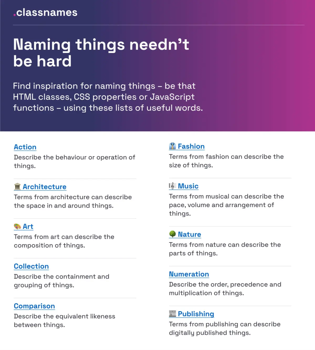
The Resource: Developers and designers struggling to find fresh terminology can turn to Classnames (created by Paul Robert Lloyd). This platform provides thematically grouped lists of words that encourage thinking outside the box.
Beyond the Obvious: Instead of relying on generic terms, Classnames offers vocabulary drawn from nature, art, theater, music, architecture, fashion, and publishing. These themed collections help establish precise metaphors for component behavior, hierarchy, and grouping without resorting to clunky naming patterns.
2. Naming Colors Systematically
Hex codes and RGB values are machine-readable, but they are entirely devoid of human context. Managing color systems requires memorable, descriptive names.
The Repository: David Aerne maintains a massive open-source repository of color names via Color Names, featuring over 30,000 unique color designations sourced from references and thousands of user contributions.
Interactive Discovery: Utilizing companion tools like Color Parrot, teams can easily input color values to find established, human-readable names. Maintaining a shared color lexicon prevents teams from creating redundant tokens for nearly identical hues.
3. Structuring Layers, Groups, and Components
In design files (such as Figma or Sketch), chaotic layer panels destroy scalability. Javier Cuello’s Design Best Practices for Naming establishes clear criteria for organizing layers and components.
The Core Principles: An effective layer or group name must be:
Logical in structure: Following a predictable top-to-bottom or left-to-right hierarchy.
Short and meaningful: Striking the balance between brevity and clarity.
Universally understood: Free of personal jargon or obscure insider acronyms.
De-coupled from visual properties: Avoiding names like Red Button in favor of semantic roles like Primary Action.
4. Designing a Flexible Design Token Taxonomy
As multi-brand corporations scale, their design tokens must adapt across diverse product lines. A masterclass in this domain is Intuit’s design token taxonomy, detailed by Nate Baldwin.
Overcoming Silos: Intuit faced the challenge of unifying brands as diverse as Mailchimp, QuickBooks, TurboTax, and Mint under a single architectural umbrella.
The Taxonomy Shift: By establishing a multi-tiered token taxonomy, they separated raw foundational values (primitives) from context-aware semantic tokens. This allowed different brands to swap themes effortlessly while preserving underlying structural integrity.
The Vodafone Blueprint: Similarly, the Vodafone UK Design System team published their Variables Taxonomy Map in Figma. Built on top of Nathan Curtis’s foundational token research, the Vodafone map illustrates a four-tier collection system—moving seamlessly from brand primitives to semantics and page-level implementation.
Interactive Tooling: For teams looking to build their own systems, Romina Kavcic’s Design Token Naming Guide + Builder offers an interactive framework to configure naming structures incorporating components, categories, states, and roles, paired with an inventory spreadsheet for seamless auditing.
5. Identifying Standard UI Component Names
When unsure what to call a recurring interface element, looking at established design systems is the fastest path to alignment.
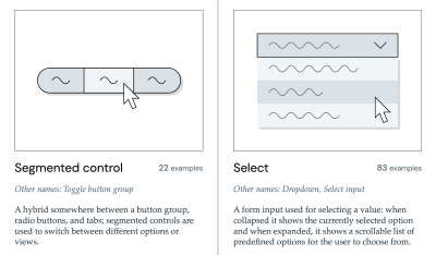
The Component Gallery: Created by Iain Bean, The Component Gallery catalogs real-world interface components from dozens of design systems. Covering over 50 UI components—from accordions to visually hidden utilities—it lists every alternative name an element goes by in the wild.
Visual Dictionaries: Supplementary resources like Name That UI provide a quick visual lookup for common interface patterns, bridging the gap between colloquial descriptions and formal design system nomenclature.
6. Naming User-Facing Features for Maximum Adoption
Erin Gannon’s practical guide, “What Do We Call This Thing?”, tackles the psychological barrier of feature discoverability. Low adoption rates are frequently caused by internal, engineering-centric feature names that fail to resonate with users.
Jobs-To-Be-Done (JTBD): Feature names should be driven by user needs and concrete outcomes.
Emulating the User: The golden rule of feature naming is to adopt the user’s vocabulary. By conducting user interviews and asking participants to describe a workflow in their own words, product teams can align feature titles with real-world mental models, accelerating trial, understanding, and integration into existing habits.
7. Naming Products and Services
At the highest macro level, naming a product or service requires balancing legal availability, cultural resonance, and brand positioning.
The Onym Repository:Onym serves as an open-source clearinghouse for product naming, organizing methodologies, brainstorming frameworks, vetting exercises, sprints, etymological resources, and recommended reading for naming agencies and creators alike.
Official Industry Insights & Expert Consensus
To synthesize how leading design authorities view the state of nomenclature, industry experts consistently emphasize governance over guesswork.
"The right name is the one that is well-understood and actively used by both the internal team and the end-users. So much operational time is wasted simply because designers, developers, product managers, and users are talking about the exact same artifact using entirely different dialects."
— Vitaly Friedman, UX Consultant & Founder of Smashing Magazine
Industry consensus stresses that naming conflicts should never be ignored. When overlapping terminology is identified, it must be logged into a dedicated backlog for systematic resolution. Treating nomenclature as an active design deliverable—rather than a trivial typing exercise—drastically reduces cognitive friction and empowers cross-functional teams to build better products together.
Future Outlook: The Next Generation of Semantic Design
Looking forward, the discipline of naming is poised for automated integration. As design systems mature and AI-driven interface tools become ubiquitous, the manual burden of naming layers, tokens, and variables will increasingly be assisted by intelligent linting and semantic mapping tools.
However, automation will not replace human consensus; rather, it will demand higher precision from it. As AI interfaces require hyper-contextualized prompts and structured component schemas, the clarity of an organization’s underlying taxonomy will dictate its technological agility. Companies that invest in robust naming conventions today are building the semantic foundation required to scale seamlessly across multi-platform, multi-modal digital futures.