

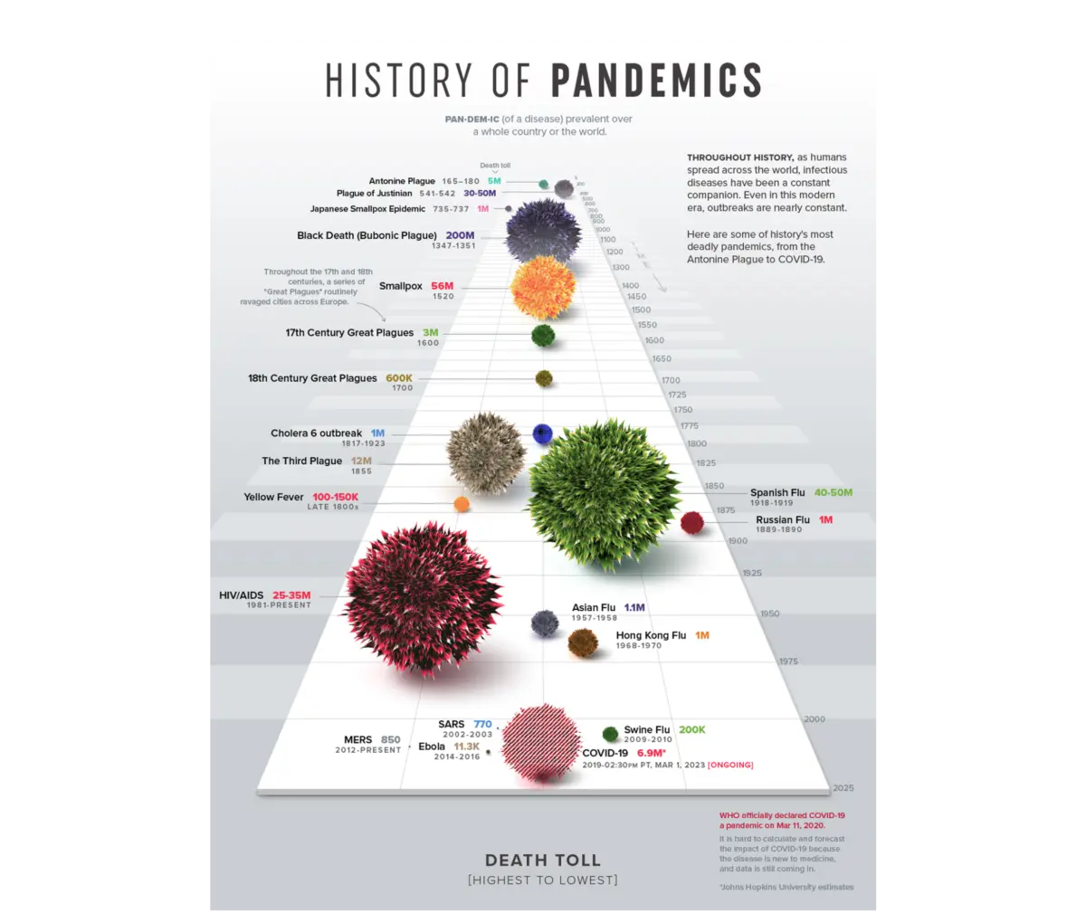
Executive Overview
In the modern enterprise, data has never been more abundant. Walk into any corporate boardroom or weekly standup, and you will find an alphabet soup of performance metrics, real-time tracking platforms, and beautifully rendered dashboards covering everything from sales pipeline velocity to product adoption. The technical barriers to creating these interfaces have dropped to nearly zero, empowering cross-functional teams to spin up custom analytics suites with just a few clicks.
And yet, a curiously repetitive ritual plays out across industries every single day: an analyst shares a freshly generated deck, the room nods politely in unison, and the meeting adjourns without a single concrete decision or clear direction.
When this happens, the data itself almost invariably takes the blame. Stakeholders complain that the numbers weren’t granular enough, that the tracking parameters were incomplete, or that leadership simply needs more time—and more data points—before taking action. But according to data and design strategist Meriem Benhabiles, the underlying numbers are rarely the culprit.
The core issue is far more fundamental: nobody designed the interface to deliver insights.
Too often, charts are built based purely on what data happens to be available, rather than the specific questions that need answering. Audiences are assumed rather than thoroughly understood, and the critical question of what should actually change as a result of viewing the data is bypassed entirely.
This article explores the intersection of data visualization and User Experience (UX)—two disciplines that historically rarely speak to the same language, despite solving the exact same underlying problem. By treating data presentation through a rigorous UX framework, organizations can shift dashboards from passive, decorative collections of charts into functional, decision-making engines.
Detailed Chronology: The Evolution of Data Presentation
To understand why contemporary dashboards so frequently fail, we must look backward to examine how the philosophy of data representation has evolved over the past half-century.
The Diagnostic Era (1973)
The foundational epiphany of data visualization as a diagnostic tool arrived in 1973, when statistician Francis Anscombe published a landmark paper. Anscombe constructed four distinct datasets that were statistically identical: they shared the exact same mean, variance, correlation coefficient, and regression line. If you only ran the mathematical numbers, they were indistinguishable.
However, the moment Anscombe plotted those four datasets onto scatterplots, they revealed profoundly different underlying realities. Anscombe’s Quartet taught statisticians and analysts a timeless lesson: visualisation reveals the operational truth that raw numbers conceal.
The Aesthetic Era and the Quest for Purity
In the decades that followed, data visualization pioneers like Edward Tufte sought to codify the rules of clean graphic communication. Tufte’s "data-ink ratio"—the principle that every mark on a chart should serve the data rather than decorate it—became a core dogma of the field. The goal was visual hygiene, minimalism, and unadulterated clarity.

While this approach works wonderfully for isolated charts, it presents a dangerous blind spot in corporate environments. A chart is never read in a vacuum; it is consumed by a human being under specific psychological, operational, and political pressures. Stripping a chart down to its absolute minimalist form often inadvertently strips away the contextual layers that decision-makers desperately need. Simplicity, as it turns out, is not the ultimate goal. Appropriate complexity is.
The Rise of the Modern Dashboard (2010s–Present)
As cloud infrastructure exploded, business intelligence (BI) tools democratized data access. Suddenly, every department—marketing, engineering, human resources, and sales—could build complex dashboards overnight.
Unfortunately, volume outpaced utility. Instead of empowering decision-makers, organizations built "data graveyards"—dense, multi-layered interfaces that overwhelmed cognitive capacity. The modern challenge is no longer about accessing data; it is about translating data into human intent. This realization has triggered the convergence of data visualization and UX design.
Supporting Context & Metrics: The 80% Rule of Data UX
The central thesis of a UX-driven approach to data is stark: roughly 80% of the work that determines whether a dashboard succeeds happens before a single chart is ever drawn.
This high-leverage upstream work relies on three foundational questions. When institutionalized, these inquiries permanently alter what teams notice, what they question, and what they push back on during project kickoffs.

[ Upstream UX Framework ]
         │
         ├── 1. Context: What are we trying to show? (Metric + Population + Action)
         ├── 2. Audience: Who is this for? (Familiarity + Accountability)
         └── 3. Insight: What changes when this lands? (Information vs. Action)
1. Context: What Are We Trying To Show With This Data?
Most data projects start backward. Teams pull whatever metrics their internal analytics tools already track and build visualisations around them, treating the existing database schema as the absolute boundary of what is possible.
Vague goals like "Show me how the product is performing" are useless. In contrast, a goal framed as "Identify which features drive retention among users who signed up in Q1" succeeds because it contains three vital elements missing from the former: a metric, a population, and an implied action.
- The Data-First Trap: Yields a bloated dashboard with every available metric, leaving everyone asking, "What do we actually change?"
- The Context-First Approach: Imposes constraints. By filtering out 90% of structural noise, designers can build targeted interfaces—such as a clean funnel chart that immediately flags a payment-screen bottleneck in an e-commerce checkout flow.
2. Audience: Who Is This For, And How Do They Think?
Designing for an audience requires analyzing two distinct vectors: familiarity and accountability.
- Familiarity (Data Literacy): Does the user read charts instinctively, or does a complex multi-layered visualization create cognitive friction? Handing a dense, granular path-exploration graph to an executive who needs a high-level overview is like giving map grid coordinates to someone who navigates purely by local landmarks.
- Accountability (Stakes): A chart showing a 12% decline carries vastly different psychological and political weight for the executive directly responsible for that business unit than it does for the analyst simply exporting the spreadsheet.
By adjusting the "density dial," designers can serve both ends of the spectrum: providing high-density diagnostic graphs for analysts doing deep discovery, and highly synthesized, aggregated overviews for executives making rapid budget allocations.
3. Insight: What Should Change Once This Data Lands?
There is a massive chasm between information and insight. Information is simply what the data displays; insight is the specific decision, cognitive shift, or operational course correction triggered by seeing it.

Consider a sudden 15% drop in enterprise booking rates:
- Information-Driven Dashboard: Sounds an immediate alarm with a flat metric, sparking executive panic and sending UX designers on a wild goose chase to rewrite functional app code.
- Insight-Driven Dashboard: Maps the drop against traffic sources and concurrent marketing campaigns, instantly revealing that core user conversion is stable while sitewide rates were merely diluted by a massive influx of low-intent click traffic from a newly scaled ad spend. The team avoids a costly, unnecessary product redesign and instead pauses the underperforming campaign.
Practical Application: A B2B SaaS Case Study
To see this framework in action, consider a real-world enterprise project undertaken for a B2B SaaS platform specializing in talent management and employee competency tracking.
The platform captured a massive footprint of daily telemetry. The initial brief from leadership was characteristically open-ended: "We have an immense archive of user activity; now we need to present it to enterprise teams."
Following a data-first approach would have resulted in a data graveyard. Instead, the project team applied structured UX principles to transform the telemetry into an active decision-making tool.
Upstream Architecture & Layout Decisions
Rather than defaulting to standard linear bar charts, the design team evaluated the core cognitive task required of end users: Across eight distinct competency areas, where are my relative strengths and gaps?

- The Radar Chart Solution: By mapping data across axes radiating from a central point using polar coordinates, the interface connects data points to form a unified polygon. An even, balanced shape instantly signals well-rounded proficiency, while a sharply skewed shape immediately highlights critical skill vulnerabilities.
- Unified Mental Models: A strict color-coding system established during early branding sessions was hardcoded directly into the data model. By the time users first opened the dashboard, the cognitive language was already intuitive; they did not need to be taught how to read the interface.
The Impact on Organizational Behavior
Following the deployment of personalized individual workspaces and side-by-side team comparison tools, the results were profound:
- Elevated Engagement: Weekly active usage of the platform’s analytics features rose significantly. Managers stopped opening the tool once a month to pull static post-mortem reports; instead, they utilized it every Monday morning for forward-looking operational planning.
- Reduced Churn: Enterprise customer churn dropped to historic lows as managers leveraged early visual cues to schedule supportive catch-ups with team members before minor skill gaps evolved into critical project failures.
Future Outlook: The Next Generation of Data UX
As artificial intelligence and automated analytics become deeply embedded in enterprise software, the role of human data visualization is shifting. We are moving away from static dashboards that simply render historical tables and toward interactive, conversational, and context-aware data experiences.
However, technology alone cannot solve the human communication gap. Whether designing an AI-driven predictive analytics suite, an executive performance deck, or a public-facing infographic, the mandate for creators remains unchanged:
- Define the human question before opening any design tool or database query.
- Honor audience literacy and accountability by modulating information density.
- Design for action, ensuring that every visual element carries a clear implication for what happens next.
When data visualization is treated as an upstream architectural choice rather than a downstream cosmetic task, spreadsheets and metrics cease to be passive historical logs. They become powerful navigational instruments capable of steering organizations purposefully into the future.
