In the fast-paced ecosystem of digital product design, staying ahead of visual trends is often treated as a prerequisite for survival. Designers and developers routinely borrow from the latest styling playbooks—neo-brutalist layouts, high-contrast monochrome experiments, fluid gesture-driven navigation, and gamified dopamine loops—to capture user attention and project technological innovation. However, a profound contradiction emerges when these standard aesthetic and interaction trends are injected into the realm of mental health and wellness applications (mHealth).
Recent empirical data exposes a staggering crisis in user retention within the mental health app sector. Studies consistently show that nearly 95% of users who download and open a mental health application on Day 1 abandon it completely by Day 30, with median retention hovering at a meager 3.3%. Even market-leading platforms hemorrhage approximately 50% of their active user base within the first ten consecutive days.
While multiple factors drive this catastrophic drop-off, a critical culprit is the fundamental mismatch between trend-driven UI goals and the psychological reality of the user. Unlike e-commerce or productivity apps, users rarely open a mental health application out of casual curiosity or leisurely exploration. They arrive driven by acute need: overwhelmed, anxious, depressed, exhausted, or emotionally distressed. In these moments of diminished cognitive capacity, an unconventional icon, a hidden menu, a jarringly bright color scheme, or a non-skippable celebration animation ceases to be a delightful surprise. Instead, it becomes an unwelcome cognitive obstacle, eroding trust and pushing an already fragile user to close the app—often for good.
Detailed Chronology: The Evolution of Digital Therapeutics vs. Modern UI
To understand how the mental health application market arrived at this retention crisis, one must examine the parallel tracks of user-interface (UI) evolution and clinical psychology.
Phase 1: The Clinical Translation Era (Early 2010s): Early mental health apps were essentially digital worksheets. Built by clinicians or academic researchers, they prioritized absolute functional utility over aesthetic polish. While they suffered from dry, uninspiring interfaces, their predictable structures made them reliable tools for tracking cognitive behavioral therapy (CBT) exercises. However, engagement was low because they failed to meet modern expectations of digital usability.
Phase 2: The Consumerization and Gamification Boom (Mid-to-Late 2010s): Seeking to combat low engagement, developers began adopting design patterns from the broader consumer tech market. Meditation and sleep apps introduced lush illustrations, soothing background audioscapes, and smooth micro-interactions. While this successfully drove initial downloads, it also marked the beginning of content bloat and sprawling digital libraries.
Phase 3: The Trend-Chasing and Visual Fashion Cycle (2020s–Present): Driven by competitive pressures and the desire for social media validation (such as viral Dribbble or Behance showcases), product teams began integrating high-friction aesthetic trends like neo-brutalism, complex glassmorphism, abstract iconography, and aggressive engagement hooks (streaks, push notifications, and forced rewards).
The Current Crisis: Today, the industry faces a reckoning. The uncritical adoption of trend-forward UI has collided with vulnerable user states, resulting in severe abandonment metrics. Thoughtful designers are now pushing back, advocating for an evaluative framework that prioritizes cognitive relief and emotional alignment over superficial novelty.
Supporting Context & Metrics: The Human Cost of Cognitive Friction
The tension between modern UI trends and therapeutic utility manifests across five distinct friction points: cognitive strain, emotional mismatch, interaction novelty, accessibility barriers, and coercive engagement loops.
1. Cognitive Friction and Executive Dysfunction
When a user experiences acute anxiety, depression, or burnout, their executive functioning—the mental capacity required to plan, focus, remember, and make decisions—is severely compromised. Research in digital health highlights that high-complexity interfaces require active interpretation. Neo-brutalist high-contrast blocks force the visual cortex to work harder; hidden hamburger menus or gesture-based swipes demand spatial memory; unlabeled abstract icons force the user to guess rather than instantly recognize functionality.
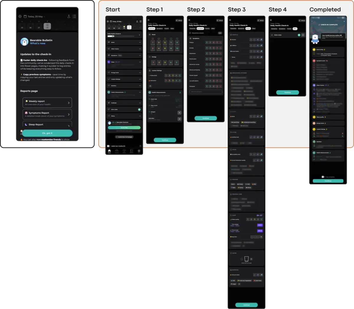
When an app forces a distressed user to solve interface puzzles just to reach a panic-breathing exercise or a grounding tool, it imposes an unacceptable cognitive tax. If the path to support is obscured by surprise paywalls, crowded home screens, or dense dashboards (such as those found in hyper-comprehensive symptom trackers), the frustrated user will abandon the session. Conversely, linear, low-friction flows—such as dedicated voice-input options or prominent, singular "Quick Relief" entry points—drastically lower the barrier to entry, accommodating low-capacity mental states.
2. Emotional Tone Mismatch and Trust Erosion
Visual language communicates empathy before a single word is read. Studies investigating color psychology and aesthetics in mHealth apps reveal a striking insight: users in psychological distress show a pronounced preference for subtlety. They gravitate toward muted palettes, grounded earth tones (such as soft greens, taupes, and deep slates), and clean, uncluttered visual breathing room.
Bright, hyper-saturated colors and relentlessly cheerful illustrations—while intended to inspire optimism—frequently create a jarring, invalidating emotional mismatch for someone grappling with grief or severe depression. Furthermore, mechanics that abruptly shift tone, such as celebratory confetti or discount wheels immediately following the logging of a painful emotional state, erode trust by signaling that the app is more interested in monetization or metrics than authentic support.
3. The Inconsistency Penalty of Novelty
Routine and predictability are foundational pillars of mental health management. While consumer apps rely on novelty to keep users entertained, mental health tools require stable information architectures. When a trendy redesign alters core navigation patterns or forces users to relearn how to access their daily check-ins, it breaks the predictable routine necessary for habit formation. Non-skippable gamification screens—while engaging for casual users—become burdensome interruptions for individuals attempting to complete a single, quiet task during a high-stress day.
4. Silent Exclusion via Accessibility Failures
Many trending UI choices are inherently exclusionary. Minimalist aesthetics often sacrifice text contrast, violating Web Content Accessibility Guidelines (WCAG) and shutting out users with visual impairments. Gesture-only navigation marginalizes individuals with motor difficulties or tremors. Furthermore, visually dense, rapidly animated interfaces can trigger sensory overload or panic in users with neurodivergent conditions or attentional disorders. In mental health tech, accessibility cannot be treated as an afterthought; it is a vital clinical constraint.
5. The Coercion Paradox: When "Engagement" Becomes Pressure
Adopting growth-hacking patterns from the gaming and social media industries—such as aggressive streak counters, guilt-inducing notifications, and urgency-driven copy—presents a severe psychological risk. While streaks can successfully motivate habits in productivity apps, in a non-linear mental health recovery context, a broken streak is frequently internalized as personal failure. Supportive design must replace punitive metrics with forgiving systems that encourage return without inducing shame.
Official Statements & Expert Perspectives
Industry leaders and researchers increasingly emphasize the need for a paradigm shift in mental health product design.
"In mental health technology, sustainable retention is earned not by capturing attention, but by becoming a consistently respectful and helpful presence in a user’s life." — Kat Homan, UX Designer & Researcher
Reflecting on the psychological impact of digital interfaces, clinical usability experts emphasize that visual design in this sector is a therapeutic variable, not merely a branding exercise. When products prioritize the aesthetic validation of the designer over the emotional capacity of the user, the technology actively undermines its own clinical purpose.
Furthermore, global health authorities stress the urgency of accessible, reliable digital infrastructure. With the World Health Organization (WHO) reporting that over one billion people globally live with mental health conditions—and cases of anxiety and depression rising significantly over the last decade—the stakes for digital therapeutics have never been higher. Products deployed at this scale must be engineered for universal reliability, ensuring that vulnerable populations are never alienated by transient design fads.
Future Outlook: A Practical Evaluation Framework for Designers
As the digital health sector matures, the era of uncritical trend-chasing in mHealth apps is drawing to a close. To bridge the gap between initial downloads and long-term retention, product teams must adopt rigorous evaluation frameworks before deploying new visual or interactive patterns.
Every proposed UI trend should be subjected to a five-point contextual audit:
Does it reduce cognitive load when the user has the least mental energy to spare?
Does the emotional tone align with the psychological reality of someone arriving in distress?
Does it preserve navigational stability, supporting routine rather than demanding continuous relearning?
Is it fully accessible across diverse visual, motor, and cognitive spectra?
Does it respect user autonomy, avoiding coercive pressure loops and punitive engagement metrics?
Ultimately, the most successful mental health applications of the future will not be those that shout the loudest or showcase the most experimental design trends. They will be those designed as quiet, trusted refuges—interfaces that step into the background, ensuring that the technology is never seen, but the support is deeply felt.