

Executive Overview
In the realm of digital product design, few user interface (UI) components are as ubiquitous—or as frequently mishandled—as the humble accordion menu. Designed to conserve precious screen real estate by collapsing and expanding content blocks, accordions serve as the structural backbone of modern mobile navigation, e-commerce categorization, and complex FAQ architectures. Yet, despite their widespread adoption, recent UX research reveals a startling amount of friction, cognitive fatigue, and user error stemming from seemingly minor design choices.
At the center of this usability debate are accordion icons: the small visual signifiers intended to telegraph whether a section is expanded or collapsed. Recent findings from the Nielsen Norman Group (NN/g) shed new light on how users interact with these symbols, challenging conventional wisdom regarding arrows, carets, plus-minus signs, and custom graphic markers.
Even more critically, the research issues a stern warning against the use of split menus—patterns where a text label navigates to a new page while an adjacent icon triggers the accordion drawer. By forcing users to split their mental models between two distinct actions within a single component, designers inadvertently introduce severe friction into the user journey.
This deep dive explores the psychological mechanics of accordion interactions, examines why certain icons consistently outperform others, dissects the hidden dangers of split-menu patterns, and outlines actionable rules of thumb for creating frictionless, intuitive digital experiences.
Detailed Chronology and Evolution of Accordion Design Patterns
To understand where modern accordion design has gone astray, it is helpful to trace its evolution from early web development paradigms to contemporary multi-device ecosystems.
The Early Web: Static Links and Page Bloat
In the infancy of the web, information architecture relied heavily on deeply nested page hierarchies. Every category click required a full page reload, steering users down rigid rabbit holes. As content volumes exploded, particularly with the advent of e-commerce and mobile-first browsing, this linear approach collapsed under its own weight. Designers needed a way to present dense taxonomies without overwhelming the viewport.
The accordion pattern emerged as a solution borrowed from desktop application design (think native file trees and expandable OS menus). However, translating a desktop paradigm governed by precise mouse pointers to touch-driven mobile screens introduced immediate challenges.
The Mobile Shift and the Rise of Custom Iconography
With the mobile boom of the early 2010s, screen space became the ultimate luxury. Accordions migrated from sidebars to primary navigation drawers and mobile menus. Eager to distinguish their brands and modernize their interfaces, product designers began experimenting with custom icons, trendy geometric markers, and dynamic directional arrows.

Unfortunately, this aesthetic experimentation often outpaced empirical usability testing. Designers assumed that users would intuitively grasp what a stylized arrow or a rotating chevron signified. In practice, users were left guessing whether a tap would redirect them to a dedicated landing page, slide a sub-menu open, or trigger an entirely unrelated site action.
The Empirical Reckoning: NN/g and Modern UX Research
Recognizing the widespread ambiguity surrounding disclosure patterns, user experience researchers began conducting rigorous empirical studies to measure actual user behavior. Rather than relying on designer intuition, studies like those published by the Nielsen Norman Group observed how real users interact with various icon sets, hit areas, and navigation structures.
The results challenged long-held assumptions. Researchers discovered that users do not differentiate between the tap target of an icon and its adjacent text label as cleanly as designers might hope. Instead, users treat the entire component block as a unified hit area, meaning that the choice of icon fundamentally alters user expectations across the entire interactive surface.
Supporting Context and Metrics: Decoding User Behavior and Icon Psychology
Why do users struggle so often with seemingly simple UI elements? The answer lies in cognitive load, mental models, and the semiotic overload of common graphical symbols.
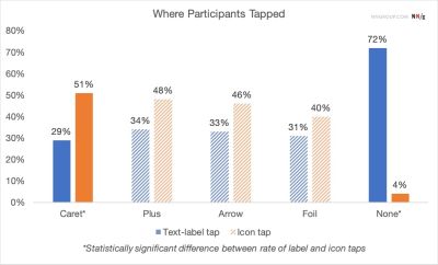
The "No Icon" Expectation
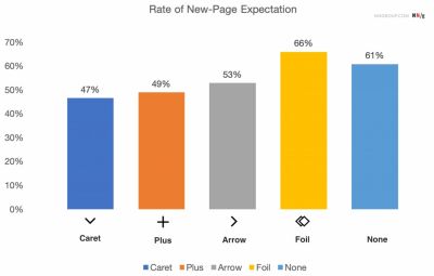
When an accordion menu item is presented with text alone—completely devoid of an expansion icon—user expectations are remarkably consistent. Research shows that without a visual signifier, users overwhelmingly expect that tapping the menu item will execute a primary navigation event: loading a completely new page.
This highlights a fundamental rule of digital affordance: absence of a disclosure icon equals navigation. When designers attempt to repurpose text-only labels to open accordions without signaling the behavior, users experience a jarring disconnect when a hidden menu drops down instead of taking them to the expected category hub.
The Semiotic Overload of Plus/Minus and Arrows
To solve the disclosure problem, interface designers historically turned to two primary icon families:
- Plus/Minus (+ / -): Long favored in desktop software, the plus sign theoretically signals "add" or "expand," while the minus signals "collapse." However, in modern web applications, the plus sign has been heavily overloaded. It can mean "add to cart," "save for later," "zoom in," or "create new entry." In multi-level navigation systems where several accordions are open simultaneously, a screen cluttered with plus and minus signs creates visual noise and cognitive ambiguity.
- Arrows and Chevrons (➡ / ⬇ / ⬆): Directional arrows are similarly burdened with multiple interpretations. A right-facing arrow often implies navigation ("go to this page"), while a down-facing arrow is intended to signal expansion. Yet, in practice, users frequently confuse these signals with scrolling indicators, pagination controls, or jump-links to specific page sections.
The Hit Area Reality
A critical insight from usability studies is that users tap with roughly equal frequency on both the text label and the accordion icon itself.

[ Text Label (User Expects Navigation) ] <---[ Icon (User Expects Expansion) ]---> THE SPLIT MENU TRAPBecause users do not restrict their taps exclusively to the icon when attempting to expand a menu, any design that segregates these actions creates an immediate usability trap. If a user taps the text label expecting the accordion to open, but the label is hardcoded as a text link to a landing page, the user is abruptly yanked away from their browsing flow.
Official Guidelines and Expert Insights: The Dangers of Split Menus
Among the most damaging anti-patterns in modern web design is the split menu—a configuration where the text label of a menu item links directly to a parent category page, while the adjacent icon handles the accordion expansion.
Why Split Menus Fail Usability Tests
At first glance, split menus appear to offer the best of both worlds: users can drill down into sub-categories via the icon, or visit the main category overview via the text label. In reality, usability testing repeatedly proves that split menus are deeply harmful to the user experience.
- Target Precision Failure: On mobile devices, tap targets are governed by human thumb accuracy. Forcing a user to distinguish between a tiny icon hit box and a text label hit box within the same row leads to constant mis-clicks.
- Broken Mental Models: Users do not anticipate that a single UI component has a split personality. When an accidental tap on the text label launches a heavy category page load while the user was merely trying to check sub-categories, frustration spikes.
- Cognitive Friction: Users are forced to consciously calculate where they are placing their finger rather than focusing on the content they are trying to discover.
The Alternative: Clear Hierarchy and Overview Links
To eliminate the need for split menus, best-practice interface design adopts a simpler, more robust architectural pattern:
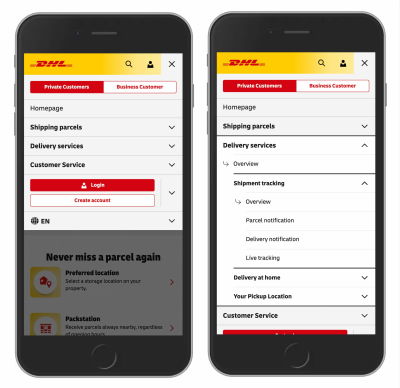
- Unified Tap Target: Tapping anywhere on the parent category row (both text and icon) triggers the accordion expansion, exposing the sub-menu options.
- Dedicated Overview Links: To provide access to the parent category’s landing page, designers should include a clear, explicit "Overview" or "All [Category Name]" link as the first item inside the newly exposed sub-menu.
This approach, successfully utilized by large-scale platforms like DHL and major e-commerce hubs, completely removes ambiguity. The parent row’s sole job is navigation/expansion control, while the sub-menu safely houses the link to the primary category page.
Future Outlook: Embracing Simplicity and the Ascendancy of the Caret
As digital interfaces continue to evolve across an expanding array of form factors—from ultra-wide desktop monitors to foldable smartphones and spatial computing displays—the core principles of human-computer interaction remain anchored in clarity and predictability.
The Caret as the Gold Standard
Based on comprehensive empirical data, the safest, most universally understood icon choice for accordion menus is the caret or triangle pointing down (▼) in its collapsed state, transitioning to a caret pointing up (▲) or sideways (▶) upon expansion.
Unlike overloaded plus signs or ambiguous directional arrows, the caret has established a clear, unambiguous digital vernacular. Users instantly recognize it as a disclosure indicator.
The Rule of the Underline
When an element is explicitly intended to function as a hyperlink rather than an accordion controller, interface designers should rely on the oldest, most reliable convention in web history: the underline.
While minimalist underlines may lack the trendy aesthetic appeal of custom floating icons or complex multi-state graphical animations, they work flawlessly every single time. They require zero cognitive load, carry no secondary interpretations, and immediately communicate clickability to users of all technical skill levels.
Summary Recommendations for Product Teams
- Ditch the Split Menu: Never split the action between a text label link and an icon expander. Use unified tap targets for accordions.
- Provide Explicit Overview Links: Place a dedicated overview link inside the expanded drawer if users need access to the parent category page.
- Standardize on Carets: Default to the downward-facing caret (▼) for collapsed accordions and update its orientation upon interaction.
- Keep Text Links Underlined: If a label is a direct link, underline it. Do not rely on ambiguous icons to do the job of basic typographic affordance.
Ultimately, the ongoing evolution of interface design teaches us a humbling lesson: innovation for its own sake often breeds friction. In the perpetual quest to make digital products more engaging, simpler is almost invariably better. By respecting established user mental models and eliminating needless complexity, designers can build web experiences that are not only visually polished, but fundamentally intuitive and frictionless.
