The global digital health revolution has transformed how society approaches wellness, offering instant access to therapy, meditation, and crisis management tools straight from our pockets. Yet, behind the polished marketing campaigns and soaring download metrics lies a quiet, measurable crisis: an epidemic of application abandonment.
Data underscores a staggering retention collapse. Nearly 95% of users who open a mental health application on Day 1 completely abandon it by Day 30, with a median 30-day retention rate languishing at an abysmal 3.3%. Even industry giants suffer staggering attrition, losing roughly 50% of their user base within the first ten days.
While multiple variables drive this mass exodus, emerging UX research points to a core culprit: the uncritical adoption of trend-driven user interface (UI) patterns. In an industry segment defined by human vulnerability, cognitive fatigue, and acute distress, the chase for visual novelty—such as neo-brutalist contrasts, hidden navigation, and gamified addiction loops—frequently works against the user.
When an individual opens a mental health application, they are rarely driven by curiosity. They arrive stressed, anxious, overwhelmed, or exhausted. In these compromised, low-capacity states, an unconventional icon, a confusing gesture, or a flashy animation ceases to be a "delightful surprise." Instead, it acts as an additional cognitive load—and a direct invitation to disengage forever.
This article introduces an investigative evaluation framework designed to help product teams assess whether trendy visual and interaction patterns truly support the healing process, or if they quietly undermine utility, trust, and retention.
Detailed Chronology: The Evolution of mHealth Design and Its Misalignment
To understand how user experience design lost its way in the mental health sector, we must trace how aesthetic trends migrated from commercial tech into clinical and therapeutic spaces.
Phase 1: The Consumerization of Healthcare (2015–2018)
As smartphones saturated the global market, digital health startups flooded app stores. Eager to compete with consumer tech giants (like social media and e-commerce platforms), developers adopted high-energy engagement loops, bright color palettes, and frictionless onboarding flows. The underlying philosophy assumed that more screen time equated to better health outcomes.
Phase 2: The Gamification Era (2019–2022)
During the pandemic, demand for remote mental healthcare surged. To keep users accountable, developers imported gamification mechanics—daily streaks, celebratory confetti, and milestone badges—directly from productivity and gaming apps. While effective for habit formation in fitness trackers, these mechanics inadvertently introduced performance pressure and guilt for users experiencing clinical depression or burnout. A broken streak transformed from a missed task into a visible marker of personal failure.
Phase 3: The Neo-Minimalist and Avant-Garde Disruption (2023–Present)
Today, modern UI design is dominated by aesthetic maximalism or stark minimalism: neo-brutalism, dark-mode glassmorphism, abstract iconography, and hidden gesture-based navigation. While these trends capture attention on design portfolios and Dribbble, they create catastrophic friction for users with limited cognitive bandwidth. The industry has reached an inflection point: design must pivot from capturing attention to offering refuge.
Supporting Context & Metrics: The High Cost of Trend-Driven Design
The World Health Organization (WHO) estimates that approximately one billion people globally live with a mental health condition, with depression alone impacting nearly 5% of adults. Over the past decade, cases of anxiety and depression have surged by 25%.
This massive, vulnerable population relies on digital tools when traditional healthcare systems are inaccessible or overwhelmed. However, research highlights a fundamental conflict of purpose:
Trend Design Goals: Capture attention, signal innovation, maximize session length, and prioritize visual novelty.
Mental Health Design Goals: Offer refuge, reduce cognitive strain, build trust, and provide immediate, low-friction utility.
When interface design ignores this tension, it triggers five major failure points that erode user trust and shatter retention.
1. Cognitive Friction: The Barrier to Healing
When a user experiences acute anxiety, even typing or making simple choices can feel insurmountable. Neo-brutalist layouts with stark contrasts, hidden menus requiring non-standard swipes, and abstract, unlabeled icons force users to decode the interface rather than receive help. Research shows that simple, predictable interfaces drastically reduce the time and effort required to engage, directly boosting retention. Conversely, complex interfaces transform a support tool into an obstacle course.
2. Emotional Mismatch: Tone Deafness in UI
Users in distress show a strong preference for visual subtlety—darker, grounded palettes, sleek looks, and uncluttered aesthetics. Cheerful, hyper-saturated colors can feel jarring and physically uncomfortable to someone experiencing a panic attack. Furthermore, mechanics like "discount wheels" or celebratory confetti after logging a severe depressive episode create a profound emotional mismatch that shatters trust.
3. The Inconsistency Penalty: Novelty Versus Routine
Mental health relies heavily on routine and predictability. Novel interaction patterns—such as non-standard swipe gestures or continually changing navigation layouts—force users to relearn the product during every session. When an exhausted user cannot immediately find their way to a breathing exercise or crisis tool, they simply close the app.
4. Silent Exclusion: Compromising Accessibility
Minimalist low-contrast text fails users with visual impairments. Gesture-only navigation marginalizes those with motor difficulties. Because mental health populations disproportionately intersect with accessibility needs, choosing a trendy aesthetic over WCAG 2.2 compliance is an active decision to exclude the most vulnerable users.
5. The Coercion Paradox: When Engagement Becomes Pressure
Aggressive notifications, rigid streaks, and urgent upsell pop-ups turn a therapeutic refuge into another demanding system. Sustainable retention in mental health is earned not by manufacturing dependency, but by acting as a respectful, reliable presence.
Official Statements and Industry Insights
Clinical researchers and digital product leaders emphasize that the metric for success in mHealth must shift from screen-time maximization to rapid emotional regulation and effortless access.
"In mental health technology, sustainable retention is earned not by capturing attention, but by becoming a consistently respectful and helpful presence in a user’s life." — UX Design Research
"Crucially, improving engagement depends less on which UI trends you follow than on a single test applied to each one of them: does a trend lower the cost of using the app when the user can least afford it?"
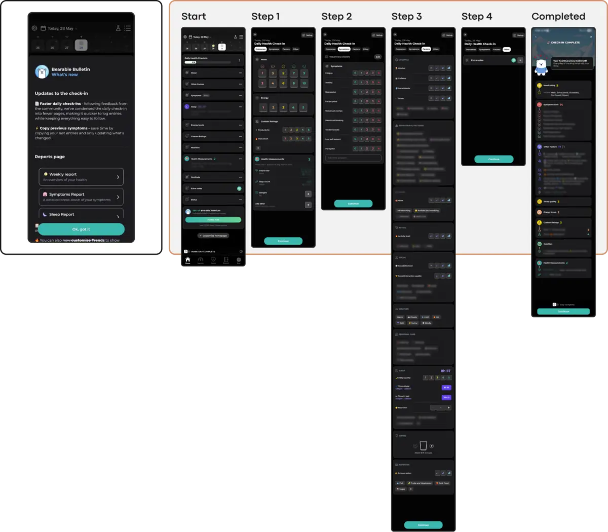
Pioneering applications are beginning to model this shift. For instance, platforms incorporating "Quick Relief" or "Hot Flows"—such as dedicated emergency entry points that permit immediate voice venting before transitioning into reflective exercises—demonstrate how structural empathy outperforms abstract UI fashion. By utilizing voice input as an alternative to typing, these interfaces bypass the cognitive paralysis associated with acute stress.
Future Outlook: A Practical Evaluation Framework
To reverse the retention crisis, product designers, clinical advisors, and developers must abandon the uncritical implementation of portfolio-driven UI trends. Instead, every interface pattern must be evaluated through a specialized, context-aware framework.
The 5-Point Mental Health UI Evaluation Checklist
Does it lower cognitive load during distress?
Test: Can an exhausted or panicked user navigate this screen with zero instructions or hesitation?
Does the emotional tone match the user’s reality?
Test: Does the color palette and micro-interaction style offer solace and subtlety rather than jarring, forced cheerfulness?
Is the navigation predictable and stable?
Test: Does the interface respect routine, avoiding unnecessary layout shifts or novel gestures that require learning?
Is it fully accessible by default?
Test: Does the design comply with WCAG 2.2 standards (contrast ratios, touch targets, alternative inputs) to prevent silent exclusion?
Are engagement mechanics non-coercive?
Test: Do retention loops (like streaks or reminders) support the user without inducing guilt, shame, or performance pressure?
Conclusion
UI trends can be genuinely inspiring; they win design awards and generate initial market buzz. However, in the realm of mental health and digital therapeutics, the ultimate benchmark of success is not whether an interface steals the spotlight—it is whether the support is truly felt. By prioritizing emotional alignment, accessibility, and radical simplicity over fleeting visual novelties, designers can build resilient, empathetic tools that users trust enough to return to in their moments of greatest need.