

Executive Overview
In the realm of digital product design and software engineering, a persistent adage echoes through every code repository, design system, and product roadmap: "Naming is hard." While software development has long grappled with this truism—famously immortalized by Phil Karlton’s remark that there are only two hard things in computer science: cache invalidation and naming things—the challenge extends far beyond lines of backend logic. Today, the friction of nomenclature permeates UI components, design tokens, color palettes, CSS classes, layer hierarchies, and overarching product features.
Language shapes cognition, dictating not only how practitioners conceptualize digital architecture, but also how cross-functional teams communicate. When designers, front-end developers, product managers, and end-users speak in disparate dialects, friction ensues. Misaligned terminology leads to ambiguous color variables, bloated HTML classes, misunderstood feature flags, and fragmented design systems.
This comprehensive guide explores the structural anatomy of naming in modern product development. By examining authoritative frameworks, open-source repositories, real-world case studies from industry leaders like Intuit and Vodafone, and expert methodologies, this article provides a practical blueprint for eliminating ambiguity. Whether you are scaling a multi-brand design system or attempting to boost feature discovery through intuitive user-centric phrasing, establishing a unified taxonomy is the definitive step toward seamless collaboration and scalable digital infrastructure.

Detailed Chronology & Evolution: From Arbitrary Labels to Systemic Taxonomies
To understand why modern naming requires rigorous methodology, one must examine how the digital landscape evolved from ad-hoc asset creation to enterprise design systems.
Phase 1: The Wild West of Web Development (Early 2000s)
In the nascent stages of modern web design, developers and designers operated in relative isolation. Naming conventions were largely personal or arbitrary. CSS classes were assigned based on immediate visual appearance (e.g., .red-box or .bold-text) rather than semantic purpose. In graphic design and early prototyping tools like Photoshop, layers were frequently left as Layer 1, Rectangle copy 4, or Group 22. This lack of structural integrity posed minimal risk for solo projects, but as codebases and product teams scaled, it catalyzed severe maintenance bottlenecks.
Phase 2: The Rise of BEM and Component-Driven Architecture (2010s)
As web applications grew in complexity, the industry recognized the urgent need for scalable styling architectures. Methodologies such as BEM (Block, Element, Modifier) emerged to bring order to CSS classes, encouraging developers to think in discrete, reusable components rather than monolithic style sheets. Concurrently, the advent of component-driven development shifted the focus from static pages to dynamic UI libraries. Designers began constructing atomic design systems, forcing a reckoning with how buttons, cards, and modals were labeled across both Figma files and production code.

Phase 3: The Enterprise Design Token Era (Present Day)
Today, digital product ecosystems are multi-platform, multi-themed, and multi-brand. The introduction of design tokens—agnostic variables storing design decisions like spacing, typography, and color—has elevated naming from a localized styling concern to a core architectural challenge. Modern engineering and design teams now build deeply nested taxonomies that bridge the gap between design tools (like Figma) and production codebases (via platforms like Style Dictionary), demanding a level of linguistic precision previously unseen in the tech sector.
Supporting Context & Metrics: The Anatomy of an Effective Name
When evaluating what constitutes a successful name for a UI component, variable, or feature, industry experts consistently point to a specific set of criteria. Javier Cuello, in his definitive design guidelines, outlines the foundational pillars of effective asset naming: a good name must possess a logical structure, remain concise, carry unambiguous meaning, be universally understood across disciplines, and—crucially—remain completely divorced from transient visual properties.
The Dangers of Being Too Generic vs. Too Specific
A primary hurdle in taxonomy design is striking the delicate balance between abstraction and utility:

- Too Generic: Names like
.container,.wrapper, or primary color variables labeled simply as#1offer zero contextual clues. They force developers and designers to constantly inspect downstream elements to understand intent, severely degrading maintainability. - Too Specific: Conversely, names like
.blue-submit-button-with-rounded-cornerstrap teams in a corner. The moment a designer changes the button to green or adjusts the border radius, the name becomes semantically obsolete, breaking the mental model and triggering unnecessary refactors.
Leveraging External Repositories and Inspiration
When teams hit a creative wall, looking at how external ecosystems solve naming dilemmas can break cognitive loops.
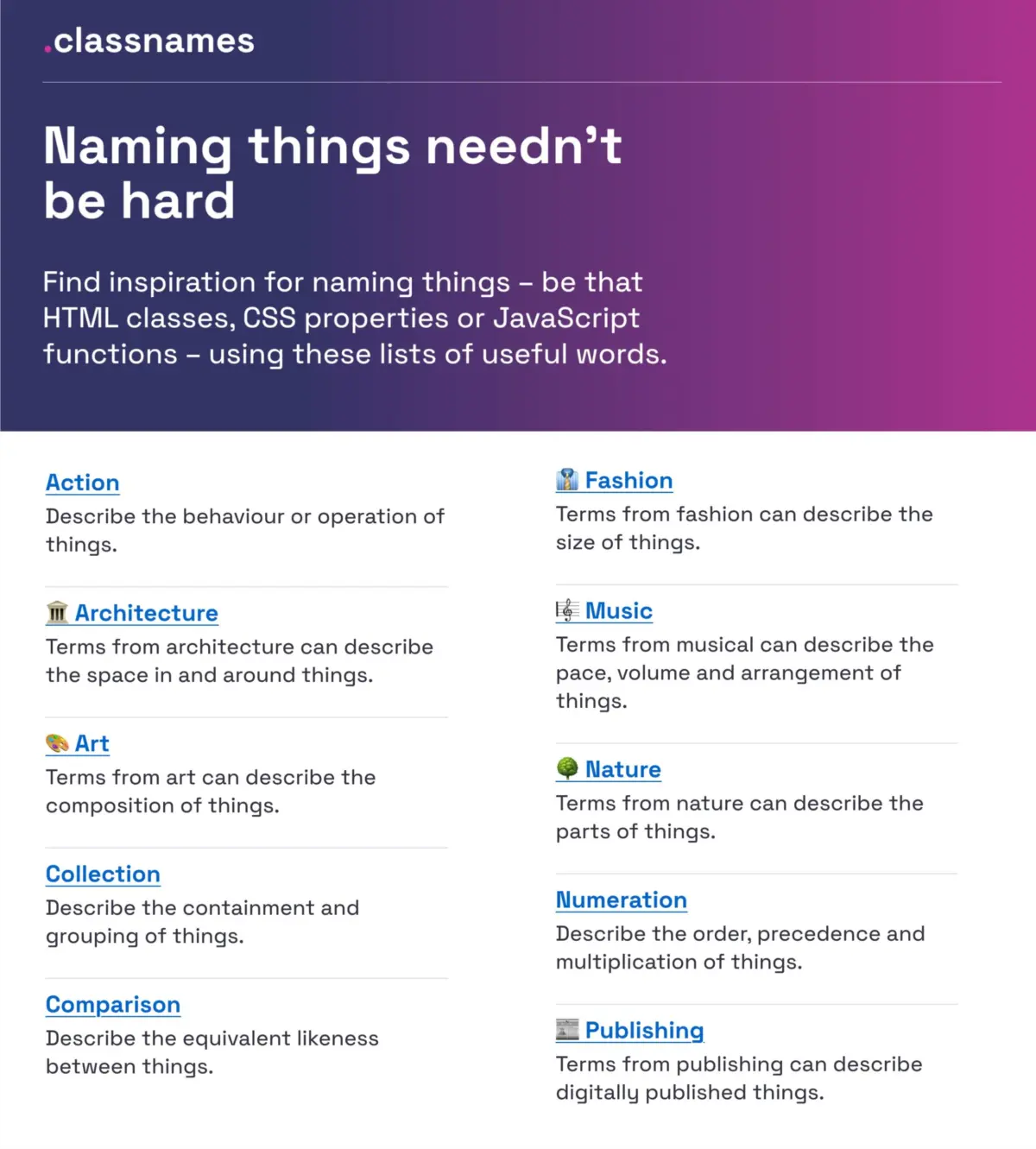
- Classnames: Developed by Paul Robert Lloyd, Classnames functions as a vast repository of thematically grouped lists tailored for naming HTML classes, CSS properties, and JavaScript functions. It encourages lateral thinking by organizing terms by behavior, likeness, order, and grouping, alongside unconventional thematic collections drawn from nature, architecture, fashion, theater, and publishing.
- Color Names: Naming colors is notoriously subjective. David Aerne’s massive open-source repository, Color Names (featuring over 30,000 unique, user-contributed color titles) and tools like Color Parrot, provide robust alternatives to raw hex codes or rigid numeric scales, offering delightful, recognizable nomenclature for design tokens.
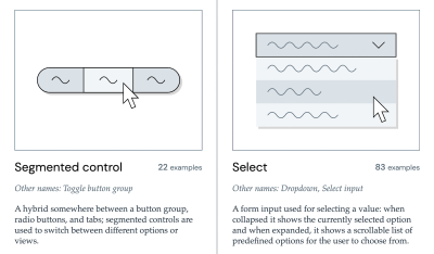
- The Component Gallery: Curated by Iain Bean, The Component Gallery aggregates real-world examples and alternative aliases for more than 50 common UI components—ranging from accordions to visually hidden elements. It serves as an invaluable dictionary for standardizing component terminology across disparate teams.
- Name That UI: For rapid visual identification, Name That UI acts as a visual dictionary, ensuring that cross-functional stakeholders agree on the exact visual definition of a component before a single line of code is written.
Official Case Studies: Scaling Taxonomies at Enterprise Level
To observe these theoretical frameworks in action, one need only look at how global enterprises tackle complex, multi-brand design systems.
Intuit’s Flexible Design Token Taxonomy
As the parent company behind powerhouse financial and small-business tools like Mailchimp, QuickBooks, TurboTax, and Mint, Intuit faced a monumental architectural challenge: how to build a unified design token taxonomy that could scale effortlessly across vastly different product ecosystems and brand identities.

In a comprehensive case study, Nate Baldwin detailed the creation of Intuit’s modern token system. The team diagnosed major pain points in their legacy structure, which was brittle and overly bound to individual brand themes. By redefining their token taxonomy around a clear, hierarchical model, Intuit established a foundational system that accommodates global primitives, semantic aliases, and component-specific values. This transformation ensured that a color or spacing token could adapt fluidly whether it was rendering an invoice in QuickBooks or an email campaign in Mailchimp.
Vodafone UK’s Variables Taxonomy Map
Similarly, the Vodafone UK Design System team developed an exceptionally rigorous Variables Taxonomy Map (available via the Figma Community). This framework breaks down the intricate anatomy and categorization of design tokens within a complex, multi-brand, multi-themed telecommunications environment.
Building upon Nathan Curtis’s foundational work on token naming conventions, Vodafone’s map illustrates four distinct collections required to support a resilient design system:

- Brand Tokens: Core values tied to specific brand identities.
- Primitive Tokens: Raw values (e.g., core hex codes, pixel measurements).
- Semantic Tokens: Contextual applications (e.g.,
color-background-danger). - Component/Page Tokens: Highly specific variables applied directly to UI elements.
This structured cascade ensures that any team member can immediately deduce where a token is utilized and what semantic role it plays simply by reading its identifier. For practitioners seeking hands-on tools, Romina Kavcic’s Design Token Naming Guide + Builder and accompanying Design Token Names Inventory spreadsheet offer turnkey frameworks to audit and structure token hierarchies without losing track of multi-theme variations.
Feature Discoverability and Product Naming
While code and design tokens affect internal team efficiency, the nomenclature assigned to user-facing features directly impacts business metrics, user retention, and feature adoption. Low feature adoption is frequently misdiagnosed as a lack of user need, when it is actually a symptom of poor discoverability caused by opaque internal jargon.
As Erin Gannon outlines in her practical guide on feature naming, true user adoption requires a multi-step cognitive journey: a feature must first be discovered, then understood, subsequently tried and learned, and finally integrated into the user’s existing daily workflow.
To achieve this, product teams must adhere to core psychological principles:
- Jobs-to-be-Done (JTBD): Names should signal the tangible value or outcome a feature delivers, rather than hiding behind clever marketing puns or internal project codenames.
- Adopt the User’s Lexicon: Teams must actively conduct user research, asking customers to describe their problems and workflows in their own everyday language. By adopting these exact terms into the UI, products reduce cognitive friction and dramatically accelerate comprehension.
- Onym Repository: For naming entire products, services, or major initiatives, open-source directories like Onym provide structured methodologies, brainstorming prompts, vetting exercises, and etymological guides to steer teams away from confusing nomenclature and toward resonant brand identities.
Future Outlook: The Horizon of Unified Design Engineering
As artificial intelligence, automated design-to-code pipelines, and multi-platform digital experiences continue to mature, the precision of our digital taxonomies will become even more mission-critical. AI models trained on codebases and design systems rely heavily on consistent semantic naming to accurately generate components, write accessible markup, and maintain design integrity.
The future of digital product development points toward deeply integrated token pipelines where changes propagate seamlessly from a designer’s canvas to production code without human translation errors. However, technology alone cannot solve semantic drift. The onus remains on engineering, design, and product leaders to establish strict organizational dictionaries, conduct regular nomenclature audits, and bridge the cultural dialects that divide technical and non-technical stakeholders.

Wrapping Up
Ultimately, the right name is simply the one that is universally understood, agreed upon, and actively utilized by both the cross-functional team and the end-user. Countless hours of engineering and design time are squandered annually because teams talk about identical concepts using different dialects—the designer’s dialect, the developer’s dialect, the product manager’s dialect, and the user’s dialect.
By investing time in robust taxonomies, utilizing open-source naming resources, and treating nomenclature as a first-class architectural concern, organizations can drastically curtail friction, eliminate confusion, and empower teams to build more cohesive, accessible, and scalable digital products.