

Executive Overview
There is a distinct, telling moment in almost every usability testing session. A participant navigates to a digital product’s login screen, pauses, types a string of characters into a credential field, and glances up at the facilitator. Their body language asks a silent, critical question: "Am I doing this right?"
That micro-pause is a glaring red flag for UX researchers. In that fraction of a second, the participant has consciously or subconsciously realized that they are interacting with a hollow mockup rather than a living, breathing application. From that exact moment onward, every data point collected, every user behavior observed, and every critique voiced is fundamentally compromised. The feedback is no longer authentic; it is filtered through the artificial lens of a user trying to humor a demonstration.
In the high-stakes realm of financial technology (FinTech) product testing, this fidelity gap becomes a massive liability. Financial services consumers are conditioned by years of rigorous digital security to immediately spot anomalies: a bank balance that fails to reconcile, an input field that nonchalantly accepts arbitrary special characters, or a login button that grants instant access without authenticating credentials. When a banking prototype skips proper authentication routines, participants do not merely disengage—they actively halt the session to point out the flaw. Consequently, product teams walk away with qualitative findings that reflect user behavior in a shallow tech demo, rather than real-world reactions to a production-ready application.
The solution, though technically straightforward, demands a deliberate shift in prototyping philosophy: Identify the precise juncture where user trust is established, and make that exact interaction functionally real. In modern digital banking, that foundational cornerstone is the login sequence.
This comprehensive guide breaks down how product teams can leverage advanced, code-free prototyping tools—specifically ProtoPie and Figma—to build a banking login flow featuring validated credentials, dynamic live error states, and native biometric animations. By elevating prototype fidelity at the point of entry, development and design teams can transform usability testing from a guessing game into a high-signal research environment.

Detailed Chronology: Building a Production-Grade Login Flow Without Code
To achieve a level of fidelity that suspends disbelief, product teams must move beyond static screens. Using the fictional mobile banking application "Pie Bank" as our blueprint, the following step-by-step methodology outlines how to engineer a fully functional login interface—complete with text input handling, conditional logic, and Face ID simulation—entirely without writing code.
Step 1: Strategic Figma Imports — Preserving Layer Hierarchy
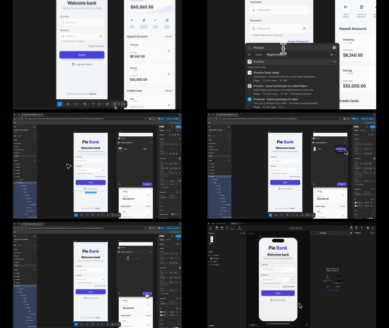
The journey begins in Figma. When exporting your login frame into ProtoPie via the native plugin, selecting the correct import mode is critical. Designers must choose Scene rather than Flattened.
Opting for a flattened export collapses the entire interface into a single, static image file, rendering individual elements un-targetable. Conversely, importing as a Scene preserves your exact layer hierarchy. Every UI element—from input fields to action buttons—arrives in ProtoPie as a separate, fully manipulable layer.
Before proceeding to animation and logic, strict naming conventions must be enforced. Renaming a generic asset from Rectangle 14 to Input Username prevents catastrophic confusion later. Because these exact names will be referenced in variable formulas and conditional triggers, ambiguous labeling introduces compounding time loss during development.
Step 2: Replacing Static Elements with Native Input Layers
Static mockups rely on placeholder text that vanishes upon tap without accepting actual keystrokes. ProtoPie bridges this gap via its native Input layer, which invites real keyboard interaction.
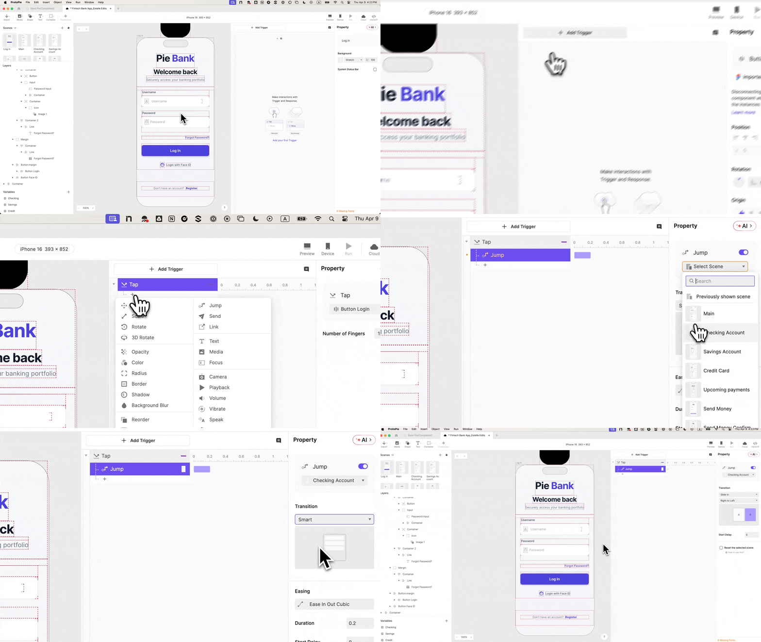
By navigating to Text ➔ Input, designers can drag an active input layer directly onto the canvas, nesting it precisely within the username field group. Visual attributes—such as placeholder styling, background fills, and typography—must mirror the core design system. When previewed, clicking this field invokes the system keyboard, allowing participants to type real text. This single interaction shifts the prototype from depicting an app to behaving like one. This step is then repeated to create a dedicated password input layer.
Step 3: Streamlining Password Masking
Historically, masking sensitive password characters required cumbersome condition trees or conditional text-swapping scripts. Modern prototyping frameworks have largely automated this friction.
By taking the duplicated password input layer, updating its placeholder text to Password, and changing its input Type to Text Password, ProtoPie automatically handles character masking (displaying dots instead of plain text). Previewing both fields simultaneously reveals a username displaying clear text and a password rendering secure dots—all achieved with a single property change and zero custom logic.
Step 4: Constructing the Destination Scene First
A frequent architectural error in advanced prototyping is attempting to wire navigation triggers before the destination scene has even been created. Designers often find themselves troubleshooting broken jump responses simply because the landing page does not exist.
The remedy is procedural discipline: always build and populate the destination scene (in this case, the main account dashboard) before attempting to wire navigation paths.
Step 5: Wiring the Navigation Button (And Recognizing Its Flaws)
With the dashboard scene established, the next step involves wiring the primary Log In button.
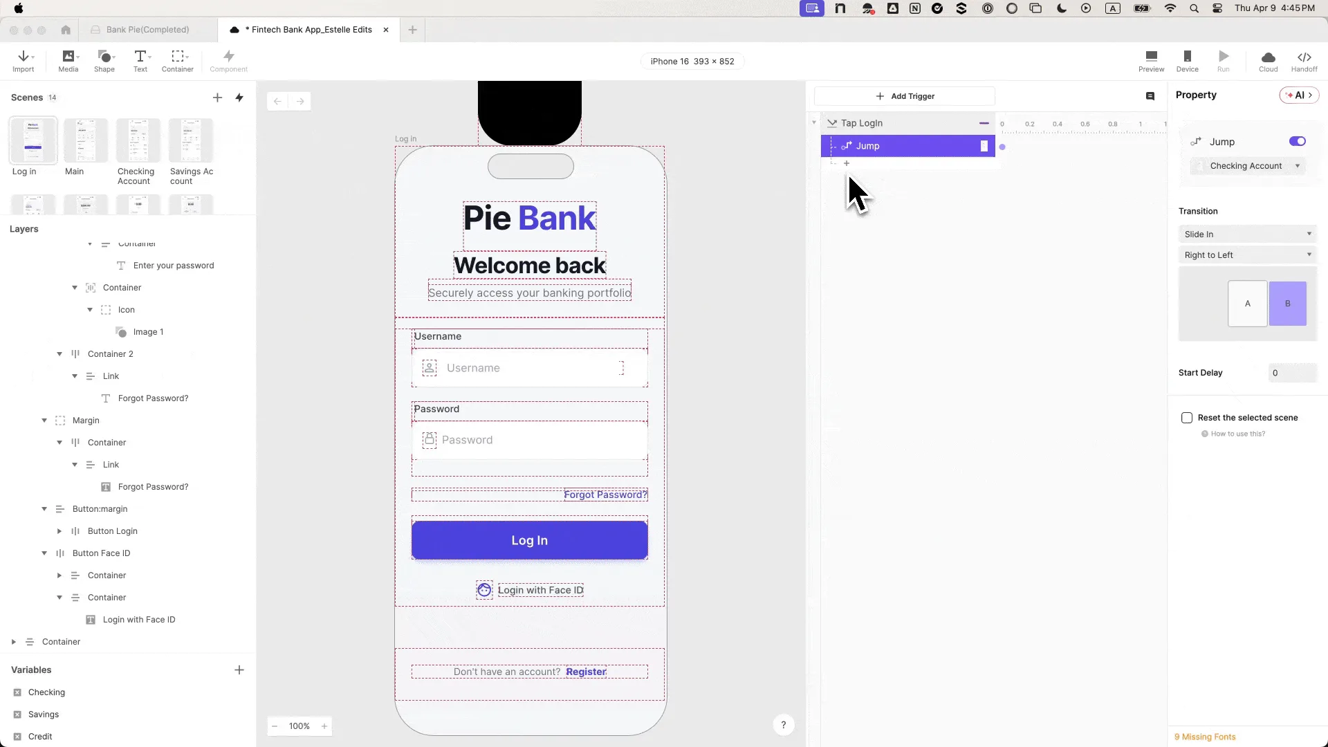
By selecting the button, adding a Tap trigger, and assigning a Jump response targeted at the dashboard scene—complete with a smooth "Slide in from right to left" transition—the flow appears complete on the surface. However, a crucial vulnerability remains: previewing and tapping the button triggers successful navigation regardless of what text (or lack thereof) resides in the input fields. The prototype is still effectively permitting unauthenticated access, undermining the integrity of subsequent user testing.
Step 6: Deploying Variables for State Retention
To give a prototype memory, developers must introduce variable architecture. Situated in the bottom-left workspace of ProtoPie, two Text-type variables—designated username and password—must be established.
Each variable is dynamically bound to its respective input layer using straightforward formula syntax:
input("Input Username").text
input("Input Password").text
Enabling ProtoPie’s built-in debug icons activates live green overlays that display real-time variable values as keystrokes are entered. Seeing keystrokes dynamically populate these data containers visually confirms that the binding is active and functioning correctly.

Step 7: Implementing Conditional Security Gates
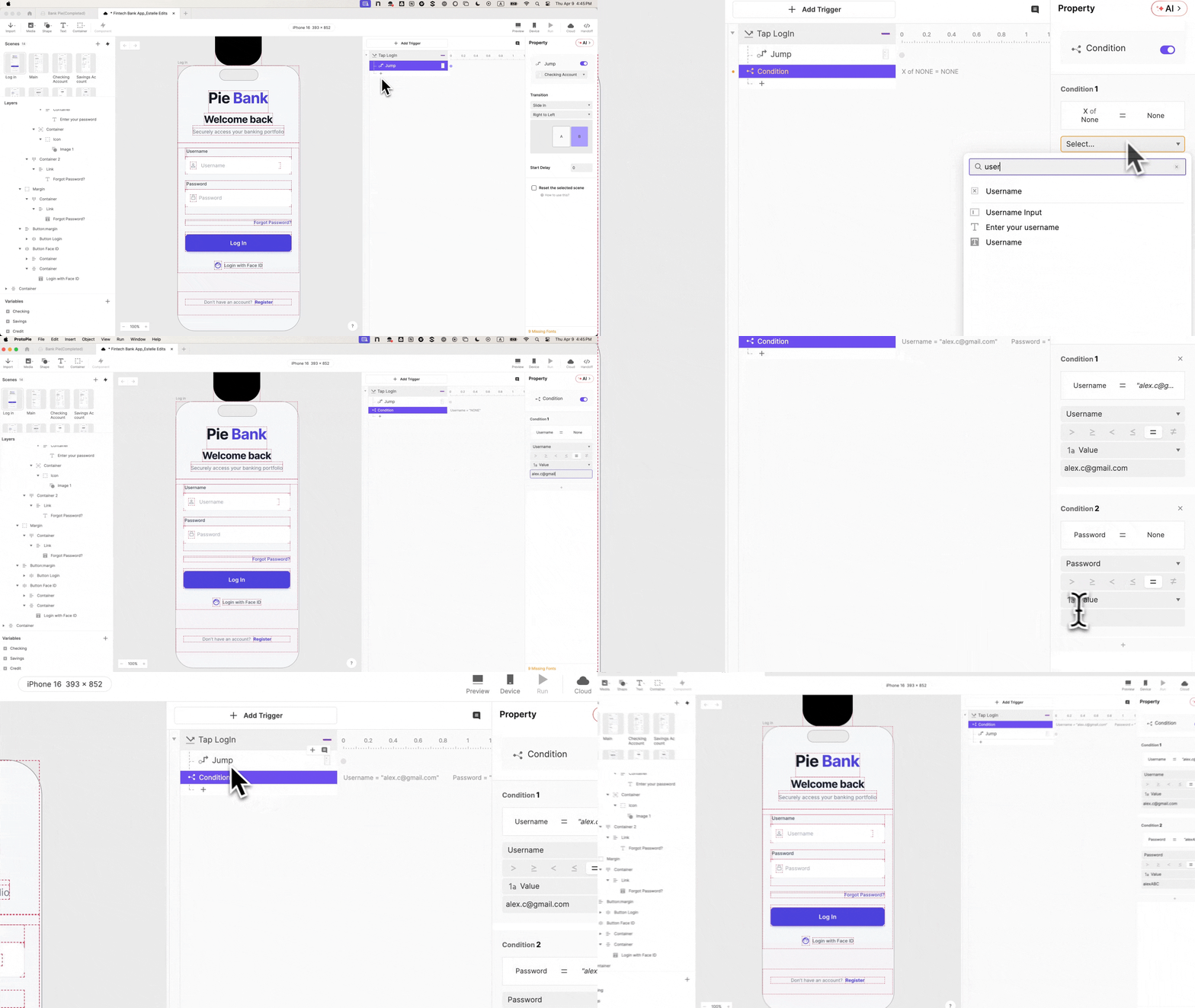
With variable states captured, security logic can be enforced. Returning to the Tap trigger on the login button, designers introduce a Condition response housing two mandatory evaluation rules that must both evaluate as true:
- The
usernamevariable matches authorized parameters. - The
passwordvariable matches authorized parameters.
The original Jump response is then dragged inside this conditional wrapper. Consequently, incorrect credentials, empty fields, or improper formats are categorically blocked from advancing. Participants are suddenly forced to interact with the system as they would a real banking portal, fundamentally altering the qualitative texture of every subsequent testing session.
Step 8: Engineering the Live Error State
To mirror real-world application behavior, a failed authentication attempt must yield visible feedback rather than silent failure.
Designers locate the pre-designed error message text layer, rename it Error Text, and set its initial opacity to 0. A secondary, inverse condition is then established on the login button. If entered credentials fail the validation check, a Change Property response dynamically shifts the opacity of the Error Text layer to 100. This creates a bifurcated system response—correct credentials yield a dashboard transition, while incorrect inputs trigger a visible error message—turning the prototype into a genuine testing instrument.
Step 9: Simulating Native Biometric Authentication
To push the prototype past the threshold of skepticism, biometric login must be integrated.
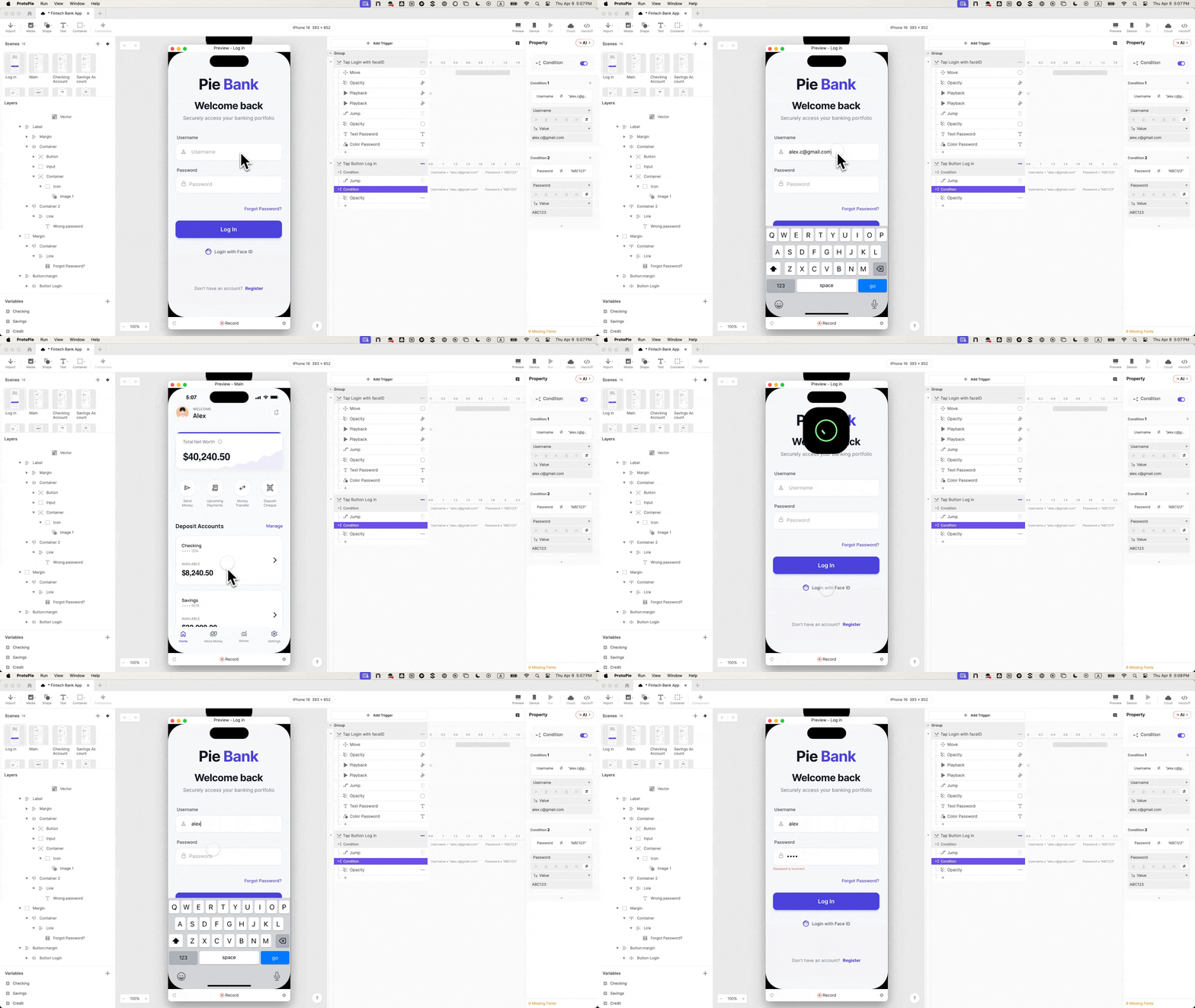
By navigating to the Media panel, designers drag a Lottie animation layer onto the canvas, load a standard Face ID JSON animation file, and position it gracefully off-screen directly above the device frame. On the Login with Face ID action button, a dedicated Tap trigger (renamed Tap Face ID) is paired with a sequence of four distinct responses:
- Move: Translates the Lottie animation into the visible viewport.
- Seek: Establishes the exact frame position of the animation sequence.
- Play: Initiates the motion graphic playback.
- Jump: Transitions the user to the destination dashboard upon authentication completion.
Step 10: Staggering Timing for Native Fluidity
Without deliberate timing offsets, all four biometric responses fire simultaneously, causing the interface to jump to the dashboard before the Face ID animation has a chance to play.
To achieve buttery-smooth, native-feeling performance, precise delays are introduced:
- Move Response:
0sdelay - Seek Response:
0sdelay - Play Response:
0.5sdelay - Jump Response:
1.0sdelay
Additionally, enabling Reset selected scenes on the final Jump response ensures that navigating backward via the app architecture does not leave the biometric animation permanently frozen mid-frame. The resulting preview delivers a biometric login experience utterly indistinguishable from a native iOS application.
Supporting Context & Metrics: The Cost of Low-Fidelity Testing
The rationale behind investing development hours into high-fidelity prototyping is rooted in empirical UX research principles. Industry data consistently indicates that usability testing conducted with low-fidelity, static wireframes yields high rates of "false-positive" feedback regarding navigation, while frequently missing critical friction points associated with security and validation.

| Prototyping Fidelity Tier | User Suspension of Disbelief | Detection of Validation Errors | Stakeholder Buy-In Potential | Engineering Handoff Clarity |
|---|---|---|---|---|
| Static Wireframes (Figma/Sketch) | Low (Immediate drop-off) | Poor (Users bypass input norms) | Moderate (Requires verbal explanation) | Low (Static visual specs only) |
| Basic Interactive Mockups | Moderate (Breaks at login/forms) | Fair (Allows entry, no error handling) | High (Visuals clear, logic assumed) | Moderate (Basic click-through paths) |
| High-Fidelity Prototypes (ProtoPie) | High (Indistinguishable from real app) | Excellent (Forces realistic user behavior) | Exceptional (Demonstrates operational flow) | Superior (Documents conditional logic & timing) |
When users encounter functional authentication walls during testing, qualitative insights expand exponentially. Researchers can observe whether users comprehend specific error messaging, whether they instinctively attempt secondary recovery pathways (such as password resets), or if they seamlessly pivot to biometric alternatives like Face ID. These nuanced behavioral metrics remain entirely inaccessible when utilizing rudimentary, unvalidated prototypes.
Official Statements & Industry Perspectives
Leading product design and user research advocates emphasize that prototyping fidelity is no longer a luxury reserved for final-stage polish; it is a core component of risk mitigation in product development.
"When participants interact with a financial prototype that lets anything pass through a login screen, you aren’t testing their reaction to your product—you’re testing their tolerance for a broken demo. True behavioral signal only emerges when the system pushes back against user error with the same authority as a shipped application."
— Senior FinTech UX Architect
Furthermore, engineering teams report significant downstream efficiencies when high-fidelity prototypes accompany design handoffs. Rather than attempting to interpret static arrows between Figma artboards, software engineers can review the operational logic, variable bindings, and animation timing charts embedded directly within advanced prototyping projects. This eliminates ambiguity, aligning design intent with engineering execution from day one.
Future Outlook: The Convergence of Prototyping and Production Code
As design tools continue to evolve, the historical boundary separating prototyping environments from production codebases is rapidly dissolving. The integration of advanced conditional logic, native device sensor emulation (such as cameras and biometrics), and robust variable data management means that modern design prototypes are increasingly serving as functional specifications.
Looking ahead, the FinTech sector is poised to adopt AI-assisted prototyping workflows where complex security states, biometric triggers, and dynamic error handling can be generated instantaneously from natural language prompts. However, the foundational principle highlighted by advanced workflows remains immutable: Trust is earned at the point of entry.
Whether teams are building mobile banking applications, decentralized finance (DeFi) platforms, or enterprise payment gateways, investing upfront in authentication fidelity ensures that user research remains anchored in reality. By eliminating the awkward pauses and skeptical glances during usability sessions, product teams can unlock genuine insights, secure confident stakeholder alignment, and ultimately ship financial products that users trust implicitly from the very first tap.