The global digital health revolution has brought mental healthcare to the fingertips of millions, yet the industry faces a profound, often overlooked retention crisis. Empirical data reveals a stark reality: nearly 95% of users who open a mental health application on day one abandon it by day thirty, with median retention hovering at a mere 3.3%. Even market-leading platforms lose up to 50% of their user base within the first ten days of download.
While multiple factors contribute to this rapid drop-off, a critical culprit lies in the user interface (UI) and user experience (UX) layers. In an attempt to signal technological innovation and capture fleeting attention, many digital product designers import trendy, high-friction visual paradigms from e-commerce, fintech, and social media into clinical and therapeutic spaces.
As UI/UX expert Kat Homan highlights, this creates a fundamental conflict of purpose. Standard trend-driven design prioritizes novelty, cognitive stimulation, and maximum screen-time engagement. Conversely, mental health apps must prioritize cognitive ease, emotional safety, predictability, and trust. When an individual experiencing acute anxiety, severe depression, or burnout opens an app for refuge, a confusing gesture, an overly saturated palette, or a non-skippable gamification loop acts as an insurmountable cognitive barrier.
This article explores the systemic flaws of trend-driven design in mobile health (mHealth), examines the five major friction points where modern aesthetics clash with therapeutic utility, and introduces a practical evaluation framework designed to align digital interfaces with human vulnerability.
Detailed Chronology: The Evolution of mHealth UI and the Rise of Aesthetic Friction
To understand how mental health app design reached its current crossroads, one must examine the shifting paradigms of mobile application development over the past decade.
Phase 1: The Clinical Translation Era (Early 2010s)
In the early days of mobile mental health solutions, applications were primarily digital adaptations of paper-based cognitive behavioral therapy (CBT) worksheets and clinical logs. Interfaces were strictly utilitarian, featuring heavy text, basic forms, and stark corporate color palettes. While these apps were clinically sound, their rigid, uninspired aesthetics often felt sterile, failing to engage users outside of clinical directives. Retention was low simply because the technology lacked emotional resonance and intuitive flow.
Phase 2: The Wellness Boom and Gamification (Mid-to-Late 2010s)
As the wellness market expanded, developers sought to drive habit formation by borrowing engagement loops from mobile gaming and productivity tools. Streak counters, aggressive push notifications, daily check-in reminders, and animated avatars became ubiquitous. While these features temporarily boosted daily active users (DAUs) in general habit-tracking apps, their uncritical translation into mental health platforms introduced unintended consequences: performance pressure, anxiety over broken streaks, and guilt during depressive episodes.
Phase 3: The Era of Visual Experimentation and Trendy UI (2020s–Present)
In recent years, the democratization of advanced front-end frameworks and micro-interactions has led to a surge in bold visual trends: neo-brutalism, dark-mode minimalism, glassmorphism, abstract iconography, and hidden gesture-based navigation. Designed to capture attention on portfolio sites like Dribbble, these aesthetics prioritize visual disruption and trend compliance. Unfortunately, when applied to mental health apps without contextual adaptation, these very trends alienate users whose cognitive capacities are heavily depleted by emotional distress.
Supporting Context & Metrics: The Human and Data Reality
The stakes of getting mHealth design right have never been higher. According to the World Health Organization (WHO), over one billion people globally live with a mental health condition, with depressive and anxiety disorders surging by 25% over the past decade. Depression alone now affects nearly 5% of the adult population.
When digital tools fail these individuals, the cost is not merely lost app revenue; it is prolonged human suffering and abandoned pathways to recovery. Research published in the Journal of Medical Internet Research (JMIR) and related public health journals underscores specific behavioral patterns among distressed users:
Cognitive Overload in Crisis: Users rarely open mental health apps out of casual curiosity; they turn to them out of immediate need—often while stressed, anxious, exhausted, or experiencing brain fog. In this low-capacity state, decoding an abstract icon or navigating a hidden menu requires executive function that the user simply does not possess.
The Preference for Subtlety: Studies investigating color and aesthetics in mHealth apps reveal that distressed users display a strong preference for subtlety. While designers often gravitate toward bright, cheerful palettes to inject positivity, users frequently report that high-saturation colors feel jarring, inauthentic, and physically uncomfortable against their internal emotional state.
The Accessibility Imperative: A disproportionate percentage of individuals requiring mental health support also experience visual, motor, or cognitive impairments. Minimalist trends featuring low-contrast text, small tap targets, and gesture-only navigation systematically exclude these users, turning an inclusive tool into an exclusive barrier.
The Five Fronts of Trend-Driven Friction
The core tension between modern UI trends and therapeutic usability manifests across five distinct operational fronts.
1. Cognitive Friction and the Capacity Mismatch
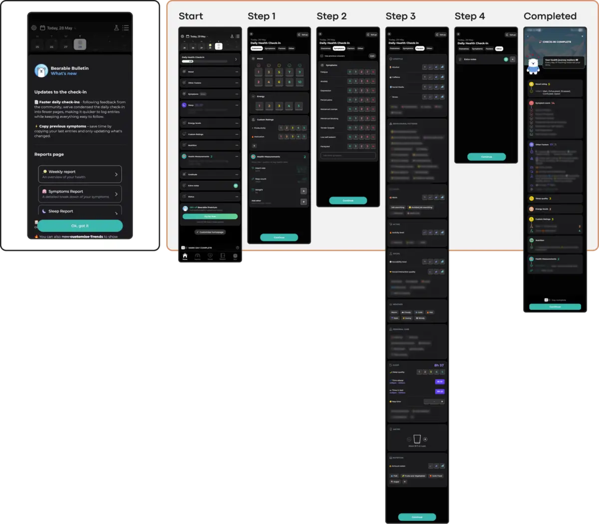
Trendy layouts like neo-brutalism demand heavy visual parsing, while hidden navigation drawers and non-standard swipe gestures turn simple actions into puzzles. For a user grappling with panic or acute anxiety, a confusing interface adds unnecessary cognitive load, driving them to close the app and abandon it permanently. Effective designs, such as those utilizing linear flows or direct voice-input pathways, minimize decision fatigue and meet users precisely where their energy levels lie.
2. Emotional Mismatch and Trust Erosion
An interface that feels aggressively cheerful or trend-forward can easily feel dismissive to someone experiencing emotional pain. Trust is built when an app’s visual tone—such as grounded, muted earthy palettes—respectfully aligns with the user’s internal reality. Conversely, unaligned mechanics, such as a celebratory confetti animation immediately following the logging of a severe depressive episode, erode psychological safety and break trust.
3. The Inconsistency Penalty and Routine Disruption
While novelty drives engagement in entertainment applications, predictability and routine are essential for mental health management. When an app constantly redesigns its navigation or forces users through unskippable gamified introduction screens to complete a simple task, it penalizes routine use. Stable information architecture—where users can consistently find tools to learn, track, and manage symptoms—supports long-term therapeutic habits.
4. Silent Exclusion via Accessibility Failures
Aesthetic minimalism often sacrifices accessibility standards. Low-contrast typography, micro-fonts, and complex animated backgrounds violate Web Content Accessibility Guidelines (WCAG). In the mental health space, ignoring these standards is not just a compliance oversight; it is a silent exclusion of the most vulnerable user segments, including those with visual impairments or neurodivergence.
5. The Coercion Paradox: When Engagement Becomes Pressure
Borrowing retention loops like rigid streak counters and urgency-driven notifications from the gaming industry transforms supportive tools into systems of surveillance and judgment. In non-linear recovery contexts, a broken streak should not be framed as a failure. Sustainable retention in mental health is earned through forgiving, non-coercive design that gently encourages return without inducing guilt.
Official Statements and Expert Insights
Industry practitioners and clinical researchers increasingly emphasize that digital health design must break away from traditional tech-sector metrics.
"Crucially, improving engagement depends less on which UI trends you follow than on a single test applied to each one of them: does a trend lower the cost of using the app when the user can least afford it?"
— Kat Homan, UI/UX Design Specialist
Clinical usability experts note that therapeutic design requires a paradigm shift: success should not be measured solely by daily active time or session length, but by the efficiency with which a user achieves emotional regulation or finds necessary resources. When an app successfully guides a user from a state of distress to calm and encourages them to put the phone down, that represents a profound UX victory, even if it results in lower screen-time metrics.
A Practical Framework for Evaluation
To prevent trend-driven design from undermining clinical goals, product teams must evaluate every proposed visual and interactive pattern through a rigorous, sequential framework:
Cognitive Load Test: Does this pattern reduce or increase the effort required for a user in a low-capacity state to find help?
Emotional Alignment Test: Does the visual and behavioral tone match the vulnerability of the user, or does it risk feeling dismissive or jarring?
Predictability Test: Does this interface respect established mental models and support routine use, or does novelty disrupt habit formation?
Accessibility Compliance Test: Does the design strictly adhere to contrast, sizing, and interaction standards, ensuring no user is excluded?
Non-Coercion Test: Do the engagement mechanics encourage healthy return without introducing shame, guilt, or artificial performance pressure?
Future Outlook
As digital therapeutics become increasingly integrated into mainstream healthcare ecosystems, the standard for mHealth design must mature. The future of mental health applications lies away from superficial "Dribbble-driven" aesthetics and toward empathetic, resilient, and deeply contextual engineering.
Developers and designers must recognize that in the realm of mental health, the ultimate objective of an interface is not to draw attention to itself, but to fade quietly into the background—serving as a trusted, respectful sanctuary where support is not just offered, but truly felt. By prioritizing human capacity over trend compliance, the digital health industry can finally bridge the retention gap and build tools that sustain users through their most vulnerable moments.