

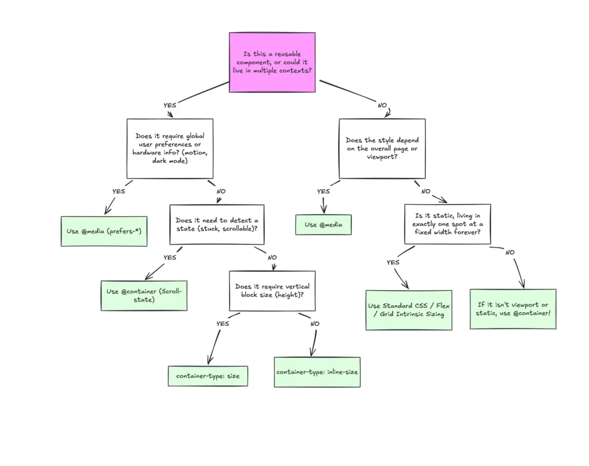
Executive Overview
Despite boasting a formidable 94% global browser support rate across modern web engines, CSS container queries remain a perplexing paradox in contemporary front-end development: they are universally recognized yet astonishingly underutilized. According to the 2025 State of CSS survey, while an overwhelming 86% of developers are explicitly aware of container queries, a mere 41.4% have integrated them into production environments. This glaring adoption gap has transformed what should have been an immediate, paradigm-shifting web standard into an under-leveraged tool often treated as an exotic alternative rather than a foundational web primitive.
The core friction point behind this sluggish uptake is psychological and perceptual. At first glance, the syntax of a container query—relying on the @container declaration—looks almost indistinguishable from the familiar @media queries that have anchored responsive design since the inception of CSS3. Because they look and feel alike, many developers instinctively assume they serve identical purposes, differing only in the target of their inquiry.
This assumption is fundamentally incorrect. Traditional media queries are structurally "blind"; they ask the browser a single, macro-level question: "How wide is the physical viewport right now?" In contrast, container queries look inward. They ask a component-centric question: "How much physical space is available to me inside my immediate parent container right now?"
By failing to make this conceptual leap, developers often write container queries as if they were media queries, running into unexpected roadblocks, layout collapses, or logic loops. This article investigates the historical oversight surrounding container queries, dissects the crucial philosophical divide between macro and micro layouts, explores practical implementations like fluid component typography and flex-wrap detection, addresses native side effects and limitations, and outlines a definitive roadmap for when to reach for @media versus @container.
Detailed Chronology: From CSS Wishlists to Production Reality
To understand why container queries are so frequently misunderstood, it is necessary to retrace the evolution of responsive web design (RWD). When Ethan Marcotte coined the term "Responsive Web Design" in 2010, the paradigm was built on fluid grids, flexible images, and media queries. For well over a decade, the viewport was our sole proxy for environmental awareness.
However, as component-driven architectures (such as React, Vue, Svelte, and Web Components) took over the engineering landscape, a deep architectural mismatch emerged. Developers began building highly modular, reusable components designed to drop seamlessly into any context—whether that meant a massive, full-width homepage grid cell or a narrow, constrained 300px sidebar on a ultra-wide desktop monitor.
Yet, our styling tools remained anchored to the viewport. If a .card component was styled via a media query to flip from a vertical stack to a horizontal layout at min-width: 1024px, that card would blindly attempt to execute its horizontal layout even if it was crammed into a narrow sidebar on a 1920px screen. The viewport was 1920px wide, so the media query fired, resulting in crushed typography, overlapping text nodes, and broken layouts.
For years, the ability for components to adapt natively to their outer container sat proudly at the absolute top of the CSS community’s feature wishlists. When container queries finally landed in stable browser releases, the developer community experienced a collective wave of cognitive dissonance. Many senior engineers—admittedly including early wave adopters who missed the initial release notes—asked a blunt question: "Why do we need this when media queries already exist?"
This initial skepticism birthed a period of stagnation. At SmashingConf Amsterdam, accessibility and CSS expert Kevin Powell bluntly diagnosed the state of the industry, declaring that container adoption rates have been "terrible." This sentiment echoes across forums and codebases worldwide: developers know the tool exists, but old habits die hard. We continue to treat container queries as syntactic sugar for media queries, rather than recognizing them as an entirely new class of layout logic.

Supporting Context & Metrics: The Fragmentation of Modern Screens
The urgency for container-driven layouts becomes glaringly apparent when examining the physical fragmentation of the modern web. A recent comprehensive data study tracked over 120,000 data points across web traffic and discovered more than 2,300 unique viewport sizes in active rotation.
Gone are the days when web designers could safely optimize for three or four standardized breakpoints (e.g., iPhone portrait, iPad portrait, laptop, and desktop). With foldable devices, ultra-wide monitors, split-screen browser window resizing, picture-in-picture modes, and dynamic operating system sidebars, the concept of a static "screen size" has effectively dissolved.
The metrics paint a stark picture:
- Browser Support: ~94% globally (supporting all evergreen browsers including Chrome, Safari, Firefox, and Edge).
- Developer Awareness: 86% (State of CSS survey metrics).
- Actual Production Usage: 41.4% (indicating a massive educational and transitional lag).
When we rely exclusively on media queries in an ecosystem fractured into thousands of unique viewport sizes, we are essentially attempting to predict an infinite number of environmental permutations using blunt, macro-level tools. Container queries eliminate this guesswork by pushing the responsibility of layout calculation down from the global window to the local component.
Official Statements and Industry Insights: Macro vs. Micro Layouts
To master container queries, one must adopt a new mental model that bifurcates web architecture into two distinct layout categories: Macro Layouts and Micro Layouts.
Macro Layouts (The Outward View)
Macro layouts govern the overarching architecture of a web page. They handle the macro structure: the primary header spanning the browser window, the footer, the main structural grid, global system preferences (such as prefers-color-scheme or prefers-reduced-motion), and hardware capabilities (such as touch interactions).
For macro layouts, media queries remain the undisputed champion. Because these elements are intrinsically tied to the browser window and physical device constraints, asking the viewport for its dimensions is entirely logical.
Micro Layouts (The Inward View)
Micro layouts govern the internal anatomy of individual components living inside the macro layout. Think of cards, widgets, complex forms, user profile blocks, interactive toolbars, and navigation drawers.
For micro layouts, container queries are mandatory. An isolated component should never care whether it is being viewed on a mobile device or a 4K desktop display; it should care exclusively about the horizontal or vertical bounding box allocated to it by its direct environment.

As Kevin Powell famously noted in his breakdowns on smart layouts:
"Media queries are dumb. Not dumb in terms of the concept, but dumb in that they don’t know very much. In fact, most people assume that they know more than they do."
When we think in terms of containers and components, we are effectively empowering the content itself to dictate its layout, rather than forcing the global viewport to make micro-management decisions it is entirely unequipped to handle.
Technical Deep-Dive: Code Implementations
To truly appreciate the transition from media queries to container queries, let us examine two practical use cases where container queries solve long-standing CSS pain points.
1. Fluid Typography Inside Components
Historically, responsive typography relied heavily on viewport-relative units like vw or vh combined with CSS clamp() functions:
/* Viewport-tied typography */
.card-title
  font-size: clamp(100%, 1rem + 2vw, 24px);
While functional on a full-width page, the moment this card component is dropped into a narrow sidebar, the vw unit continues looking at the global screen width rather than the sidebar width. The typography breaks scale.
Container queries introduce dedicated relative units—such as cqi (container query inline-size) and cqb (container query block-size). By coupling these units with clamp(), typography becomes truly modular:
/* Establish the container */
.card-wrapper
  container-name: card;
  container-type: inline-size;


/* Fluid typography tied exclusively to the component's container */
.card-title
  font-size: clamp(1rem, .5rem + 3cqi, 2rem);
2. Flexbox Wrap Detection
One of the most persistent limitations of traditional CSS has been the inability to style an item based on its internal layout state—specifically, knowing when flex items wrap onto a new line. Media queries are completely blind to internal wrapping events because they only monitor the outer browser window.
Conventionally, detecting flex wrapping required heavy JavaScript solutions utilizing ResizeObserver. However, by nesting container queries inside flex items, developers can achieve native, zero-JavaScript wrap detection:

/* The flex parent container */
.flex-layout
  display: flex;
  flex-wrap: wrap;


/* Register an individual flex item as its own container */
.flex-item
  container-type: inline-size;
  flex: 1 1 390px; /* Expand to fill space, wrap when space drops below 390px */


/* Default state (narrow / stacked column layout) */
.card
  display: flex;
  flex-direction: column;
  background: #f4f4f4;


/* Container query fires once the individual item has enough room for a full row */
@container (min-width: 600px)
  .card
    flex-direction: row;
    align-items: center;
    background: #e2f0d9;
Side Effects, Pitfalls, and Limitations
While container queries are exceptionally powerful, they are not a silver bullet. Introducing them into a production codebase requires an awareness of specific architectural caveats:
-
A Container Cannot Query Itself:
You cannot assigncontainer-typeand a@containerquery to the exact same DOM node without creating an infinite calculation loop. The styling rules must target a child or descendant of the declared container wrapper. -
Layout Collapse via
container-type: size:
If you query a container’s full block (vertical) size usingcontainer-type: sizewithout explicitly defining a height, min-height, or aspect-ratio, the browser will calculate the container’s dimensions independently of its children, collapsing the element to0px. Whenever possible, default tocontainer-type: inline-size. -
Custom Properties in Queries Are Restricted:
You cannot currently evaluate container queries against CSS custom properties (variables) due to the cyclic nature of variable inheritance and scoping.
Future Outlook: The Next Era of Component-Driven Design
As we look toward the future of web standards, container queries represent a foundational shift in how we author stylesheets. The ongoing development of experimental features like Container Style Queries—which allow components to adapt based on computed parent styles rather than just dimensions—signals that the web platform is doubling down on component encapsulation.
The path forward does not involve abandoning media queries entirely. Instead, mature front-end engineering requires a nuanced, hybrid approach:
- Reach for Media Queries (
@media) when styling macro-level page architecture, global grids, and system-level user preferences. - Reach for Container Queries (
@container) when building reusable, modular components that must adapt fluidly to unpredictable, multi-context environments.
By aligning our CSS architecture with the modular nature of our component libraries, we eliminate brittle overrides, eradicate layout bugs caused by nested containers, and write resilient code built to withstand the infinite fragmentation of modern web screens.