

Executive Overview
For decades, the web design industry relied on a singular proxy to determine how layouts should adapt to the user’s screen: the viewport. Media queries gave developers the illusion that screen width alone dictated the responsive environment of an application. Yet, as the modern web evolved into an ecosystem of hyper-modular, highly reusable components, that illusion began to crack.
Enter CSS Container Queries. Despite boasting over 94% global browser support, container queries remain surprisingly underused and frequently misunderstood. According to recent data from the State of CSS survey, while 86% of developers are aware of container queries, a mere 41.4% actively use them in production environments. At SmashingConf Amsterdam, industry experts highlighted this exact paradox: container query adoption has been remarkably slow, despite component-level responsiveness sitting at the top of developer wishlists for years.
The root cause of this hesitation is deceptively simple: container queries look and feel almost identical to traditional media queries at first glance. Because of this visual familiarity, developers often assume they serve the same foundational purpose. They do not.
Media queries look outward, asking the browser, "How wide is the screen right now?" Container queries look inward, asking, "How much space is available for me in this specific spot, right now?" By exploring the differences between macro- and micro-layouts, examining practical implementations like fluid typography and flex-wrap detection, and understanding inherent architectural caveats, this article will reframe how modern web developers approach responsive design.
Detailed Chronology: The Paradigm Shift from Viewport to Container
To understand why container queries are so frequently misapplied, we must trace the history of responsive web design.
When Ethan Marcotte coined "Responsive Web Design" in 2010, the web was largely document-driven. Pages scrolled vertically, and layouts were defined by fluid grids, flexible images, and media queries. The viewport was the absolute source of truth. If a screen was 1024 pixels wide, a developer could safely assume that a .card component placed inside it had a predictable amount of horizontal real estate.
As web applications grew more complex, developers shifted from building static pages to engineering isolated, reusable components. Design systems and component-driven frameworks like React, Vue, and Svelte transformed how UIs were built. A button, a card, or a navigation bar needed to look and function identically whether it lived inside a sprawling, full-width dashboard hero section or a cramped, 300-pixel-wide sidebar.
This is where the viewport proxy broke down. If a developer wrote a media query targeting screens wider than 1024 pixels to display a .card in a horizontal flex layout, the browser evaluated only the physical screen width—say, a 1920px desktop monitor. Even if that specific card was crammed into a 300px sidebar grid cell, the media query fired unconditionally. The card contents deformed, cramped, or awkwardly overflowed their boundaries.
/* The traditional approach: relying on the external viewport */
@media (min-width: 1024px)
  .card
    display: flex;
The introduction of CSS Container Queries was meant to solve this exact structural flaw. By decoupling component responsiveness from the global browser window, developers could finally shift layout logic from the macro-environment to the micro-environment. Yet, because the syntax (@container) mirrored the familiar @media structure, many developers adopted them with a legacy mindset, treating them as drop-in replacements for screen-width checks rather than an entirely new paradigm of component-driven architecture.
Supporting Context & Metrics: The Adoption Gap and Viewport Fragmentation
The sluggish adoption of container queries is well-documented, yet it sits in stark contrast to the sheer chaotic fragmentation of modern device sizes.
Data from the State of CSS surveys highlights a striking awareness-to-adoption gap: while developer awareness hovers around 86%, actual production usage lags behind at roughly 41%. This gap is paradoxical when viewed against the modern device landscape. Recent telemetry data tracking viewport sizes across the web reveals the existence of over 2,300 unique viewport sizes.
Trying to account for thousands of distinct screen dimensions using arbitrary media query breakpoints (e.g., 320px, 768px, 1024px, 1440px) is an exercise in futility. Media queries are, fundamentally, blind to internal layout constraints. As prominent educator and CSS advocate Kevin Powell famously noted:
"Media queries are dumb. Not dumb in terms of the concept, but dumb in that they don’t know very much. In fact, most people assume that they know more than they do."
Container queries correct this blindness by handing control back to the content. Instead of forcing a component to become "tablet-sized" because the global window crosses an arbitrary 768px threshold, container queries allow a component to adapt the exact millisecond its immediate wrapper provides enough physical room to do so.

Macro vs. Micro Layouts: Defining the Boundaries
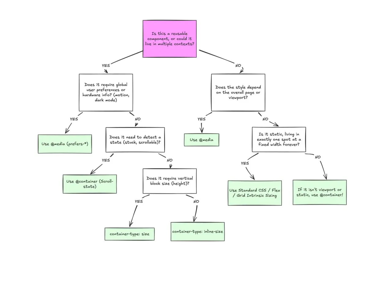
A helpful mental model for distinguishing between media queries and container queries involves categorizing layouts into two distinct tiers:
- Macro Layouts (Page-Level / Outward-Looking): Governed by media queries. These handle major page structure changes, global navigation bars, full-width headers and footers, system preferences (
prefers-color-scheme), and hardware capabilities (such as touch interactions). - Micro Layouts (Component-Level / Inward-Looking): Governed by container queries. These manage the internal responsiveness of widgets, cards, data tables, and forms. They react entirely to the localized box in which they reside.
Official Perspectives and Technical Implementation
To correctly leverage container queries, developers must move past the syntax and understand their mechanical implications. Let’s look at how container size queries differ structurally from media queries.
/* Registering an element as a container */
.card-wrapper
  container-name: card;
  container-type: inline-size;


/* Querying the container's inline (horizontal) dimension */
@container card (min-width: 450px)
  .card
    display: flex;
    flex-direction: row;
In this example, .card-wrapper declares a containment context using container-type: inline-size. The nested @container rule listens exclusively to the inline width of that wrapper. If the wrapper expands beyond 450px—regardless of whether it’s sitting on a mobile phone screen or an ultra-wide desktop monitor—the card shifts to a horizontal layout.
Advanced Example: Component-Level Fluid Typography
Historically, fluid typography relied heavily on viewport units (vw, vh) paired with CSS clamp() functions to scale text smoothly across screen sizes:
/* Viewport-dependent fluid typography */
.card-title
  font-size: clamp(100%, 1rem + 2vw, 24px);
While effective at the page level, this approach breaks down when the component is relocated to a constrained sidebar. Container queries introduce specialized container length units—such as cqi (container query inline size) and cqb (container query block size). By coupling these units with clamp(), typography becomes genuinely contextual:
/* Container-relative fluid typography */
.card-title
  font-size: clamp(1rem, .5rem + 3cqi, 2rem);
Now, the title scales relative to the specific container holding it, ensuring typography remains pristine and legible in any UI context.
Flexbox Wrap Detection Without JavaScript
One of the most powerful, non-obvious applications of container queries is detecting internal layout states—such as flex item wrapping—without resorting to heavy JavaScript ResizeObserver scripts.

Standard CSS cannot natively detect when flex items wrap onto a new line (there is no :wrapped pseudo-class). However, by turning a flex item into a container itself, we can track its expansion as space frees up:
/* The flex parent container */
.flex-layout
  display: flex;
  flex-wrap: wrap;


/* Registering an individual flex item as a container */
.flex-item
  container-type: inline-size;
  flex: 1 1 390px; /* Expands to fill available space, wraps below 390px */


/* Default state for narrow/stacked cards */
.card
  display: flex;
  flex-direction: column;


/* When the item expands into a full row, adjust layout */
@container (min-width: 600px)
  .card
    flex-direction: row;
    align-items: center;
Navigating Side Effects and Limitations
While powerful, container queries introduce specific architectural constraints that developers must navigate carefully:
- A Container Cannot Query Itself: An element cannot declare itself a container and query its own size within the same selector block, as this creates an infinite layout calculation loop. A parent-child wrapper relationship is always required.
- Layout Collapse via Block-Size Queries: Declaring
container-type: sizeforces the browser to calculate block (vertical) dimensions without evaluating child content. If an explicit height or aspect ratio is missing, the container collapses to0px. Developers should default toinline-sizeunless block containment is strictly necessary. - Custom Properties in Queries: At present, CSS custom properties (variables) cannot be directly evaluated inside container query conditions (e.g.,
@container (min-width: var(--breakpoint))), due to the circular dependency issues they introduce in the cascade.
Future Outlook
CSS Container Queries represent a permanent maturation of responsive web design. They bridge the gap between abstract device viewports and concrete component architectures, allowing developers to construct genuinely portable, bulletproof user interfaces.
The path forward does not involve discarding media queries entirely. Macro-layout orchestration, global page architecture, and system preferences remain firmly in the domain of @media. However, for component-driven design systems, micro-layouts, and reusable widgets, container queries are no longer optional "experimental" syntax—they are an essential standard.
As browser support solidifies past the 94% threshold and developer education catches up with specifications, the industry is transitioning away from asking "How big is the screen?" and embracing the much smarter question: "How much room do I have to shine?"
