

Executive Overview
In the realm of software engineering, UI/UX design, and product architecture, a running joke suggests that the two hardest things in computer science are cache invalidation, naming things, and off-by-one errors. While humorously reductive, this adage hits uncomfortably close to home for anyone who has spent hours locked in a conference room—or a chaotic Slack thread—debating whether a UI element should be called a "card," a "tile," or a "panel."
Language does not merely describe the digital artifacts we build; it actively shapes how we think about them, how we converse about them, and how teams collaborate to scale them. When designers speak one dialect, developers another, product managers a third, and users an entirely different lexicon altogether, friction is inevitable. This semantic disconnect leads directly to ambiguous color palettes, misaligned icons, confused UI components, poorly adopted features, and bloated, unmaintainable design tokens and CSS architectures.
Choosing the right name is a high-stakes balancing act. Names that are too generic leave engineers and designers guessing at intent and implementation context. Conversely, names that are too specific severely limit flexibility, preventing components and tokens from scaling gracefully across multi-brand, multi-platform environments.

This comprehensive guide explores the structural anatomy of naming across the digital product ecosystem. Drawing from industry-leading frameworks, open-source repositories, and enterprise case studies—such as those from Intuit and Vodafone—we examine practical methodologies for naming everything from HTML classes and color palettes to complex design tokens, UI components, and emerging product features.
Detailed Chronology: The Evolution of Digital Taxonomy
The challenge of digital nomenclature has evolved in tandem with the complexity of the web itself. Understanding how we arrived at our current methodologies provides critical context for modern design system architecture.
Era 1: The Wild West of Freeform Naming (Late 1990s – Late 2000s)
In the early days of the web, naming conventions were largely ad-hoc. Developers relied on idiosyncratic abbreviations (nav_bar1, red_box) or idiosyncratic layout tags. As sites grew more dynamic, styles bled together, and the lack of systematic boundaries created brittle, unmaintainable codebases. Design tools like early Photoshop versions lacked structured symbol systems, meaning visual assets were renamed manually on a per-file basis with zero systemic consistency.

Era 2: Methodologies and Modular Systems (2010s)
Recognizing the chaos of unstructured code, the industry introduced rigid naming methodologies. Systems like BEM (Block, Element, Modifier), OOCSS (Object-Oriented CSS), and SMACSS revolutionized how frontend developers approached HTML and CSS. These methodologies imposed strict hierarchies, ensuring that a class name like .card__title--featured communicated its exact role, relationship, and styling variant. Simultaneously, design tools introduced symbols and nested layers, forcing designers to adopt structured categorization to keep pace with engineering counterparts.
Era 3: Design Tokens and Multi-Brand Ecosystems (Present Day)
Today, the digital landscape is defined by design systems that serve multi-brand, multi-platform, and multi-themed applications. Products like Intuit, QuickBooks, and Vodafone operate across disparate ecosystems, requiring design token taxonomies that bridge the gap between abstract design primitives and concrete UI implementations. Naming is no longer just about writing clean CSS; it is an enterprise-wide communication protocol that connects brand strategy directly to code repositories.
Supporting Context & Metrics: Best Practices for Naming Assets
To mitigate systemic confusion, industry leaders have established rigorous frameworks for naming layers, groups, components, and variables.

1. Naming Layers and Groups in Design Files
Javier Cuello’s authoritative research on design best practices highlights that an effective layer or component name must possess a logical structure. It should be:
- Short and concise: Avoid overly verbose descriptors that clutter interfaces.
- Meaningful: Clearly state the functional role of the element rather than its visual traits.
- Universally understood: Avoid internal team slang or overly clever puns.
- Agnostic of visual properties: Never name a layer
#BlueBoxor#RoundedRectangle, because the underlying color or border-radius will inevitably change, rendering the name misleading.
2. Sourcing Inspiration Outside the Tech Bubble
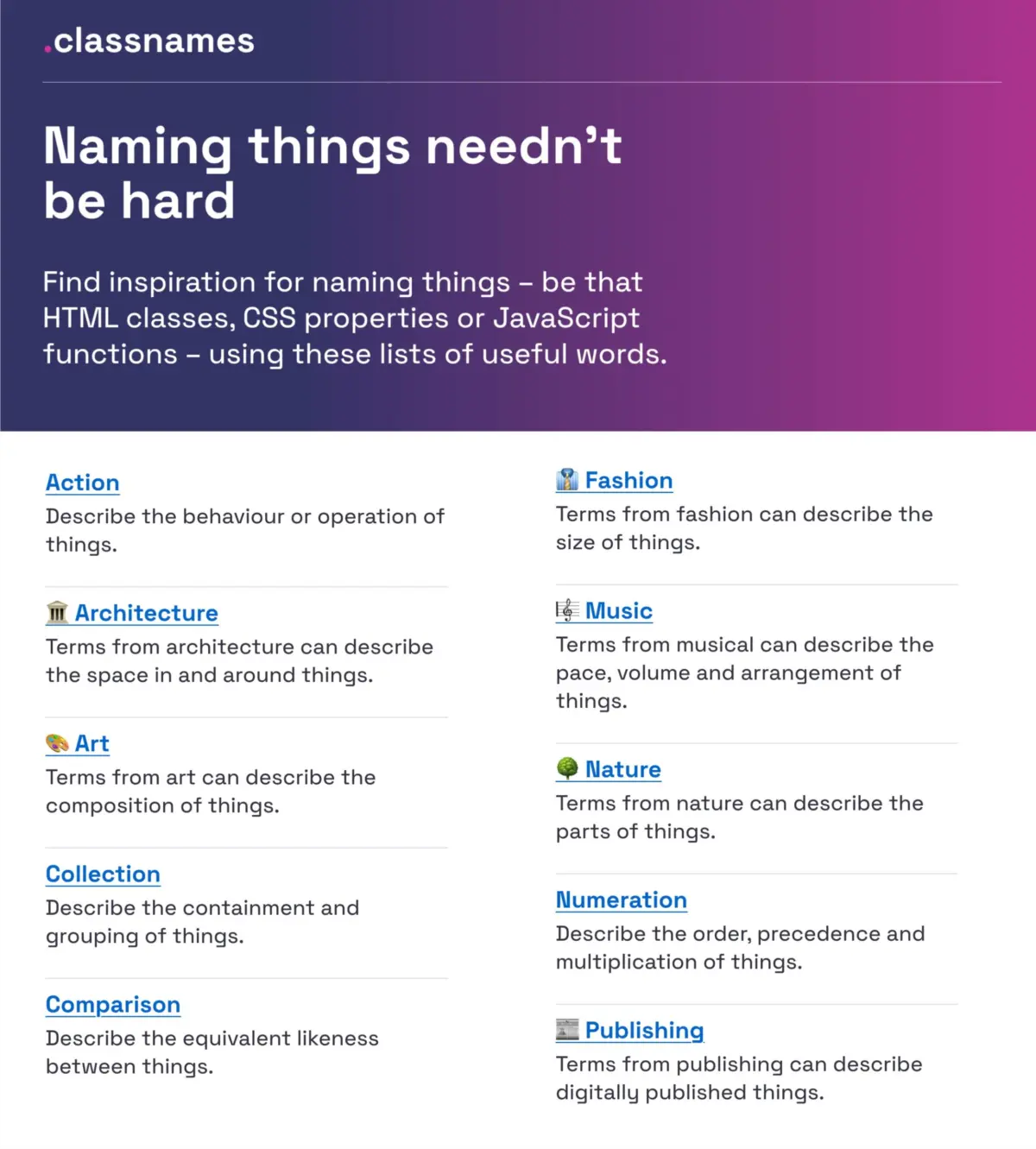
When teams hit a creative roadblock, looking exclusively at competing software often traps them in an echo chamber. Resources like Paul Robert Lloyd’s Classnames provide thematically grouped lists of words that encourage developers and designers to think outside the box. By tapping into vocabularies drawn from art, architecture, fashion, publishing, nature, and theater, teams can discover evocative, precise terms for behaviors, groupings, and states.
Similarly, David Aerne’s comprehensive color-names repository—housing over 30,000 unique, user-contributed color names accessible via tools like Color Parrot—removes the headache of inventing semantic names for raw hex codes, ensuring that brand palettes have distinct, memorable identifiers.

Official Case Studies: Enterprise Strategies for Scalable Taxonomies
Intuit’s Flexible Design Token Taxonomy
Managing a suite of household-name financial and small-business products—including Mailchimp, QuickBooks, TurboTax, and Mint—presents a monumental architectural challenge. Nate Baldwin documented how the Intuit design system team overhauled their token taxonomy to serve a vast portfolio of brands.
The old system suffered from rigid, brand-locked naming conventions that failed when new product acquisitions required integration. Intuit’s new taxonomy establishes a clear, multi-tiered hierarchy:
- Primitive Tokens: Raw values (e.g., color hex codes, base spacing measurements).
- Semantic Tokens: Contextual applications that abstract the primitive (e.g., background color for interactive states).
- Component Tokens: Highly specific variables tied directly to individual UI components.
This structured separation ensures that changing a brand theme upstream cascades cleanly across all integrated applications without breaking UI integrity.

Vodafone UK’s Variables Taxonomy Map
The Vodafone UK Design System team confronted similar multi-brand complexities, publishing their comprehensive Variables Taxonomy Map on the Figma Community. Built upon Nathan Curtis’s foundational work on design tokens, Vodafone’s map organizes variables into four interconnected collections:
- Brand
- Primitives
- Semantics
- Pages
By structuring tokens this way, any stakeholder can instantly discern where a token is utilized, what data it represents, and how it relates to the overarching design system architecture simply by reading its name.
Future Outlook: Component Standardization and Feature Discoverability
As design systems mature, the focus of naming is shifting toward user-facing discoverability and cross-industry component standardization.
Universal Component Galleries
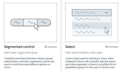
When engineers and designers debate what to call a new interactive element, looking at established design systems is the most efficient shortcut. Iain Bean’s Component Gallery aggregates real-world examples for over 50 UI components—ranging from accordions to visually hidden utility classes—documenting the various aliases each component goes by across different corporate design systems. Complementary tools like Name That UI serve as visual dictionaries to align cross-functional teams instantly.
Solving the Feature Discovery Crisis
Naming new product features presents a unique marketing and UX challenge. As Erin Gannon notes in her practical framework on feature naming, low adoption rates are frequently a symptom of poor discoverability rather than poor utility.
Users must discover a feature, understand its value, try it, learn it, and eventually integrate it into their daily workflows. To achieve this:

- Feature names must be driven by user needs and problems, not internal corporate roadmaps.
- Names should signal the outcome or "job-to-be-done" rather than technical mechanics.
- Teams must adopt the user’s language by conducting user interviews and applying the exact terminology customers use to describe their pain points.
Conclusion
The pursuit of clear, scalable nomenclature is not an administrative afterthought; it is a core pillar of digital craftsmanship. By leveraging modern resources—such as Romina Kavcic’s Design Token Naming Guide and Inventory, the Onym repository for product naming, and structured token maps—teams can eliminate the friction caused by semantic dialects.
When designers, developers, product managers, and users speak the same lexical language, confusion dissipates, frustration drops, and software becomes fundamentally more cohesive, accessible, and human-centered.
(Editor’s Note: At Smashing, we celebrate the collaborative spirit of the web community. We regularly publish deep-dive guides, books, and online workshops designed to make the digital landscape more accessible and usable. For group discounts and student rates on our upcoming online events, reach out to our team directly.)