

Executive Overview
In the fast-paced ecosystem of digital product design, aesthetic trends move at a breakneck speed. From the heavy borders and raw contrasts of neo-brutalism to the slick, translucent planes of glassmorphism and the hidden navigation models of modern mobile UI, designers constantly chase visual innovation. The primary goal of these contemporary interaction patterns is usually clear: capture attention, signal technological advancement, and maximize immediate user engagement.
However, when these trend-driven patterns are transplanted directly into mental health and digital wellbeing applications, a profound foundational conflict occurs. Mental health apps do not operate in a neutral environment. They serve users who are frequently operating at a severely reduced cognitive capacity—individuals navigating acute anxiety, depression, burnout, or emotional distress.

Recent clinical data reveals a startling crisis of user retention across the mobile health (mHealth) landscape. According to peer-reviewed public health metrics, nearly 95% of users who open a mental health application on day one abandon it entirely by day thirty, with the median thirty-day retention lingering at a meager 3.3%. Even the industry’s most recognized platforms lose approximately half of their user base within the first ten days.

As UI/UX researcher and product designer Kat Homan argues, interface design in this sector is not merely a superficial layer of polish or an aesthetic preference; it is a critical clinical tool that directly dictates whether an individual receives timely support or quietly disconnects out of sheer frustration. This article investigates the dangerous friction caused by trend-driven design in mental health technology, explores the five primary fronts where usability clashes with therapeutic needs, and introduces a comprehensive evaluation framework designed to prioritize cognitive refuge, emotional alignment, and sustainable user trust.

Detailed Chronology: The Evolution and Divergence of mHealth Design
To understand how the mental health app sector arrived at its current retention crisis, it is necessary to examine how mobile interface design has evolved alongside clinical technology over the past decade.

Phase 1: The Clinical Translation Era (Early 2010s)
In the early days of smartphone-based psychological tools, applications were largely digital adaptations of paper-based therapeutic worksheets (such as Cognitive Behavioral Therapy thought records). These interfaces were utilitarian, text-heavy, and functionally rigid. While they lacked aesthetic warmth, they succeeded in maintaining a literal translation of clinical methods. However, their high cognitive load and dry, sterile visual presentation made them unappealing for everyday preventative use, leading to early drop-off rates driven by boredom rather than frustration.

Phase 2: The Consumer Wellness Boom (Mid-to-Late 2010s)
As the broader app economy matured, venture-backed startups flooded the wellbeing market, introducing consumer-grade design patterns. Meditation giants like Headspace and Calm popularized playful illustrations, soothing color palettes, and structured content libraries. This era proved that design could destigmatize mental health support. However, it also established a dangerous precedent: the blending of clinical utility with consumer entertainment paradigms, laying the groundwork for aggressive gamification and content bloat.

Phase 3: The Trend-Driven Disconnect (2020s–Present)
In recent years, the race for market differentiation has driven product teams to adopt cutting-edge UI trends directly from mainstream consumer apps, fintech platforms, and e-commerce spaces. Neo-brutalist cards, complex micro-interactions, hidden gesture-based menus, non-skippable celebratory animations, and dynamic paywalls have become commonplace. Unfortunately, these features are optimized for attention economies rather than attention-depleted users. The result is a profound emotional and cognitive mismatch: an interface designed to impress Dribbble audiences is being handed to a user experiencing a panic attack, creating an invisible barrier between the individual and the care they desperately need.

Supporting Context & Metrics: The Anatomy of User Abandonment
The urgency of reforming mental health UI/UX is underscored by hard data. The psychological state of a user arriving at a wellbeing application is fundamentally different from that of someone opening a banking app or a food delivery service.

- The 30-Day Drop-Off Cliff: Research published in the Journal of Medical Internet Research (JMIR) highlights that approximately 95% of day-one users abandon mental health applications by day thirty.
- Cognitive Load in Distress: Clinical studies in psychiatric informatics emphasize that individuals suffering from high anxiety, major depressive episodes, or chronic stress experience measurable reductions in executive function, working memory, and decision-making capacity. When an application introduces abstract icons, non-standard navigation drawers, or unexpected paywalls at the moment of entry, it creates an insurmountable cognitive tax.
- The Color and Tone Preference: Recent investigations into aesthetic preferences in mHealth apps reveal that distressed users heavily favor subtlety—preferring dark modes, muted earth tones, and uncluttered layouts. Conversely, hyper-saturated, aggressively cheerful interfaces can feel dismissive, creating a jarring emotional dissonance that actively erodes trust.
The Five Fronts of Friction: Where UI Trends Fail Therapeutic Goals
Product evaluations of leading mental health platforms reveal five critical areas where unadapted UI trends undermine therapeutic usability.

1. Cognitive Friction and Executive Overload
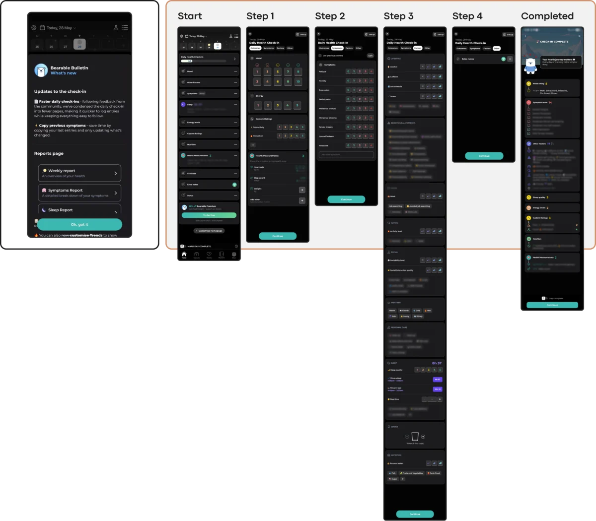
The primary objective of a mental health interface must be the reduction of cognitive load. Yet, trendy layouts—such as neo-brutalist high-contrast blocks, hidden gesture navigation, and unlabeled abstract icons—require users to solve visual puzzles before they can access help. When an overwhelmed user opens an app to find a panic relief tool, only to be confronted with a noisy home screen filled with locked cards, mascot characters, and upgrade prompts, the friction frequently causes them to close the app for good.

2. Emotional Mismatch and Trust Erosion
Visual tone communicates empathy. When an app employs bright, hyper-energetic visual styles or incorporates jarring reward mechanisms (such as celebratory confetti or spinning discount wheels) immediately after a user logs a severe depressive episode or an anxiety spike, it creates a severe emotional mismatch. This dissonance signals to the user that the system does not understand their reality, swiftly destroying the fragile trust required for ongoing engagement.

3. The Inconsistency Penalty and Disruptive Novelty
Human psychological stability relies heavily on routine, predictability, and familiarity—especially during periods of personal crisis. However, contemporary UI trends prioritize constant novelty, redesigning fundamental navigation patterns to feel "fresh." When a returning user must relearn how to access core breathing exercises or mood-tracking logs because a routine update introduced an experimental interaction model, the resulting frustration discourages habit formation.

4. The Silent Exclusion of Accessibility Needs
Minimalism often translates to low-contrast text, while modern interaction trends frequently rely on complex multi-touch gestures or dense, fast-moving animations. In the mental health sector, user populations frequently overlap with those experiencing visual impairments, motor difficulties, or neurodivergent attentional conditions. Prioritizing aesthetic minimalism over Web Content Accessibility Guidelines (WCAG) standards actively locks out the individuals who need these tools the most.

5. The Coercion Paradox: When Motivation Becomes Pressure
Borrowed directly from gaming and productivity apps, engagement mechanics such as strict streaks, aggressive push notifications, and daily commitment contracts are designed to manufacture habit loops. In a mental health context, however, these features easily curdle into instruments of guilt. For a user managing chronic depression or burnout, a broken streak or an urgent notification demanding attention transforms a supportive tool into another demanding obligation, exacerbating feelings of failure.

Official Industry Perspectives and Expert Frameworks
Recognizing these systemic flaws, leading digital health designers and researchers are advocating for a paradigm shift. Industry consensus is moving away from metrics that measure raw screen time and toward metrics that evaluate supportive friction reduction.

Design leaders emphasize that sustainable retention in health technology cannot be engineered through dark patterns or attention-grabbing gimmicks. Instead, it is earned by building a "quiet helper"—an interface that respects the user’s emotional bandwidth, offers low-friction alternative inputs (such as voice-first processing for fatigued users), and maintains a predictable, steady information architecture.

As highlighted in emerging product design frameworks, every micro-interaction must be scrutinized not for its visual flair, but for its functional empathy: Does this design choice lower the cost of using the app when the user can least afford to spend energy?

Future Outlook: A Practical Evaluation Framework for Designers
As the global burden of mental health conditions continues to rise—with the World Health Organization estimating that over a billion people live with mental disorders—the digital tools designed to support them must mature. Product teams can no longer afford to lift trendy visual components straight from Dribbble portfolios without contextual adaptation.

To bridge the gap between aesthetic innovation and clinical safety, designers must pass every proposed UI pattern through a rigorous evaluation framework based on five core questions:

- Does it reduce cognitive load? (Ensuring clear, unambiguous paths to support during acute distress.)
- Does it achieve emotional alignment? (Matching the visual tone and interaction mechanics to the user’s actual psychological state.)
- Does it maintain navigational reliability? (Preserving predictable patterns to support routine formation without forcing users to relearn the interface.)
- Does it uphold rigorous accessibility? (Complying with WCAG standards for contrast, touch targets, and motion sensitivity.)
- Is it free of coercive pressure? (Designing engagement loops that encourage return visits without punishing absence or inducing guilt.)
By adopting this disciplined, empathy-driven approach, the next generation of mental health applications can move beyond the revolving-door retention crisis. Ultimately, the success of a wellbeing interface should not be measured by how long it keeps a user’s eyes glued to the screen, but by how reliably it helps them feel understood, grounded, and supported when the digital world fades away.