

Executive Overview
In the sprawling landscape of digital product design and software engineering, few challenges are as universally acknowledged yet chronically underestimated as the art and science of naming. As the old computing adage famously notes, "There are only two hard things in Computer Science: cache invalidation and naming things."
The language we choose does far more than merely attach labels to code blocks or visual assets; it actively shapes our cognitive models, dictates the boundaries of cross-functional dialogue, and frames how users interact with software. When teams suffer from linguistic fragmentation—speaking in divergent dialects across design, product management, and development—friction multiplies. Colors, icons, user interface (UI) components, and backend features become conceptual moving targets.
This guide provides an authoritative, comprehensive exploration into the methodologies, frameworks, and expert resources available for mastering nomenclature across every layer of the modern digital stack. From selecting evocative CSS classes and managing thousands of distinct color properties to building scalable design token taxonomies and naming user-facing features, this article synthesizes industry best practices to help engineering and design organizations establish a unified lexicon.

Detailed Chronology: The Evolution of Naming Frameworks in Digital Design
The digital industry’s approach to nomenclature has undergone a profound maturation over the past two decades. Understanding this trajectory clarifies why modern design systems demand rigorous, systemic approaches to naming rather than ad-hoc, siloed labeling.
Phase 1: The Wild West of Web Development (Late 1990s – Late 2000s)
In the early days of the web, naming conventions were largely idiosyncratic. Developers relied on personal preference, shorthand, or visual descriptions tied directly to appearance rather than semantic meaning. Classes like .blue-box or .left-sidebar-bold were ubiquitous.
As sites grew into complex web applications, this visual-first naming paradigm collapsed. If a redesign changed a sidebar from the left to the right side of the screen, or shifted a button from blue to green, the underlying codebase required massive refactoring to prevent semantic absurdities like .left-sidebar float: right; .

Phase 2: The Methodology Boom (2010s)
Recognizing the unsustainable nature of visual naming, the industry pivoted toward structured methodologies. Systems like BEM (Block, Element, Modifier), SMACSS (Scalable and Modular Architecture for CSS), and OOCSS (Object-Oriented CSS) emerged. These frameworks introduced predictability by enforcing strict hierarchies and encapsulation rules, ensuring that UI components could be reasoned about in isolation.
Concurrently, the rise of component-driven development libraries (such as React, Vue, and Angular) forced UI designers and frontend developers to reconcile their terminology. Design tools like Sketch, Adobe XD, and eventually Figma began introducing features like symbols and nested components, which necessitated parallel naming structures in design files and code repositories.
Phase 3: The Design Token Era and Systemic Taxonomies (Present)
Today, nomenclature extends far beyond HTML classes and component folders. The widespread adoption of design tokens—atomic pieces of a design system such as spacing, color values, typography scales, and animation curves—has elevated naming to an enterprise architecture concern. Modern organizations like Intuit, Vodafone, and Shopify manage multi-brand, multi-platform ecosystems where a single variable must propagate seamlessly from a Figma library down to iOS, Android, and web codebases. Consequently, naming is no longer treated as an afterthought; it is recognized as a foundational pillar of design system scalability.

Supporting Context & Metrics: The Anatomy of Effective Nomenclature
To understand how to name things correctly, we must first diagnose why naming fails. Names typically fall into one of two destructive traps:
- Too Generic: Terms like
.container,.wrapper, or.itemlack semantic weight. They force developers and designers to inspect the underlying implementation to understand a component’s purpose, defeating the abstraction benefits of design systems. - Too Specific: Terms like
.red-sale-banner-2023lock components into rigid contexts. When the sale ends or the brand color updates, the name becomes misleading and brittle, severely limiting component reuse.
According to developer productivity studies and design system audits, teams waste an estimated 10% to 15% of their sprint cycles clarifying ambiguities caused by misaligned terminology. Resolving these discrepancies requires adhering to core linguistic principles: logical structure, brevity, shared understanding, and abstraction from fleeting visual properties.
Practical Inspiration for General Code and Styles
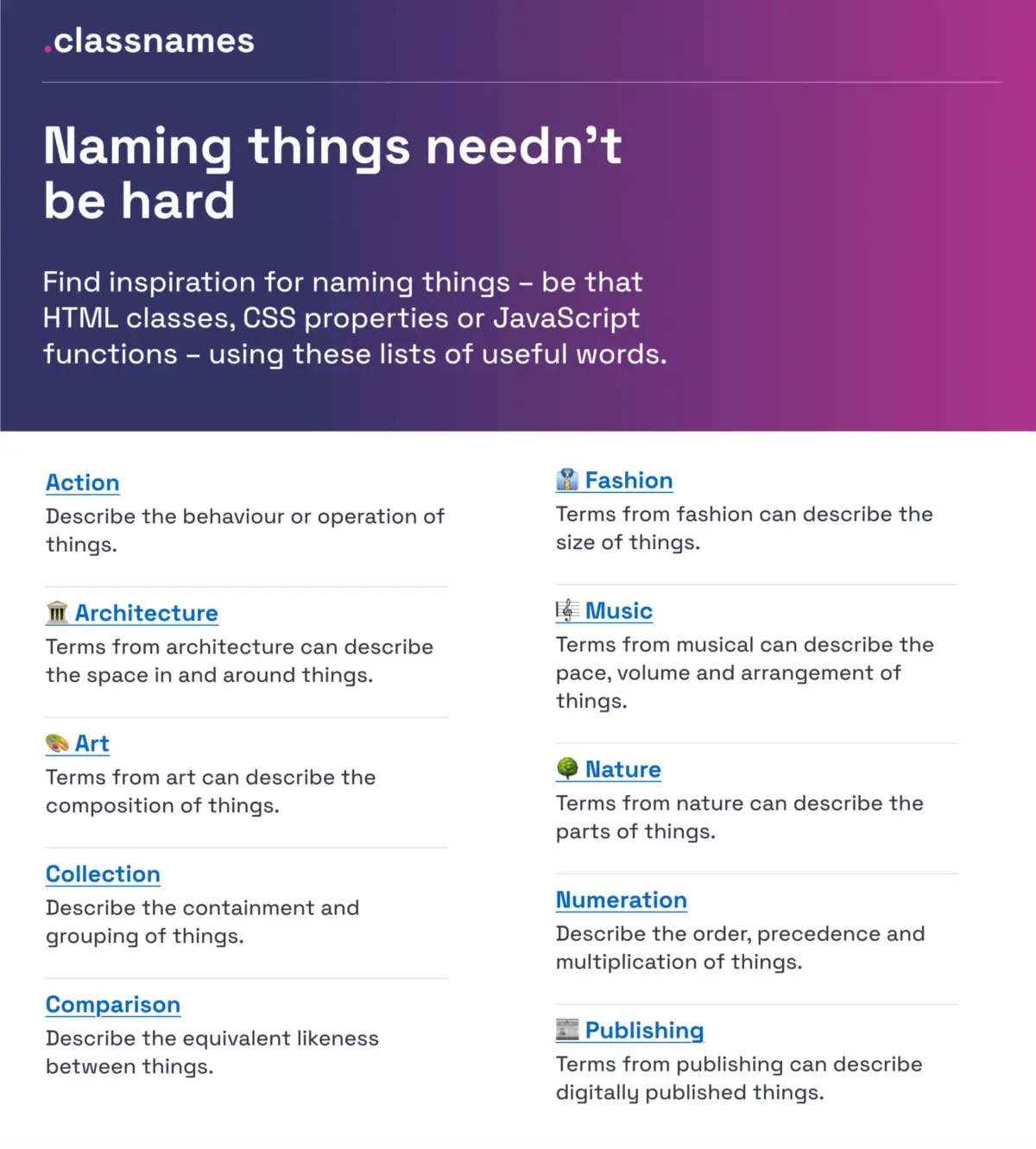
When struggling to name HTML classes, CSS properties, or JavaScript functions, resources like Classnames (curated by Paul Robert Lloyd) offer thematic lists of words designed to push developers outside conventional patterns. Rather than defaulting to generic terms, Classnames provides organized vocabularies covering behavior, relational likeness, order, and grouping, alongside unconventional domains such as nature, architecture, fashion, and publishing.

Similarly, color naming has moved past simple hex codes and rudimentary adjectives. David Aerne’s comprehensive color-naming repository (Color Names), featuring over 30,000 unique entries sourced from user contributions and historical references, provides developers and designers with precise, memorable terminology for programmatic color tokens. Accompanied by interactive color pickers and search utilities like Color Parrot, these tools ensure that palette management remains structured and intuitive.
Official Guidelines and Best Practices from Industry Leaders
Across the broader UX and engineering landscape, several prominent practitioners and enterprise teams have published definitive frameworks for naming layers, tokens, components, and features.
1. Layers, Groups, and Components in Design Tools
In his comprehensive research on design system hygiene, Javier Cuello outlines foundational best practices for organizing layers and components in tools like Figma. An effective layer or component name must:

- Possess a logical structure (e.g., following a category/subcategory or component/state hierarchy).
- Be short and meaningful.
- Be universally understood across the product team.
- Remain independent of transient visual properties (avoiding names like Rectangle 42 or Bold Pink Text).
2. Design Token Taxonomies: The Intuit Case Study
Building a token architecture that serves multiple massive brands—such as Mailchimp, QuickBooks, TurboTax, and Mint—presents extraordinary naming challenges. Nate Baldwin documented Intuit’s journey in creating a flexible design token taxonomy designed to transcend individual brand themes.
Intuit’s approach moved away from rigid, single-brand naming conventions toward a multi-tiered architecture. By categorizing tokens by abstraction level (such as global primitives, semantic aliases, and component-specific values), the team established a system where the name of a token explicitly communicates its intent and scope, preventing global styling pollution.
3. Sourcing UI Component Names: The Component Gallery
When building or auditing a design system, identifying standard nomenclature for UI components is critical. Iain Bean’s Component Gallery aggregates real-world examples and variant names for over 50 core interface components—ranging from accordions to visually hidden elements. By mapping out alternative names used across different enterprise design systems, teams can align their internal terminology with established industry conventions, drastically lowering cognitive load for incoming engineers and designers.
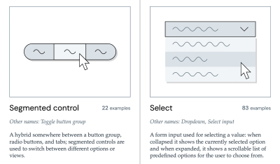
For a purely visual reference, Name That UI serves as an indispensable visual dictionary, allowing practitioners to cross-reference ambiguous interface patterns with their proper industry terminology.
4. Naming Features for Discoverability
Poor feature adoption is frequently a symptom of poor discoverability rooted in confusing nomenclature. In her practical guide “What Do We Call This Thing?”, UX researcher Erin Gannon emphasizes that feature names must be driven by user needs and problems rather than internal corporate jargon.
Effective feature names should:

- Signal the value or outcome (the "job-to-be-done").
- Tap directly into the user’s language, gathered through qualitative research where users describe workflows in their own words.
5. Multi-Brand Token Systems: Vodafone UK’s Taxonomy Map
Enterprise scaling introduces multi-brand and multi-themed complexities. The Vodafone UK Design System team released their Variables Taxonomy Map, illustrating a sophisticated model for token categorization in Figma.
Building upon Nathan Curtis’s seminal work on design token naming, Vodafone’s map organizes tokens across four distinct collections: brand primitives, semantic mappings, component states, and page-level applications. This explicit hierarchy ensures that any team member can trace a token’s lineage and understand its exact context purely from its string identifier.
Complementary tools like Romina Kavcic’s Design Token Naming Guide and Builder and her Design Token Names Inventory spreadsheet provide actionable, interactive frameworks for structuring categories, states, and roles without losing track of complex property variations.

Future Outlook: The Next Frontier of Semantic Architecture
As artificial intelligence, automated code generation, and multi-modal design tools become deeply embedded in the software development lifecycle, the importance of rigorous nomenclature will only intensify.
AI-Driven Code Generation and Semantic Clarity
Large Language Models (LLMs) and AI coding assistants rely heavily on contextual cues embedded within codebase naming conventions. When variables, classes, and design tokens follow a strict, logical taxonomy, AI tools generate cleaner, more accurate boilerplate code and UI components. Conversely, ambiguous or inconsistent naming degrades AI output quality, leading to technical debt and security vulnerabilities. Future design systems will increasingly be built with machine-readability and strict semantic schemas in mind, ensuring seamless translation between natural language prompts, design files, and production code.
Automated Token Synchronization
We are moving rapidly toward zero-latency synchronization between design tokens in tools like Figma and production variables in multi-platform repositories. As token pipelines mature, naming conventions will become programmatic contracts enforced by automated linters and continuous integration (CI) pipelines. Breaking changes in token names will be flagged and resolved programmatically, bridging the historical chasm between design intent and engineering execution.

Conclusion: Bridging the Dialect Divide
Ultimately, the right name is the one that is universally understood and actively utilized by both the product team and the end users. Far too much engineering and design time is wasted translating between different organizational dialects—the designer’s visual lexicon, the developer’s structural syntax, the product manager’s roadmap terminology, and the user’s everyday language.
By investing time in establishing robust naming conventions, auditing token taxonomies, and addressing naming conflicts in dedicated backlogs, organizations can eliminate profound layers of friction. Meticulous nomenclature is not merely an administrative chore; it is an act of clarity that empowers cross-functional teams to build more cohesive, accessible, and intuitive digital experiences.